Show code
### this is just the code that creates the "copy to clipboard" function in the code blocks
htmltools::tagList(
  xaringanExtra::use_clipboard(
    button_text = "<i class=\"fa fa-clone fa-2x\" style=\"color: #301e64\"></i>",
    success_text = "<i class=\"fa fa-check fa-2x\" style=\"color: #90BE6D\"></i>",
    error_text = "<i class=\"fa fa-times fa-2x\" style=\"color: #F94144\"></i>"
  ),
  rmarkdown::html_dependency_font_awesome()
)
Overprinting
Overprinting is where one point on a graph overlies another. It’s mainly a problem with scattergrams and if you have large numbers of points and few discrete values it can make a plot completely misleading. OK, let’s make up some data.
Show code
n <- 5000 # a lot of points means that overprinting is inevitable
nVals <- 5 # discretising continuous variables to this number of values (below) makes it even more certain
set.seed(12345) # ensures we get the same result every time

### now generate x and y variables as a tibble
as_tibble(list(x = rnorm(n),
               y = rnorm(n))) -> tibDat

### create strong correlation between them by adding x to y (!)
tibDat %>%
  mutate(y = x + y) -> tibDat

### now we want to discretise into equiprobable scores so find the empirical quantiles
vecXcuts <- quantile(tibDat$x, probs = seq(0, 1, 1/nVals))
vecYcuts <- quantile(tibDat$y, probs = seq(0, 1, 1/nVals))

### now use those to transform the raw variables to equiprobable scores in range 1:5
tibDat %>%
  mutate(x5 = cut(x, breaks = vecXcuts, include.lowest = TRUE, labels = FALSE, right = TRUE),
         y5 = cut(y, breaks = vecYcuts, include.lowest = TRUE, labels = FALSE, right = TRUE)) -> tibDat
Now let’s have a simple scatterplot.
Show code
### use ggplot to generate the simple scattergram for the raw variables
ggplot(data = tibDat,
       aes(x = x, y = y)) +
  geom_point() +
  theme_bw()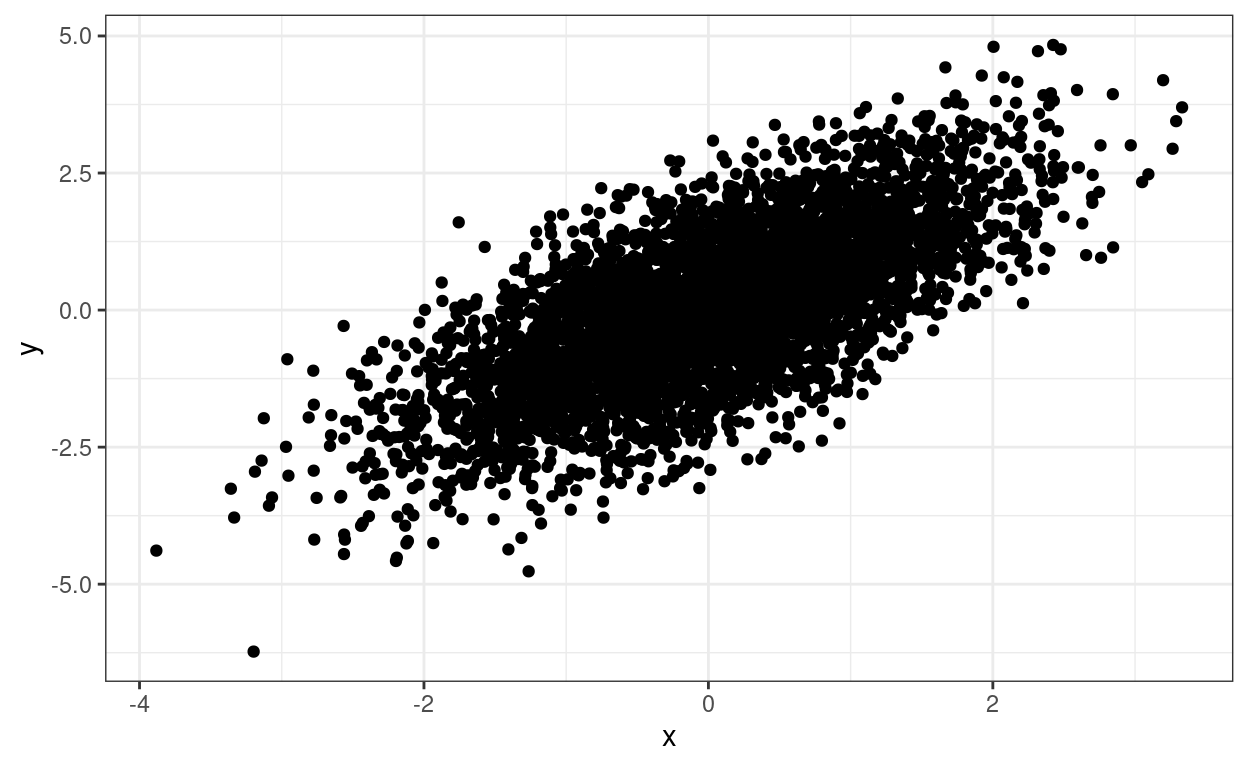
The relationship between the two variables is clear but we don’t know about any overprinting. We can add a loess smoothed regression which clarifies the relationship between the scores but doesn’t resolve the overprinting issue.
Show code
ggplot(data = tibDat,
       aes(x = x, y = y)) +
  geom_point() +
  geom_smooth() + # adding the loess smoother
  theme_bw()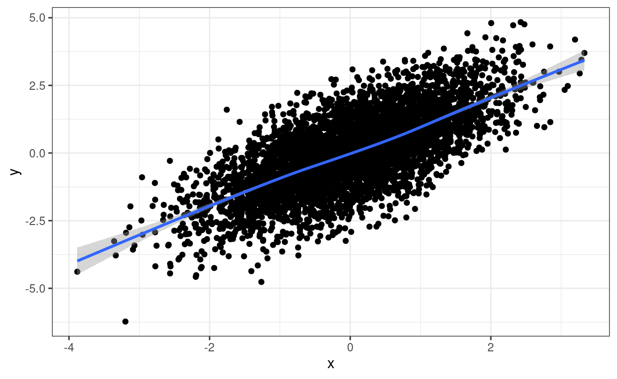
However, to really drive home the point about overprinting, if those points are transformed and discretised to five equiprobable scores then things look like this.
Show code
ggplot(data = tibDat,
       aes(x = x5, y = y5)) + # use discretised variables instead of raw variables
  geom_point() +
  theme_bw()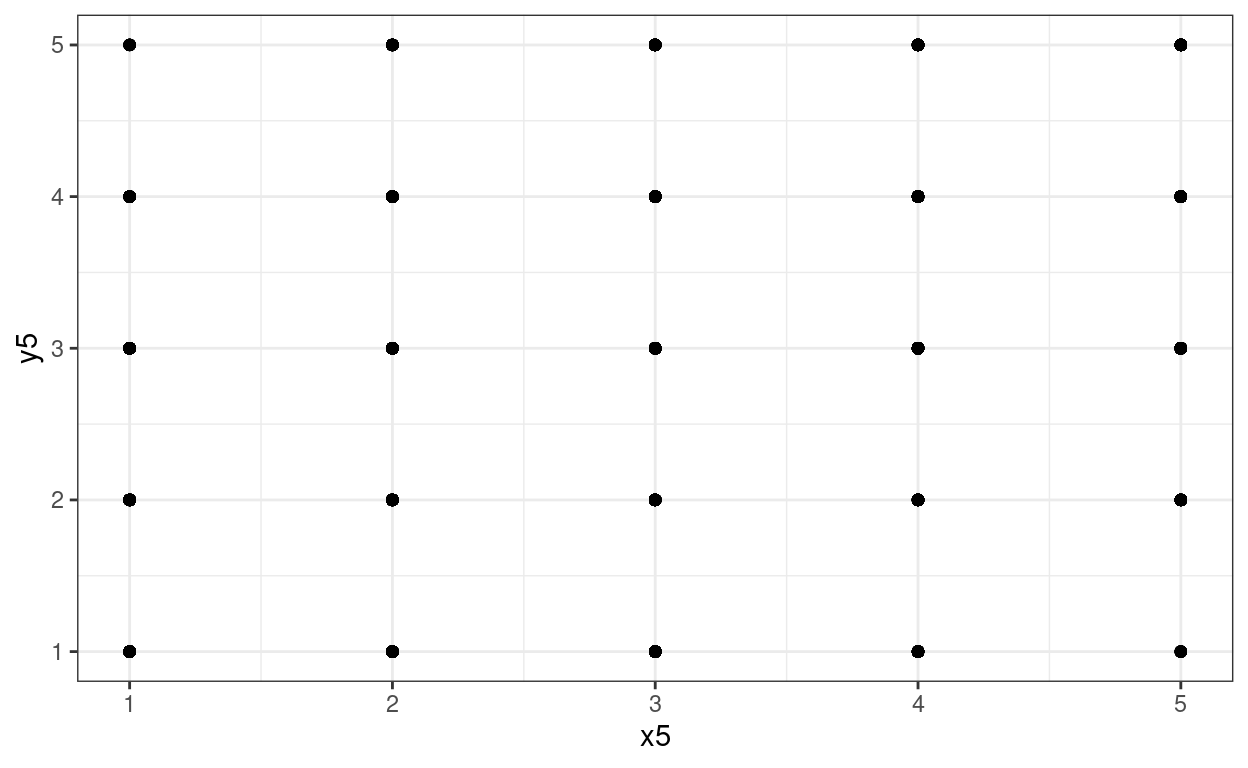
Whoops: much overprinting as 5000 points have collapsed to 25 visible points on the scattergram but we can’t see how much and no apparent relationship between the variables at all.
Again we can add a regression to that plot for amusement and to show that the transform hasn’t removed the relationship. (Has to be a linear regression as the number of distinct points doesn’t allow for loess smoothing.)
Show code
ggplot(data = tibDat,
       aes(x = x5, y = y5)) +
  geom_point() +
  geom_smooth(method = "lm") + # linear regression fit
  theme_bw()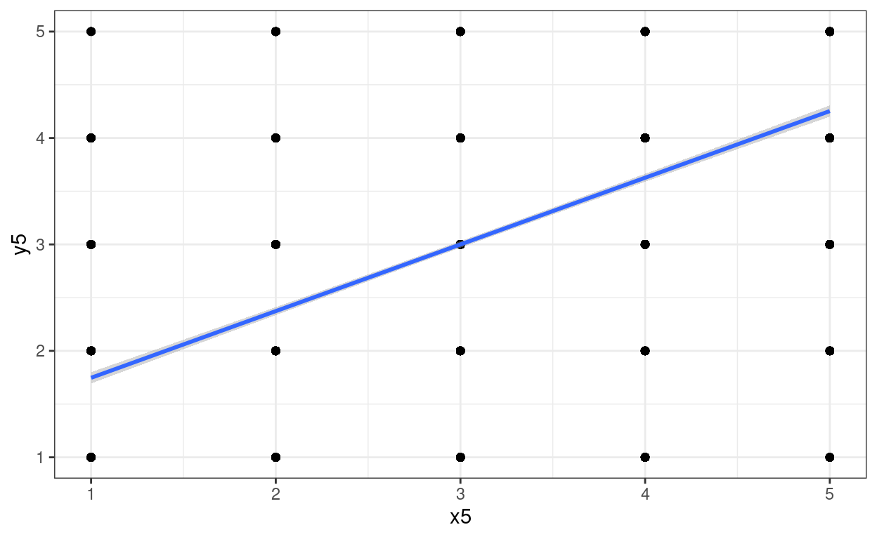
Jittering
One way around overprinting it is to jitter the points. Here I have used geom_jitter(width = .2, height = .2) which adds random “jittering” to both x and y values spread across .2 of the “implied bins”. I’ve left the raw data in in blue.
There are situations in which you just want jittering on one axis and not the other so you can use geom_jitter(width = .2). Sometimes playing around with width helps get the what seems the best visual fit to the counts.
Show code
ggplot(data = tibDat,
       aes(x = x5, y = y5)) +
  geom_jitter(width = .2, height = .2) + # jittered data
  geom_point(data = tibDat,
             aes(x = x5, y = y5),
             colour = "blue") +
  theme_bw()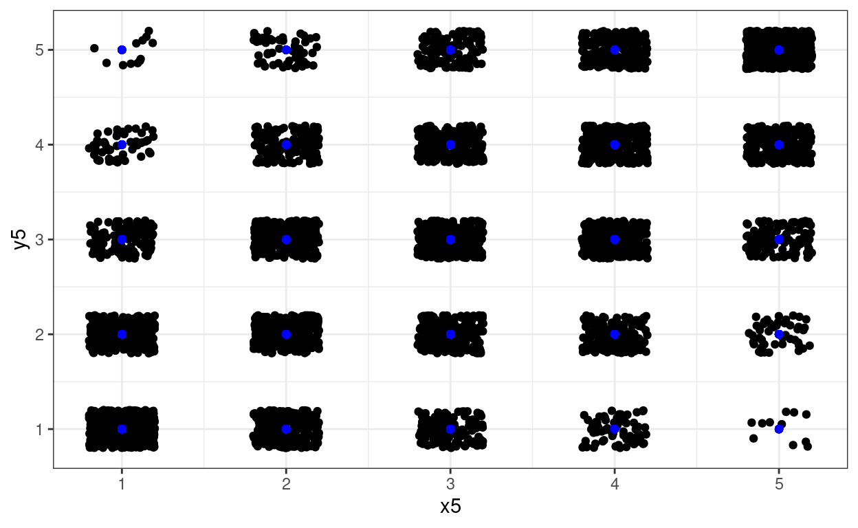
Using transparency
Another approach is to use transparency. Here you just have the one parameter, alpha and again, sometimes you need to play with different values.
Show code
ggplot(data = tibDat,
       aes(x = x5, y = y5)) +
  geom_point(alpha = .01) +
  theme_bw()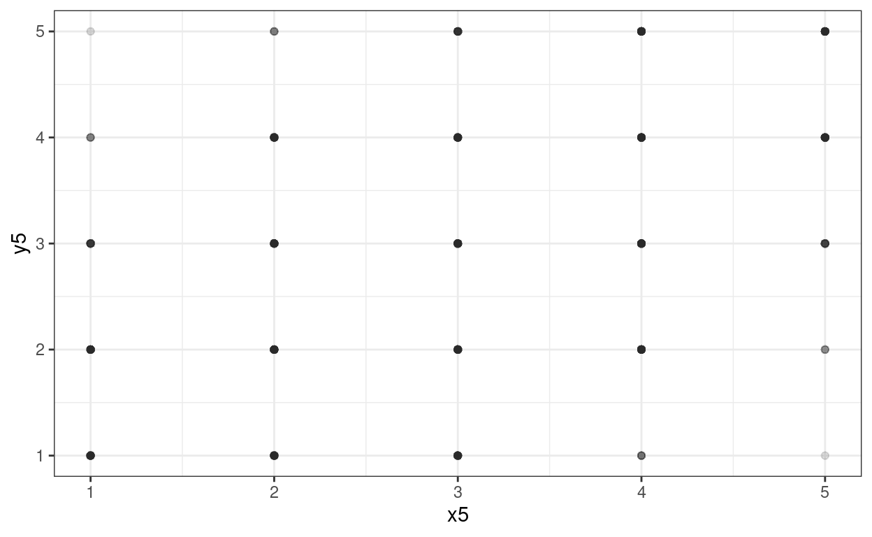
That’s not working terribly well as we have so many points (n = 5000).
Using area to show counts: geom_count()
And another approach, good when values are widely spaced as here, is geom_count().
Show code
ggplot(data = tibDat,
       aes(x = x5, y = y5)) +
  geom_count() +
  scale_size_area(n.breaks = 10) +
  theme_bw()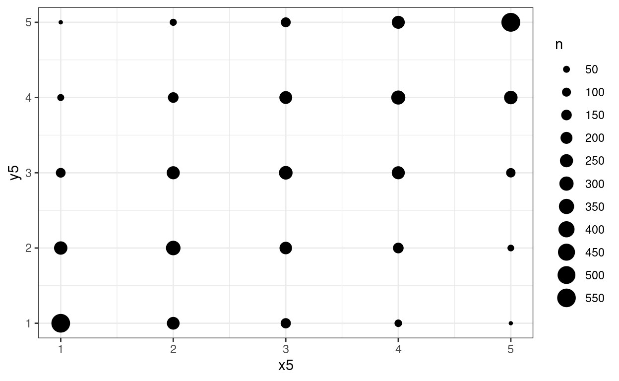
I used a rather excessive number of breaks there but it makes the point.
How do those methods work with the original data?
In this next set of blocks I’ve applied the same three tricks but to both the raw data and the discretised data.
Jittering
Show code
### reshape data to make it easy to get plots side by side using facetting
tibDat %>%
  ### first pivot longer
  pivot_longer(cols = everything()) %>%
  ### which gets something like this
  #   # A tibble: 20,000 x 2
  #    name    value
  #    <chr>   <dbl>
  #  1 x      0.586
  #  2 y     -0.107
  #  3 x5     4
  #  4 y5     3
  #  5 x      0.709
  #  6 y      1.83
  #  7 x5     4
  #  8 y5     5
  #  9 x     -0.109
  # 10 y      0.0652
  # # … with 19,990 more rows
  ### now get new variables one for x and y
  mutate(variable = str_sub(name, 1, 1),
       ### and one for the transform
       transform = str_sub(name, 2, 2),
       transform = if_else(transform == "5", "discretised", "raw"),
       transform = factor(transform,
                          levels = c("raw", "discretised")),
       ### create an id variable clumping each set of four scores together
       id = (3 + row_number()) %/% 4) %>%
  ### so now we can pivot back
  pivot_wider(id_cols = c(id, transform), values_from = value, names_from = variable) -> tibDat2
### to get this
# A tibble: 10,000 x 4
#       id transform        x       y
#    <dbl> <chr>        <dbl>   <dbl>
#  1     1 raw          0.586 -0.107
#  2     1 discretised  4      3
#  3     2 raw          0.709  1.83
#  4     2 discretised  4      5
#  5     3 raw         -0.109  0.0652
#  6     3 discretised  3      3
#  7     4 raw         -0.453 -2.42
#  8     4 discretised  2      1
#  9     5 raw          0.606 -1.04
# 10     5 discretised  4      2
# # … with 9,990 more rows

ggplot(data = tibDat2,
       aes(x = x, y = y)) +
  geom_jitter(width = .2, height = .2)  +
  facet_wrap(facets = vars(transform),
             ncol = 2,
             scales = "free") +
  geom_smooth(method = "lm") +
  theme_bw()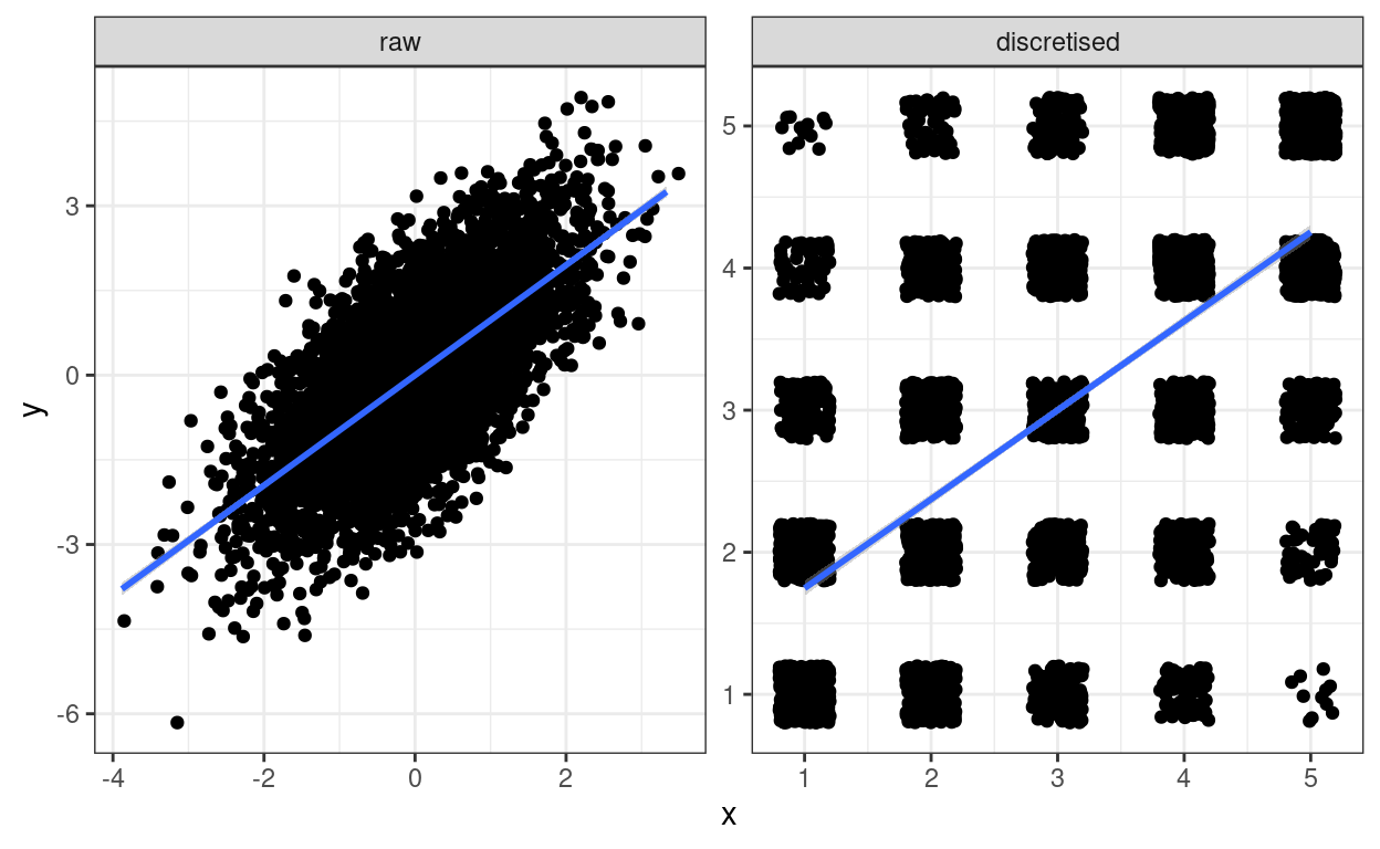
Amusing! I’ve put the linear regression fit line on both.
Transparency
Show code
ggplot(data = tibDat2,
       aes(x = x, y = y)) +
  facet_wrap(facets = vars(transform),
             ncol = 2,
             scales = "free") +
  geom_point(alpha = .01) +
  geom_smooth(method = "lm") +
  theme_bw()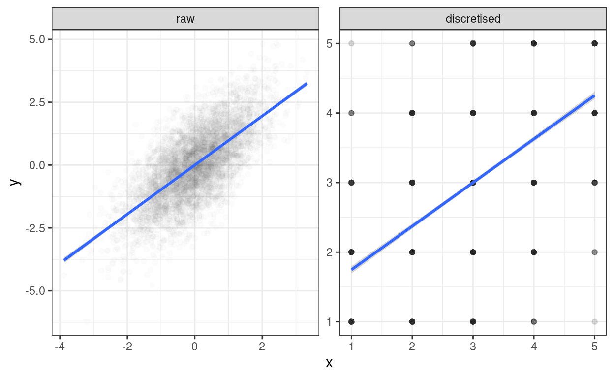
Transparency that works on the right for the discretised data, well works up to a point, is a bit too thin for the raw data. I can’t see that as of now (26.i.21 and ggplot version 3.3.3) that you can map transparency, i.e. alpha to a variable as you can, say, for colour. So to get a side-by-side plot I’m using a different approach. There are various ways of doing this, a useful page seems to be: http://www.sthda.com/english/articles/24-ggpubr-publication-ready-plots/81-ggplot2-easy-way-to-mix-multiple-graphs-on-the-same-page/
Show code
ggplot(data = filter(tibDat2, transform == "raw"), # select just the raw data
       aes(x = x, y = y)) +
  geom_point(alpha = .2) +
  geom_smooth(method = "lm") +
  theme_bw() -> tmpPlot1


ggplot(data = filter(tibDat2, transform == "discretised"), # select just the raw data
       aes(x = x, y = y)) +
  geom_point(alpha = .01) +
  geom_smooth(method = "lm") +
  theme_bw() -> tmpPlot2

### use ggarrange from the ggpubr package, see the URL for other options
ggpubr::ggarrange(tmpPlot1, tmpPlot2)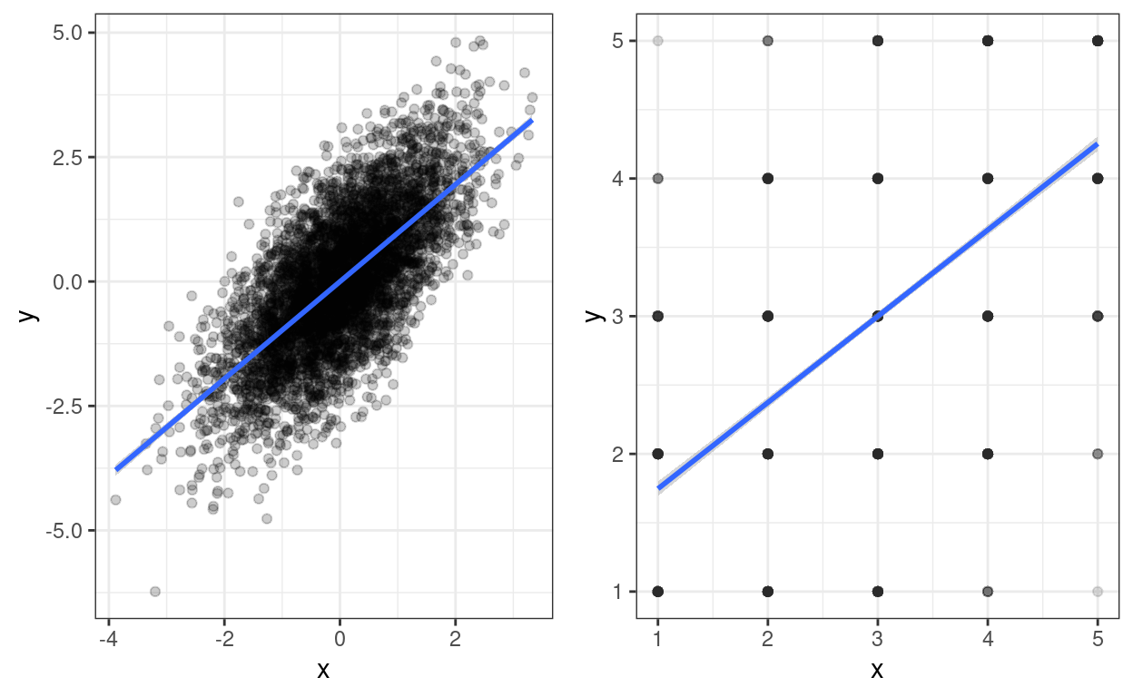
Using area: geom_count()
Show code
ggplot(data = tibDat2,
       aes(x = x, y = y)) +
    facet_wrap(facets = vars(transform),
             ncol = 2,
             scales = "free") +
  geom_count() +
  geom_smooth(method = "lm") +
  scale_size_area(n.breaks = 10) +
  theme_bw()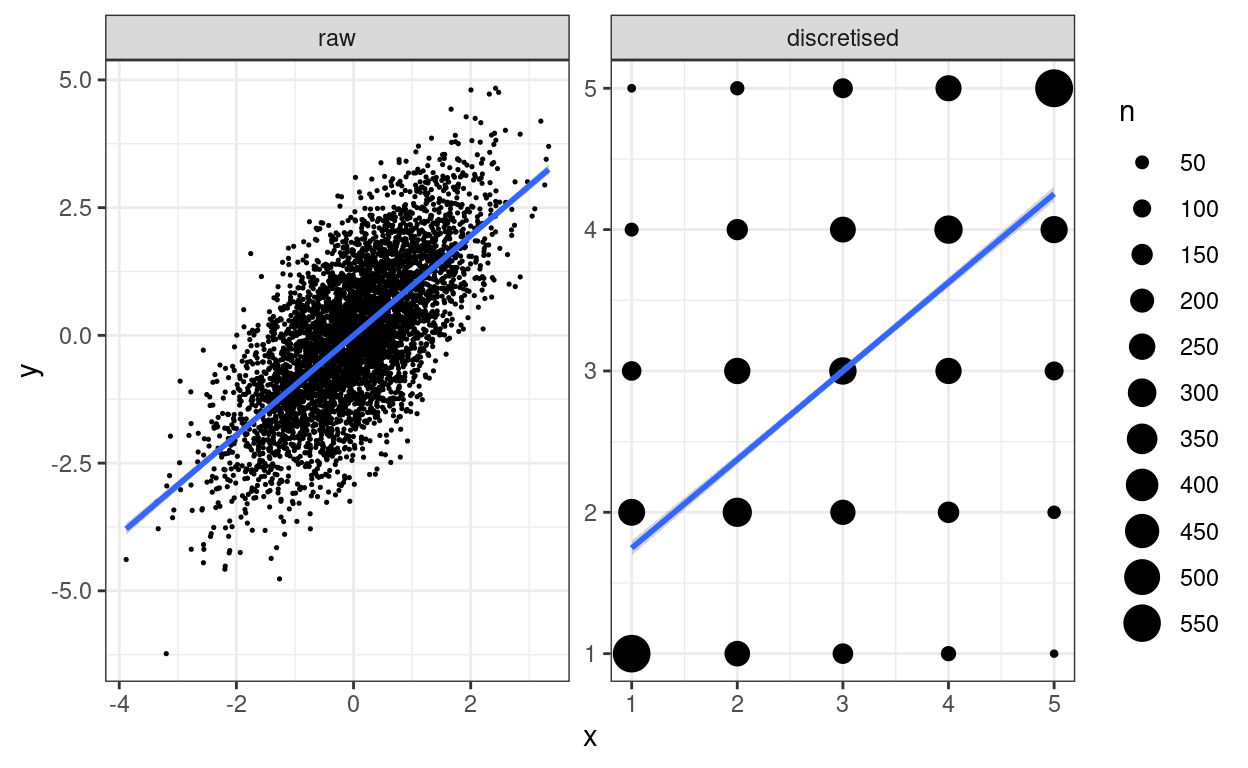
I used a rather excessive number of breaks there but it makes the point.
Tangential issue: impact of discretising on relationship between variables
Show code
valRawCorr <- cor(tibDat$x, tibDat$y)
valDisc5Corr <- cor(tibDat$x5, tibDat$y5)

vecRawCorrCI <- cor.test(tibDat$x, tibDat$y)$conf.int
vecDisc5CorrCI <- cor.test(tibDat$x5, tibDat$y5)$conf.int

### or here's another, tidyverse way to do this
### seems like unnecessary faff except that it makes
### it so easy to do a micro forest plot (see below)
getParmPearsonCI <- function(x, y){
  ### little function to get parametric 95% CI from two vectors
  obsCorr <- cor(x, y)
  tmpCI <- cor.test(x, y)$conf.int
  return(list(LCL = tmpCI[1],
              obsCorr = obsCorr,
              UCL = tmpCI[2]))
}
tibDat2 %>%
  group_by(transform) %>%
  summarise(pearson = list(getParmPearsonCI(x, y))) %>%
  unnest_wider(pearson) -> tibCorrs
### which gives us this
# tibCorrs
# # A tibble: 2 x 4
#   transform     LCL obsCorr   UCL
#   <fct>       <dbl>   <dbl> <dbl>
# 1 raw         0.676   0.691 0.705
# 2 discretised 0.609   0.626 0.643
The correlation between the original variables is 0.691 with parametric 95% confidence interval (CI) from 0.676 to 0.705 whereas that between the discretised variables is 0.626 with 95% CI from 0.609 to 0.643 so some clear attenuation there. Micro forest plot of that:
Show code
ggplot(data = tibCorrs,
       aes(x = transform, y = obsCorr)) +
  geom_point() +
  geom_linerange(aes(ymin = LCL, ymax = UCL)) +
  ylim(.5, 1) +
  theme_bw()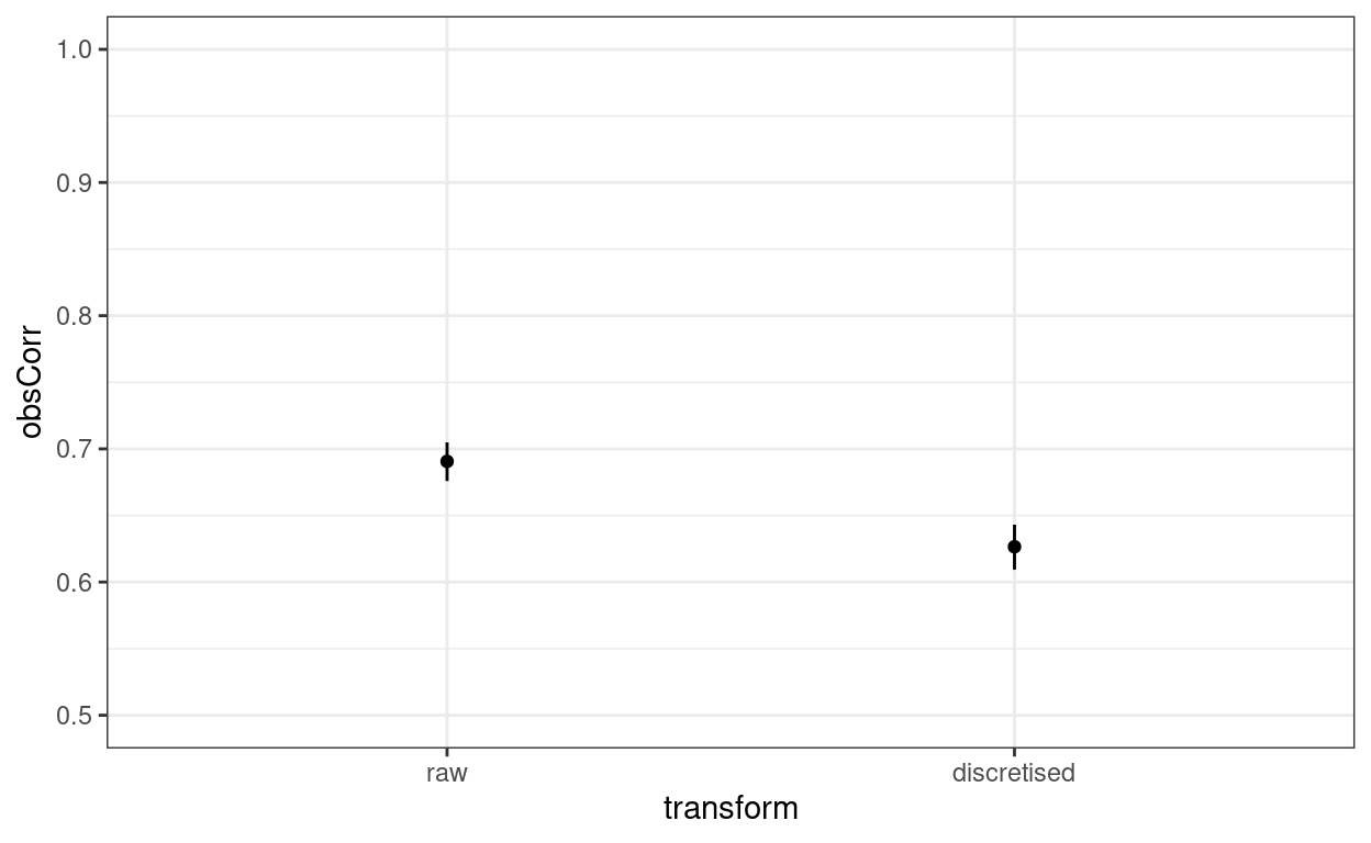
Yup, that’s a fairly large and clear difference on a y scale from .5 to 1.0. What about the linear regression?
Call:
lm(formula = scale(y) ~ scale(x), data = tibDat)

Coefficients:
(Intercept)     scale(x)
  1.066e-17    6.906e-01
Call:
lm(formula = scale(y5) ~ scale(x5), data = tibDat)

Coefficients:
(Intercept)    scale(x5)
 -1.726e-17    6.265e-01
Show code
| transform | term | estimate | std.error | statistic | p.value |
|---|---|---|---|---|---|
| raw | (Intercept) | 1.066e-17 | 0.01023 | 1.042e-15 | 1 |
| raw | scale(x) | 0.6906 | 0.01023 | 67.51 | 0 |
| discretised | (Intercept) | -1.726e-17 | 0.01102 | -1.566e-15 | 1 |
| discretised | scale(x) | 0.6265 | 0.01102 | 56.83 | 0 |
Oh dear, oh dear! I think I should have known that the standardised regression (slope) coefficients of a simple, two variable linear regression are the Pearson correlations!
Questions and feedback
https://www.psyctc.org/psyctc/ web site. In most browsers I think that will open in a new page and if you close it when you have sent your message I think that and most browsers will bring you back here.
Technical footnote and thanks
This has been created using the distill package in R (and in Rstudio). Distill is a publication format for scientific and technical writing, native to the web. There is a bit more information about distill at https://rstudio.github.io/distill but I found the youtube (ugh) presentation by Maëlle Salmon at https://www.youtube.com/watch?v=Xyc4-bJjdys much more useful than the very minimal notes at that github page. After watching (the first half of) that presentation the github documentation becomes useful.
Licensing
As with most things I put on the web, I am putting this under the Creative Commons Attribution Share-Alike licence.
free counter