Show code
### this is just the code that creates the "copy to clipboard" function in the code blocks
htmltools::tagList(
  xaringanExtra::use_clipboard(
    button_text = "<i class=\"fa fa-clone fa-2x\" style=\"color: #301e64\"></i>",
    success_text = "<i class=\"fa fa-check fa-2x\" style=\"color: #90BE6D\"></i>",
    error_text = "<i class=\"fa fa-times fa-2x\" style=\"color: #F94144\"></i>"
  ),
  rmarkdown::html_dependency_font_awesome()
)
Follows the typically generous and helpful post from John Fox on the R-help list:
Dear Paul,

On 2022-01-14 1:17 p.m., Paul Bernal wrote:
> Dear John and R community friends,
>
> To be a little bit more specific, what I need to accomplish is the
> creation of a confidence interval ellipse over a scatterplot at
> different percentiles. The confidence interval ellipses should be drawn
> over the scatterplot.

I'm not sure what you mean. Confidence ellipses are for regression
coefficients and so are on the scale of the coefficients; data
(concentration) ellipses are for and on the scale of the explanatory
variables. As it turns out, for a linear model, the former is the
rescaled 90 degree rotation of the latter.

Because the scatterplot of the (two) variables has the variables on the
axes, a data ellipse but not a confidence ellipse makes sense (i.e., is
in the proper units). Data ellipses are drawn by car::dataEllipse() and
(as explained by Martin Maechler) cluster::ellipsoidPoints(); confidence
ellipses are drawn by car::confidenceEllipse() and the various methods
of ellipse::ellipse().

I hope this helps,
  John
That made me realise that I was only “sort of” sure I understood that and reminded me that I have so far never used ellipses either as a way to describe 2D data or to map the confidence intervals of two parameters from a model. I decided to get to grips with this, starting by creating some correlated data.
Here’s the head of that dataset.
Show code
### show the data
tibDat
# A tibble: 300 × 2
x y
<dbl> <dbl>
1 0.586 0.742
2 0.709 0.712
3 -0.109 -0.241
4 -0.453 -0.0937
5 0.606 0.571
6 -1.82 -1.81
7 0.630 0.989
8 -0.276 -0.173
9 -0.284 -0.383
10 -0.919 -0.418
# ℹ 290 more rowsAnd here is a simple ggplot scattergram of that using transparency to handle overprinting.
Show code
### simple scattergram
ggplot(data = tibDat,
       aes(x = x, y = y)) +
  geom_point(alpha = .4) +
  geom_smooth(method = "lm") +
  xlim(c(-3, 3)) +
  ylim(c(-3, 3)) +
  coord_fixed(1) -> p
p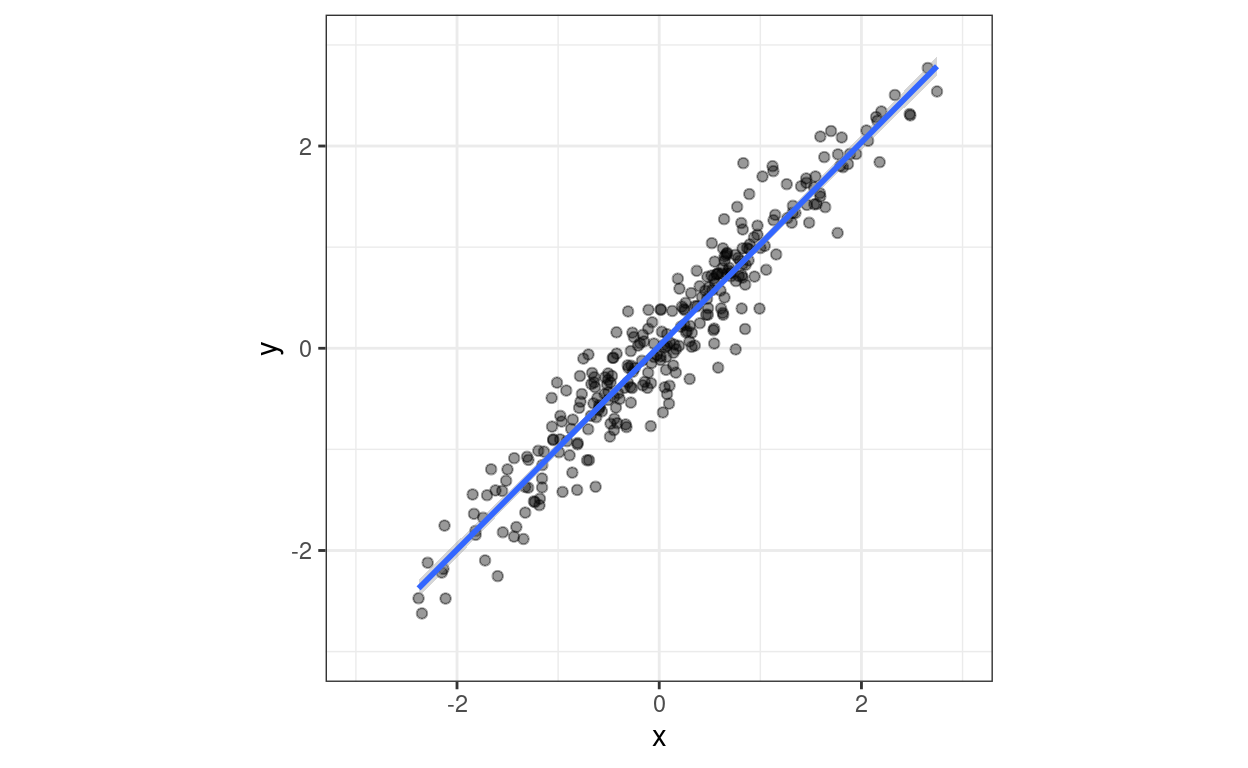
ggExtra::ggMarginal() adds marginal histograms
This is just so I remember where to find this and for the fun of it: ggExtra::ggMarginal() can add marginal histograms, density plots, boxplots, violin plots or “densigrams”, a combination of a histogram and a density plot, to the sides of a scattergram. I like this!
“Densigram”
Show code
ggExtra::ggMarginal(p, type = "densigram")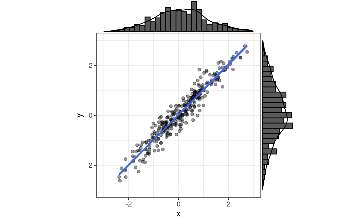
Boxplot
Show code
ggExtra::ggMarginal(p, type = "boxplot")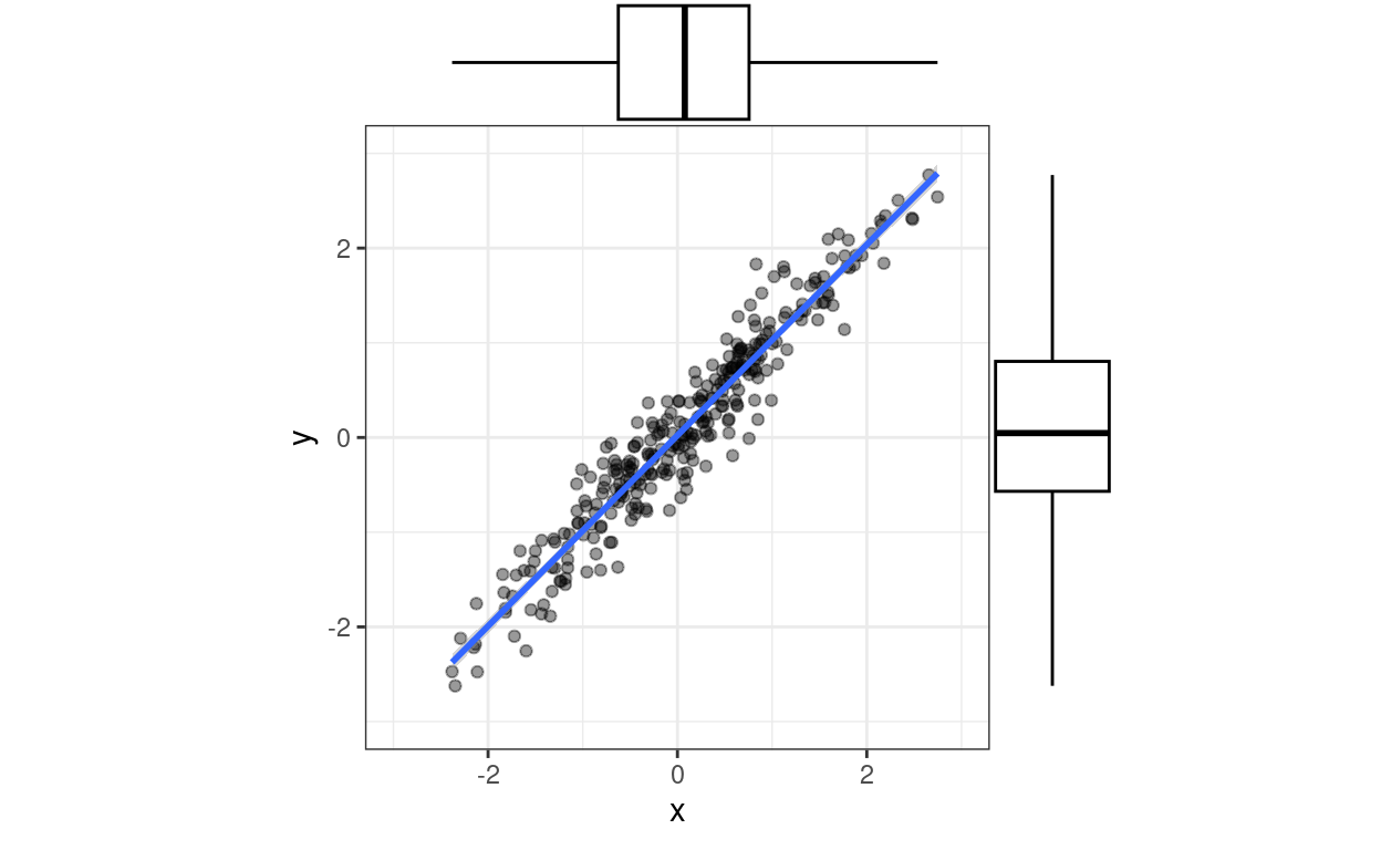
Violin plot
Show code
ggExtra::ggMarginal(p, type = "violin")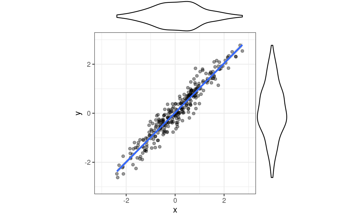
OK, back to the main issue.
Data ellipses
A 95% data ellipse is an ellipse expected to contain 95% of the joint population distributions of x and y based on the observed data and the assumption of bivariate Gaussian distributions. The area contained can be what you like really (within the logical restrictions of it being a positive proportion/percentage and lower than 100%!) Here are data ellipses for that dataset created with car::dataEllipse(). I’ve used its default confidence intervals of 50% and 95%.
Show code
car::dataEllipse(tibDat$x, tibDat$y) -> retDat # collect up data for the lines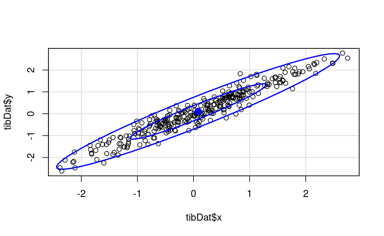
Here’s the same but using cluster::ellipsoidPoints(). A bit more work than car::dataEllipse().
Show code
tibDat %>%
  as.data.frame() %>%
  as.matrix() -> matDat

matCovLS <- cov(matDat)
vecMeans <- colMeans(matDat)
vecMeans <- colMeans(matDat)
### get 95% CI ellipse
d2.95 <- qchisq(0.95, df = 2)
cluster::ellipsoidPoints(matCovLS, d2.95, loc = vecMeans) -> matEllipseHull95
### and now 50%
d2.50 <- qchisq(0.5, df = 2)
cluster::ellipsoidPoints(matCovLS, d2.50, loc = vecMeans) -> matEllipseHull50

plot(matDat, asp = 1, xlim = c(-3, 3))
lines(matEllipseHull95, col="blue")
lines(matEllipseHull50, col="blue")
That really is the same as the other, well, minus the 50% interval but it looks different because of the changed scales.
“Robust” data ellipse
Just to extend things, the help for cluster::ellipsoidPoints() shows that you can use it with a “robust covariance” estimate rather than the least squares lm() or cov() one. Turns out that this uses cov.rob() from the MASS package which essentially does some censoring off of perceived or potential outliers to get an covariance matrix that would be less sensitive to outliers. Here we go.
Show code
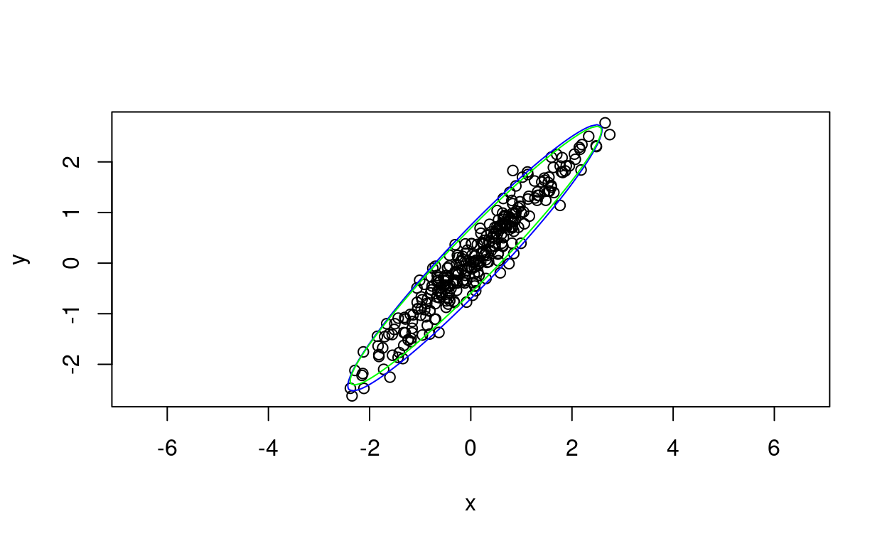
That has the 95% ellipse from the robust covariance matrix in green and the simple least squares ellipse in blue. As you would expect the difference is negligible as these are bivariate Gaussian data so there are few real outliers.
These plots are reminding me that all that learning curve to understand ggplot was worth it! However, the corollary is that I have forgotten most of what I ever knew about improving base R graphic output. Fortunately, I can take the output from car::dataEllipse() and feed it into ggplot where I use geom_path() to plot it.
Show code
ggplot(data = tibDat,
       aes(x = x, y = y)) +
  geom_point(alpha = .4) +
  geom_smooth(method = "lm") +
  xlim(c(-3, 3)) +
  ylim(c(-3, 3)) +
  coord_fixed(1) +
  geom_path(data = tib50,
            aes(x = x, y = y), colour = "red") +
  geom_path(data = tib95,
aes(x = x, y = y), colour = "orange") 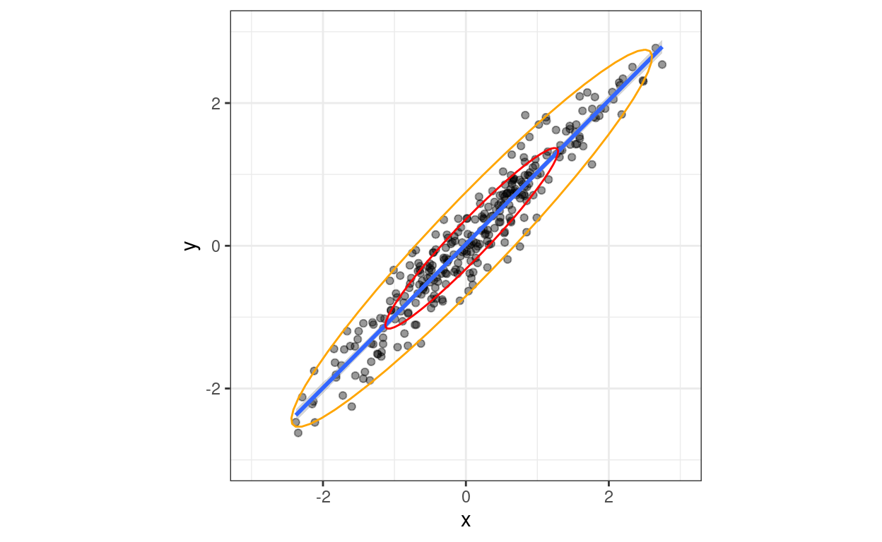
So that’s same again, now just feeding the points created by car::dataEllipse() for each CI into tibbles and those into ggplot and overlaying them on the scattergram.
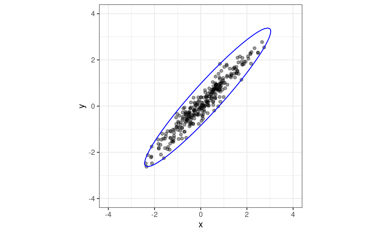
Ellipsoid hulls (or ellipsoidhulls)
This was an interesting extension of my learning. An ellipsoid hull is different from a data ellipse: it’s the ellipse that contains all the observed points (with some on the boundary of the ellipse). Here using cluster::ellipsoidhull() and base graphics.
Show code
tibDat %>%
  as.data.frame() %>%
  as.matrix() -> matDat

cluster::ellipsoidhull(matDat) -> ellipseHull

plot(matDat, asp = 1, xlim = c(-3, 3))
lines(predict(ellipseHull), col="blue")
And the same spitting the data into ggplot.
Show code
Confidence ellipses
So what are confidence ellipses? These are not about estimation the distribution of the population data but confidence ellipses for model parameters estimated from the data. Here the model is linear regression of y on x and assuming Gaussian distributions and here are the model parameters estimated using lm().
Show code
lm(y ~ x, data = tibDat)
Call:
lm(formula = y ~ x, data = tibDat)

Coefficients:
(Intercept)            x
    0.02265      1.00701
The two parameters are the intercept and the slope and the confidence ellipse shows the area containing the desired joint CIs. The default interval is 95% and here it is constructed using car::confidenceEllipse(). The point in the middle marks the point estimates of intercept and slope and the ellipse the CI around that.
Show code
car::confidenceEllipse(lm(y ~ x, data = tibDat))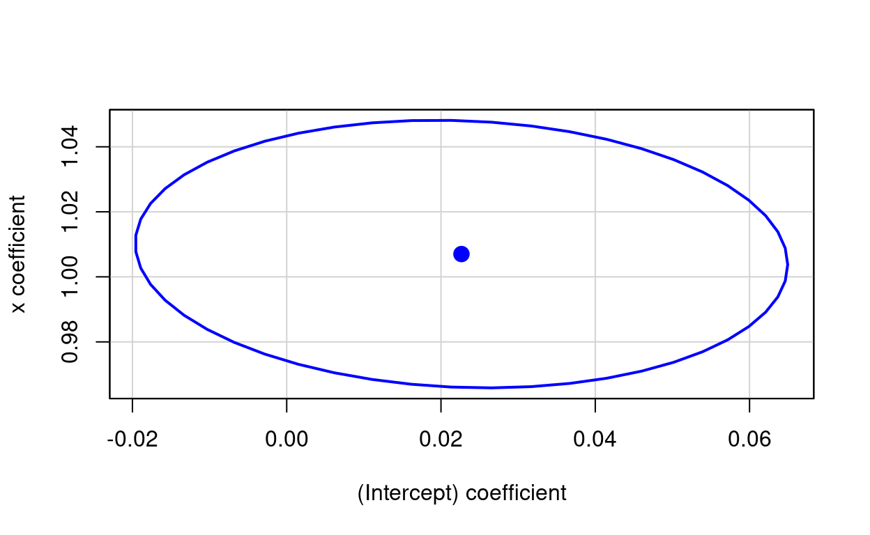
Here is the same ellipse created using ellipse::ellipse().
Show code
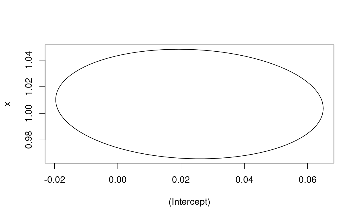
Just for completeness, it’s easy to get the ellipse path using ellipse::ellipse() and spit that into ggplot.
Show code
ellipse::ellipse(lm(y ~ x, data = tibDat)) -> matEllipseEllipse

### rather clumsy creation of tibble of parameters for ggplot
lm(y ~ x, data = tibDat)$coefficients -> vecLM
bind_cols(Intercept = vecLM[1], Slope = vecLM[2]) -> tibParms

### slightly nicer creation of tibble of the points on the ellipse
matEllipseEllipse %>%
  as_tibble() %>%
  rename(Intercept = `(Intercept)`,
         Slope = x) -> tmpTib

### plot those
ggplot(data = tmpTib,
       aes(x = Intercept, y = Slope)) +
  geom_path() +
  geom_point(data = tibParms,
             colour = "blue",
             size = 3)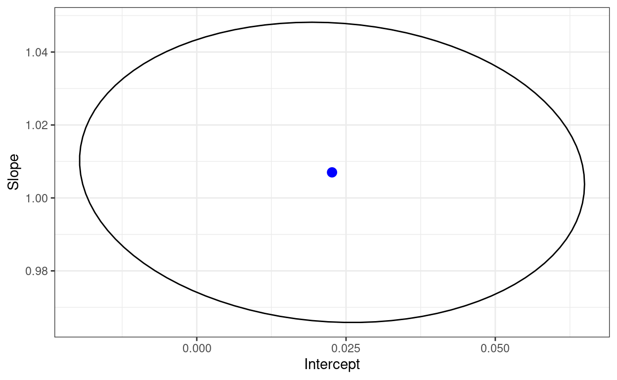
That shows a joint distribution suggesting that the two estimated parameters are pretty much uncorrelated. I think that doesn’t have to be the case. Let’s try the very non-Gaussian joint distribution we get if we square both x and y. Here’s the scattergram and 50% and 95% data ellipses for that.
Show code
tibDat %>%
  mutate(xSqrd = x^2,
         ySqrd = y^2) -> tibDat

car::dataEllipse(tibDat$xSqrd, tibDat$ySqrd) -> retDat2 # collect up data for the lines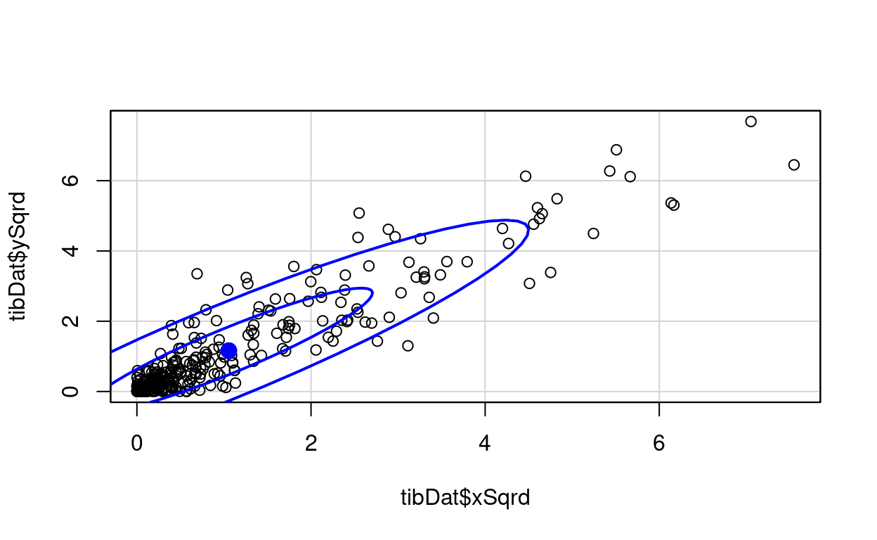
Show code
# str(retDat)
retDat2$`0.5` %>%
  as_tibble() -> tibSqrd50

retDat2$`0.95` %>%
  as_tibble() -> tibSqrd95

ggplot(data = tibDat,
       aes(x = xSqrd, y = ySqrd)) +
  geom_point(alpha = .4) +
  geom_smooth(method = "lm") +
  xlim(c(0, 9)) +
  ylim(c(0, 9)) +
  coord_fixed(1) +
  geom_path(data = tib50,
            aes(x = x, y = y), colour = "red") +
  geom_path(data = tib95,
            aes(x = x, y = y), colour = "orange")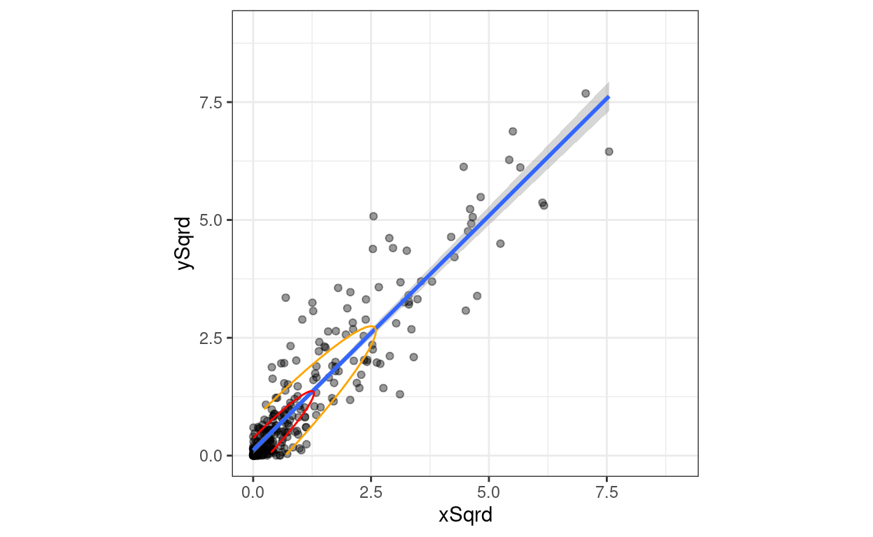
And here is the confidence ellipse from car::confidenceEllipse().
Show code
car::confidenceEllipse(lm(ySqrd ~ xSqrd, data = tibDat))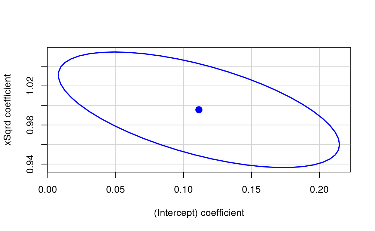
Same by ggplot.
Show code
ellipse::ellipse(lm(ySqrd ~ xSqrd, data = tibDat)) -> matEllipseEllipse2

### rather clumsy creation of tibble of parameters for ggplot
lm(ySqrd ~ xSqrd, data = tibDat)$coefficients -> vecLM2
bind_cols(Intercept = vecLM2[1], Slope = vecLM2[2]) -> tibParms2

### slightly nicer creation of tibble of the points on the ellipse
matEllipseEllipse2 %>%
  as_tibble() %>%
  rename(Intercept = `(Intercept)`,
         Slope = xSqrd) -> tmpTib2

### plot those
ggplot(data = tmpTib2,
       aes(x = Intercept, y = Slope)) +
  geom_path() +
  geom_point(data = tibParms2,
             colour = "blue",
             size = 3)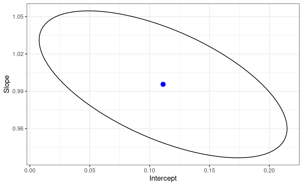
OK. I think that’s enough on this!
History
- 15.iv.24 Tweaks to add copying to clipboard, visit counter and automatic “last updated” line
- Updated 16.i.22 adding ggExtra::ggMarginal() plots
- Created 15.i.22
free website counter