Show code
### this is just the code that creates the "copy to clipboard" function in the code blocks
htmltools::tagList(
  xaringanExtra::use_clipboard(
    button_text = "<i class=\"fa fa-clone fa-2x\" style=\"color: #301e64\"></i>",
    success_text = "<i class=\"fa fa-check fa-2x\" style=\"color: #90BE6D\"></i>",
    error_text = "<i class=\"fa fa-times fa-2x\" style=\"color: #F94144\"></i>"
  ),
  rmarkdown::html_dependency_font_awesome()
)
Introduction and background
This is one of my “background for practitioners” blog posts not one of my geeky ones. It will lead into another about two specific functions I’ve added to the CECPfuns R package. However, this one will cross-link to entries in the free online OMbook glossary.
Quick introduction to quantiles (skim through if you know this)
Quantiles are important and very useful but seriously underused. They are important both because they are useful to describe distributions of data but also because they can help us map from an individual’s data to and from collective data: one of the crucial themes in the mental health and therapy evidence base.
I recommend that you read my post about ECDFs before going further if you don’t feel familiar with quantiles: the ECDF (Empirical Cumulative Density Function) is a great introduction to quantiles.
Quick terminological point: quantiles are pretty much the same as percentiles, centiles, deciles and the median and lower and upper quartiles are specific quantiles. I’ll come back to that.
Quantiles tell us about the location of observed values within a distribution of data. Let’s start with: the Gaussian distribution (often called, but a bit misleadingly, the “Normal”. Note the capital letter: it’s not normal in any normal sense of that word!) This facetted plot shows three simulated samples from the Gaussian distribution. The sample sizes are 100, 1,000 and 10,000.
Histogram of samples from Gaussian distribution
Show code
set.seed(12345) # set seed to get the same data regardless of platform and occasion
# rnorm(10000) %>%
#   as_tibble() %>%
#   mutate(n = 10000) %>%
#   rename(score = value) -> tibGauss10k
#
# rnorm(1000) %>%
#   as_tibble() %>%
#   mutate(n = 1000) %>%
#   rename(score = value) -> tibGauss1k
#
# rnorm(100) %>%
#   as_tibble() %>%
#   mutate(n = 100) %>%
#   rename(score = value) -> tibGauss100
#
# bind_rows(tibGauss100,
#           tibGauss1k,
#           tibGauss10k) -> tibGaussAll

### much more tidyverse way of doing that
c(100, 1000, 10000) %>% # set your sample sizes
  as_tibble() %>%
  rename(n = value) %>%
  ### now you are going to generate samples per value of n so rowwise()
  rowwise() %>%
  mutate(score = list(rnorm(n))) %>%
  ungroup() %>% # overrided grouping by rowwise() and unnest to get individual values
  unnest_longer(score) -> tibGauss

### get sample statistics
tibGauss %>%
  group_by(n) %>%
  summarise(min = min(score),
            median = median(score),
            mean = mean(score),
            sd = sd(score),
            lquart = quantile(score, .25),
            uquart = quantile(score, .75),
            max = max(score),
            ### and bootstrap mean (could have used parametric derivation as this is true Gaussian but I couldn't remember it!)
            CI = list(getBootCImean(score, verbose = FALSE))) %>%
  unnest_wider(CI) -> tibGaussStats

ggplot(data = tibGauss,
       aes(x = score)) +
  facet_wrap(facets = vars(n),
             nrow = 1) +
  geom_histogram(aes(y = after_stat(density))) +
  ylim(c(0, .6)) +
  ylab("Count") +
  ggtitle("Faceted histogram for three samples from Gaussian distribution",
          subtitle = "Sample sizes 100, 1,000 and 10,000")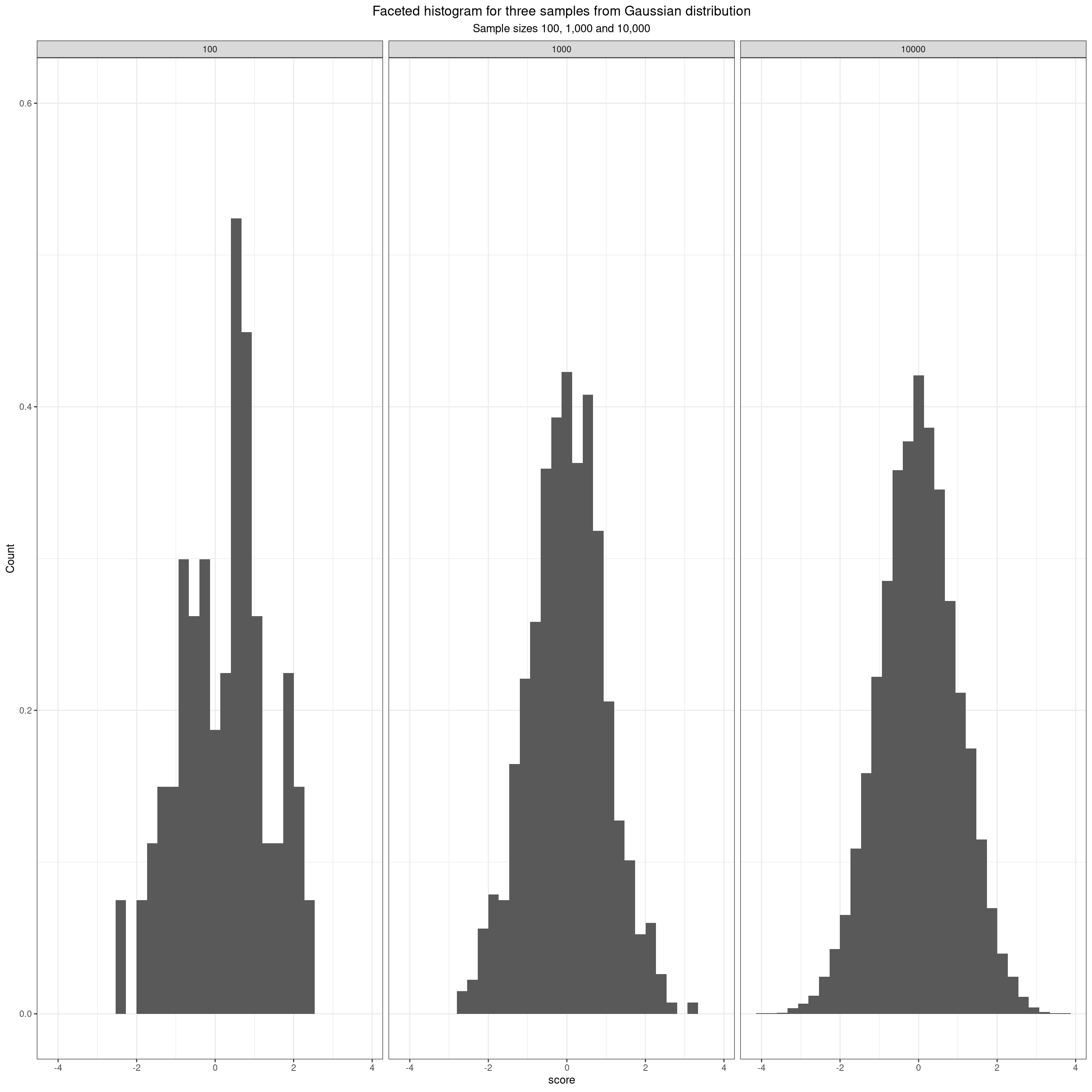
Boxplots of samples from Gaussian distribution
Here, taking us to quantiles, are the same data as boxplots overlaid with jittered points for the actual data. This brings us to the simplest quantiles.
Show code
tibGauss %>%
  filter(n == 1000) -> tmpTibGauss

tibGaussStats %>%
  filter(n == 1000) -> tmpTib

ggplot(data = tibGauss,
       aes(x = 1, y = score)) +
  facet_wrap(facets = vars(n),
             nrow = 1) +
  geom_boxplot(notch = TRUE,
               varwidth = TRUE,
               fill = "grey80") +
  geom_jitter(width = .35, height = 0,
              alpha = .05,
             colour = "grey40") +
  ylab("Scores") +
  ggtitle("Faceted boxplot with jittered observations for three samples from Gaussian distribution",
          subtitle = "Sample sizes 100, 1,000 and 10,000, sample mean in red")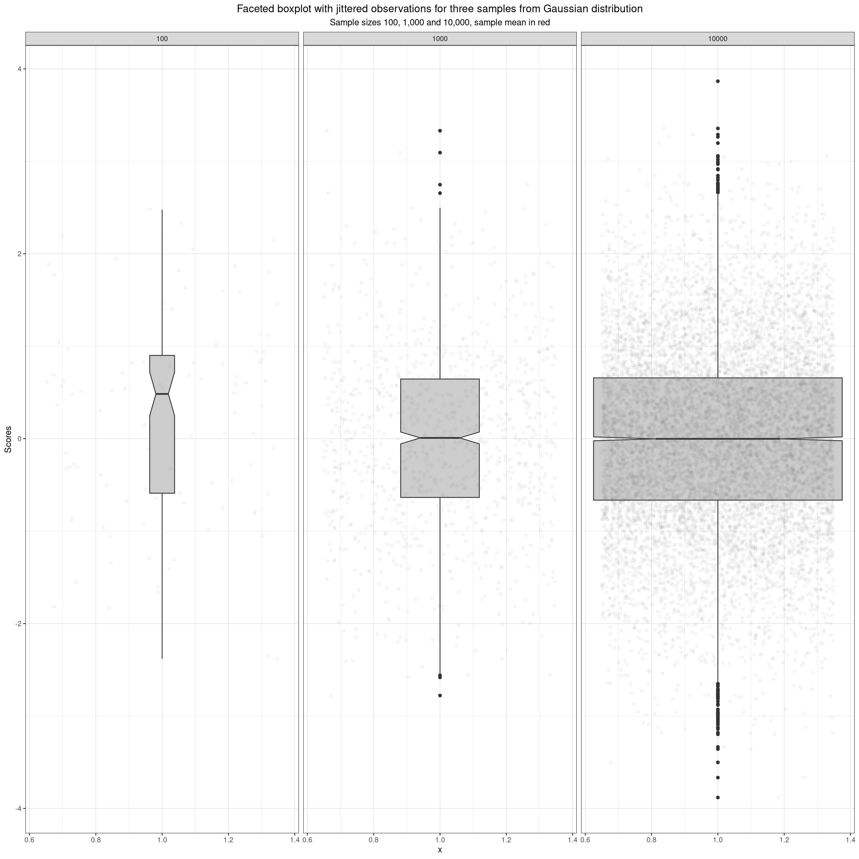
The boxplot uses three quantiles describe the box: the median locates the belt and waist across the box, and the quartiles fix the lower and upper limits of the box. What are these quantiles? The median is the score (not necessarily present in the data) that would bisect the data into two equal sized halves so it’s the value such that half the observed values lie below it and half lie above it. The lower quartile is the value such that a quarter of the observed values lie below it and three quarters above it, the upper quartile is the value such that three quarters of the sample lie below it and one quarter above it.
So we can now start to look at these names.
| Quantile | Quartile | Percentile (a.k.a. centile) |
|---|---|---|
| .25 | lower | 25% |
| .50 | median | 50% |
| .75 | upper | 75% |
Now we get to the ECDF which, like the histogram, violin plot and boxplot is another way to describe a distribution of observed data. This takes us into the richness of quantiles.
ECDF of samples from Gaussian distribution
Show code
tibGaussStats %>%
  select(n, min, lquart, median, uquart, max) %>%
  pivot_longer(cols = min:max) %>%
  rename(Quantile = name) %>%
  mutate(Quantile = ordered(Quantile,
                            levels = c("min", "lquart", "median", "uquart", "max"),
                            labels = c("Min", "Lower quartile", "Median", "Upper quartile", "Max"))) -> tibGaussStatsLong

ggplot(data = tibGauss,
       aes(x = score)) +
  facet_wrap(facets = vars(n),
             ncol = 1) +
  stat_ecdf() +
  geom_vline(data = tibGaussStatsLong,
             aes(xintercept = value, colour = Quantile)) +
  geom_text(data = tibGaussStatsLong,
            aes(label = round(value, 2),
                x = value,
                y = .28),
            nudge_x = -.04,
            hjust = 1) +
  ylab("Proportion of the sample scoring below the value") +
  ggtitle("Faceted ECDF plot for three samples from Gaussian distribution",
          subtitle = "Sample sizes 100, 1,000 and 10,000, quantiles shown as coloured lines with their values.")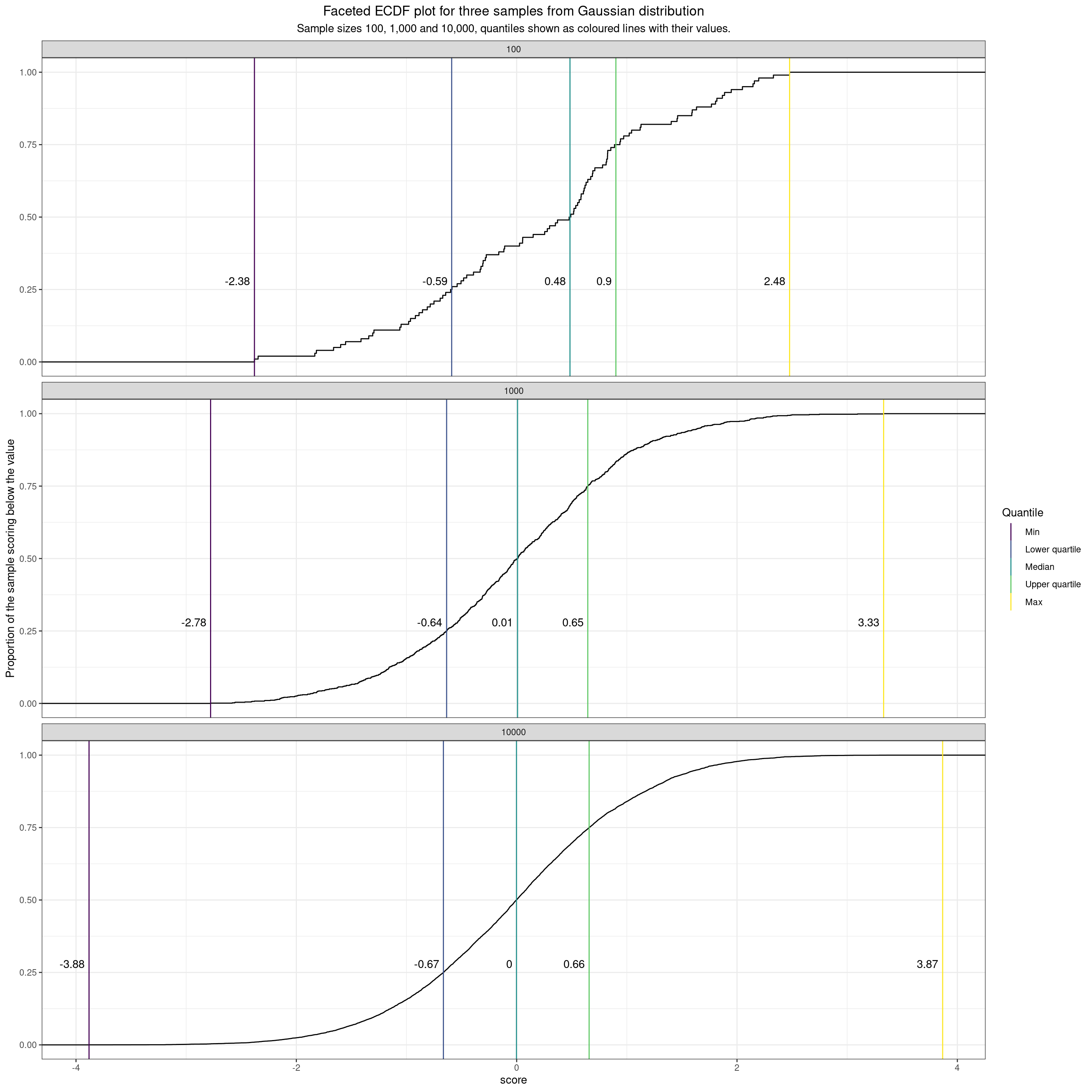
I’ve changed to faceting by rows here instead of columns to give a better spread on the plot. The ECDF plots on the y axis the proportion of the sample scoring below the value on the x axis.
A few pretty obvious comments on the impact of sample size when in the classical model of random sampling from an infinitely large population. These impacts are visible in all those distribution plots above.
- If the possible scores are genuinely continuous then the distributions are less “lumpy” the larger the sample. (Actually not possible to see this in the boxplot but in histogram it’s very clearly in the shift from a set of vertical bars to a smooth distribution. It’s less obvious in the violin plot as that is a smoothed distribution plot and in the ECDF it shows in the steps in the line that are almost invisible when the sample size is 10,000.)
- As the sample sizes get bigger, if, as with the Gaussian distribution, the possible scores actually range from -Infinity to +Infinity then the limits, i.e. the minimum (quantile zero roughly) and the maximum (quantile 1.0) move out as the sample size goes up as the larger sample gets more chance of including the rare but not impossible extreme values.
- As the sample sizes get bigger the observed quantiles get closer to their population values. That can be seen in this next table. This shows
- name = name of the quantile
- proportion = the proportion of that quantile
- the value in the infinitely large population (know from the maths)
- n100 = the observed value for that quantile in this sample of n = 100
- n1000 = the observed value for that quantile in this sample of n = 1,000
- n10000 = the observed value for that quantile in this sample of n = 10,000
Show code
tibGaussStats %>%
  select(n, lquart, median, uquart) %>%
  pivot_longer(cols = -n) %>%
  mutate(value = round(value, 4),
         proportion = case_when(
                              name == "lquart" ~ .25,
                              name == "median" ~ .5,
                              name == "uquart" ~ .75),
         popVal = qnorm(proportion),
         popVal = round(popVal, 4)) %>%
  pivot_wider(names_from = n, names_prefix = "n", values_from = value) %>%
  flextable() %>%
  autofit()
name | proportion | popVal | n100 | n1000 | n10000 |
|---|---|---|---|---|---|
lquart | 0.25 | -0.6745 | -0.5901 | -0.6359 | -0.6652 |
median | 0.50 | 0.0000 | 0.4837 | 0.0080 | -0.0019 |
uquart | 0.75 | 0.6745 | 0.9004 | 0.6453 | 0.6576 |
It can be seen there that the observed values for the quantiles get closer to the population values the larger the sample.
Confidence intervals for quantiles
So, as we can see in the above any observed quantile value, like any sample statistic, will have a different value for the next sample assuming any real sampling process, whether truly random (only in simulations in my view) or not. That means that, like any sample statistic, any observed quantile value can be given a confidence interval around it and this CI will be narrower the larger the sample size.
This brings us to the fact that there are various ways of computing this confidence interval. The R package quantileCI gives three methods including a bootstrap method. They’re all non-parametric, i.e. not making assumptions about the shape of the distribution of the scores for which you computed the quantiles. From a bit of reading led by Michael Höhle’s R package quantileCI (https://github.com/hoehleatsu/quantileCI) it seems to me that the Nyblom method is probably best (and the differences between the methods unlikely to cause us any headaches with typical MH/therapy score data). As ever the confidence interval gives a range around the observed value for a sample statistic that should include the population value in a given proportion of samples. The proportion usually used is 95%, i.e. a 95% confidence interval. Here they are for our sample data.
Show code
tibGauss %>%
  group_by(n) %>%
  summarise(lquartCI = list(quantileCI::quantile_confint_nyblom(score, .25)),
            medianCI = list(quantileCI::quantile_confint_nyblom(score, .5)),
            uquartCI = list(quantileCI::quantile_confint_nyblom(score, .75))) %>%
  unnest_wider(lquartCI, names_sep = ":") %>%
  unnest_wider(medianCI, names_sep = ":") %>%
  unnest_wider(uquartCI, names_sep = ":") %>%
  rename(lquartLCL = `lquartCI:1`,
         lquartUCL = `lquartCI:2`,
         medianLCL = `medianCI:1`,
         medianUCL = `medianCI:2`,
         uquartLCL = `uquartCI:1`,
         uquartUCL = `uquartCI:2`) %>%
  mutate(lquartCI = paste0(round(lquartLCL, 2), " to ", round(lquartUCL, 2)),
         medianCI = paste0(round(medianLCL, 2), " to ", round(medianUCL, 2)),
         uquartCI = paste0(round(uquartLCL, 2), " to ", round(uquartUCL, 2))) %>%
  left_join(tibGaussStats, by = "n") %>%
  mutate(lquart = round(lquart, 2),
         median = round(median, 2),
         uquart = round(uquart, 2)) %>%
  select(-c(min, mean, sd, max:UCLmean)) -> tmpTib

tmpTib %>%
  select(n, lquart, lquartCI, median, medianCI, uquart, uquartCI) %>%
  flextable() %>%
  autofit()
n | lquart | lquartCI | median | medianCI | uquart | uquartCI |
|---|---|---|---|---|---|---|
100 | -0.59 | -0.88 to -0.31 | 0.48 | -0.01 to 0.61 | 0.90 | 0.71 to 1.44 |
1,000 | -0.64 | -0.72 to -0.55 | 0.01 | -0.06 to 0.08 | 0.65 | 0.58 to 0.74 |
10,000 | -0.67 | -0.69 to -0.64 | 0.00 | -0.03 to 0.02 | 0.66 | 0.63 to 0.69 |
That shows the observed values for the quartiles and the median for the three samples. It’s very clear that the widths of the intervals get tighter as the sample size increases.
Plotting the ECDF with quantiles and their CIs
I’ve added the function plotQuantileCIsfromDat to the CECPfuns R package package. This creates these plots below which I like. They show any requested quantiles, here the quartiles and median, with the ECDF from the data, and plots the confidence intervals for those quantiles. Here are the plots for those three quantiles and for the the three simulated samples that we’ve been using so far.
Show code
tibGauss %>%
  filter(n == 100) %>%
  select(score) %>%
  pull() -> tmpVec

plotQuantileCIsfromDat(tmpVec, vecQuantiles = c(.25, .5, .75), addAnnotation = FALSE, printPlot =  FALSE, returnPlot = TRUE) -> tmpPlot100

tibGauss %>%
  filter(n == 1000) %>%
  select(score) %>%
  pull() -> tmpVec

plotQuantileCIsfromDat(tmpVec, vecQuantiles = c(.25, .5, .75), addAnnotation = FALSE, printPlot =  FALSE, returnPlot = TRUE) -> tmpPlot1000

tibGauss %>%
  filter(n == 10000) %>%
  select(score) %>%
  pull() -> tmpVec

plotQuantileCIsfromDat(tmpVec, vecQuantiles = c(.25, .5, .75), addAnnotation = FALSE, printPlot =  FALSE, returnPlot = TRUE) -> tmpPlot10000

library(patchwork)
### standardise the x axis ranges
tmpPlot100 +
  xlim(c(-4, 4)) -> tmpPlot100
tmpPlot1000 +
  xlim(c(-4, 4)) -> tmpPlot1000
tmpPlot10000 +
  xlim(c(-4, 4)) -> tmpPlot10000

tmpPlot100 /
  tmpPlot1000 /
  tmpPlot10000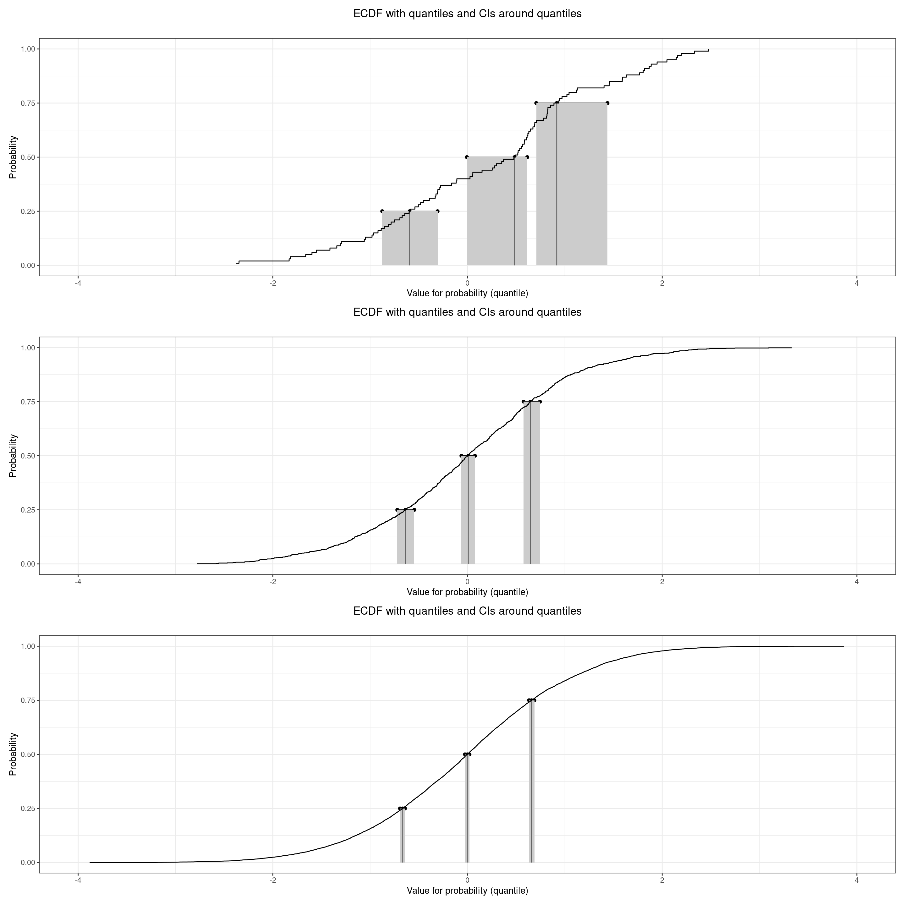
Unsurprisingly those plots show that the three quantiles are well separated with non-overlapping confidence intervals even for n = 100 and they show how the confidence intervals tighten as the n increases.
I hope this was a fairly clear introduction to putting confidence intervals around observed quantiles.
free website counter code