Created 22.i.22, extended 25-26.i.22
Show code
### this is just the code that creates the "copy to clipboard" function in the code blocks
htmltools::tagList(
  xaringanExtra::use_clipboard(
    button_text = "<i class=\"fa fa-clone fa-2x\" style=\"color: #301e64\"></i>",
    success_text = "<i class=\"fa fa-check fa-2x\" style=\"color: #90BE6D\"></i>",
    error_text = "<i class=\"fa fa-times fa-2x\" style=\"color: #F94144\"></i>"
  ),
  rmarkdown::html_dependency_font_awesome()
)
This post is a bit different from most of my posts here which are mostly about R itself. This is perhaps the first of another theme I wanted to have here about using to R to illustrate general statistical or psychometric issues. This one was created to illustrate points I was making in a blog post Why kappa? or How simple agreement rates are deceptive on my psyctc.org/psyctc/ blog.
This starts with some trivial R to illustrate how the prevalence of the quality rated affects a raw agreement rate if agreement is truly random. Then it got into somewhat more challenging R (for me at least) as I explored better than chance agreement.
The issue about raw agreement and prevalence of what is rated
The code just computes raw agreement and kappa for chance agreement and prevalences from 1 in 1,000 to 999 in 1,000. It shows that the agreement rate rises to very near 1, i.e. 100% as the prevalence gets very high (or low) whereas Cohen’s kappa remains zero at all prevalences because it is a “chance corrected” agreement coefficient.
Show code
valN <- 1000
1:(valN - 1) %>%
  as_tibble() %>%
  rename(prevalence = value) %>%
  mutate(prevalence = prevalence / valN) %>%
  rowwise() %>%
  mutate(valPosPos = round(valN * prevalence^2), # just the product of the prevalences and get as a number, not a rate
         valNegNeg = round(valN * (1 - prevalence)^2), # product of the rate of the negatives
         valPosNeg = (valN - valPosPos - valNegNeg) / 2, # must be half the difference
         valNegPos = valPosNeg, # must be the same
         checkSum = valPosPos + valNegNeg + valPosNeg + valNegPos, # just checking!
         rawAgreement = (valPosPos + valNegNeg) / valN,
         kappa = list(DescTools::CohenKappa(matrix(c(valPosPos,
                                                     valPosNeg,
                                                     valNegPos,
                                                     valNegNeg),
                                                   ncol = 2),
                                            conf.level = .95))) %>%
  ungroup() %>%
  unnest_wider(kappa) -> tibDat

ggplot(data = tibDat,
       aes(x = prevalence, y = rawAgreement)) +
  geom_line(colour = "red") +
  geom_line(aes(y = kappa), colour = "green") +
  ylab("Agreement") +
  ggtitle("Chance agreement against prevalence of quality rated",
          subtitle = "Raw agreement in red, Cohen's kappa in green")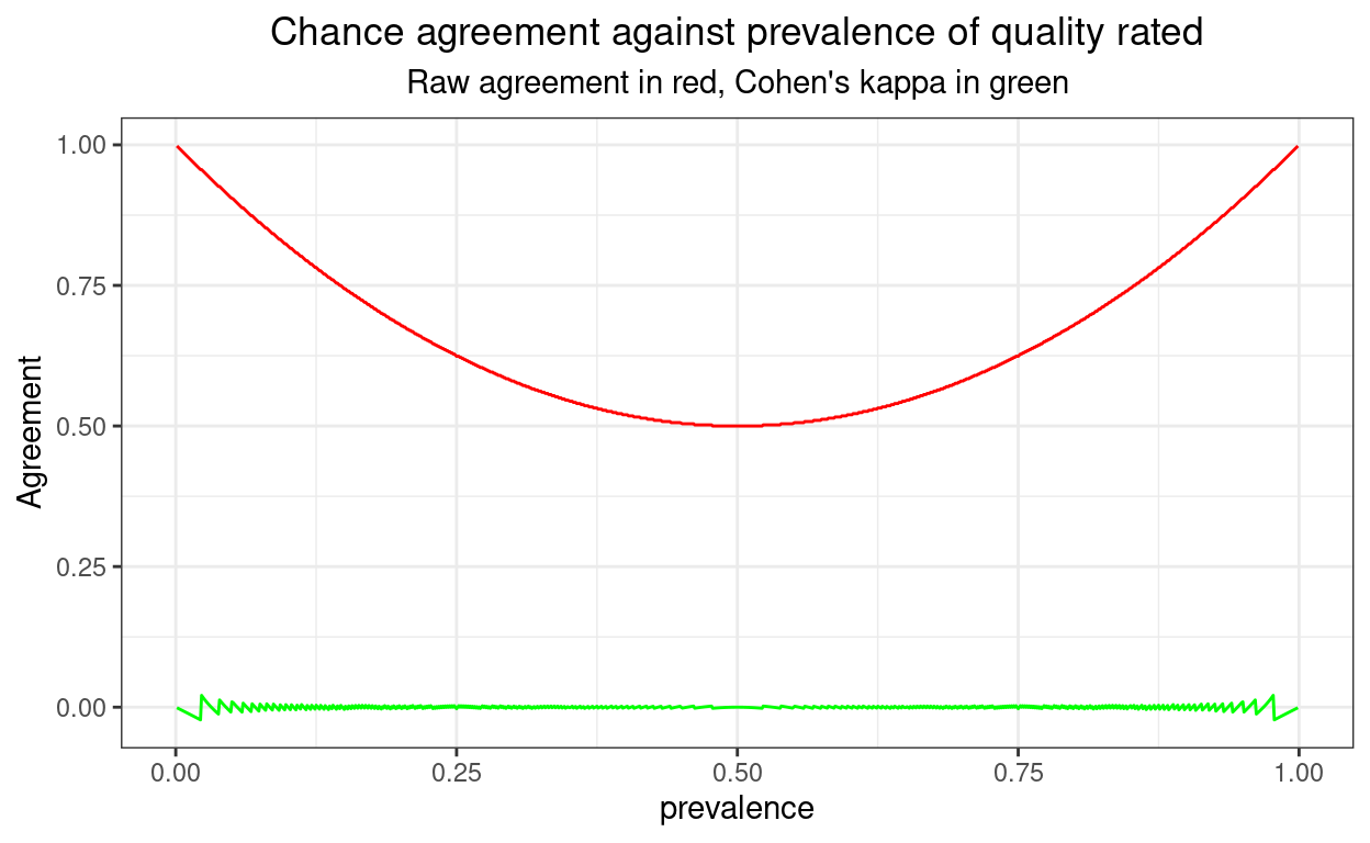
Show code
ggsave("ggsave1.png")
valN2 <- 10^6
I think that shows pretty clearly why raw agreement should never be used as a coefficient of agreement and why, despite some real arguments for other coefficients and known weaknesses (see good wikipedia entry), kappa is pretty good and likely to remain the most used such coefficient.
One perhaps suprising thing is that the kappa values aren’t all exactly zero: see the zigzag of the values towards the ends of the x axis. The biggest value is 0.0209603 and the smallest is -0.0224949. These non-zero values arise because counts are integers and I have plotted for values of prevalence between 0.001 and 0.999 and a sample size of 1000. Towards the ends of that prevalence range rounding to get integer counts means that kappa cannot be exactly zero.
If I don’t round the cell sizes to integers, in effect staying with probabilities, or simulating an infinitely large sample, the issue goes away as shown here.
Show code
### valN2 pulled through from block above
1:(valN - 1) %>%
  as_tibble() %>%
  rename(prevalence = value) %>%
  mutate(prevalence = prevalence / valN) %>%
  rowwise() %>%
  mutate(valPosPos = valN2 * prevalence^2, # just the product of the prevalences and get as a number, not a rate
         valNegNeg = valN2 * (1 - prevalence)^2, # product of the rate of the negatives
         valPosNeg = (valN2 - valPosPos - valNegNeg) / 2, # must be half the difference
         valNegPos = valPosNeg, # must be the same
         checkSum = valPosPos + valNegNeg + valPosNeg + valNegPos, # just checking!
         rawAgreement = (valPosPos + valNegNeg) / valN2,
         kappa = list(DescTools::CohenKappa(matrix(c(valPosPos,
                                                     valPosNeg,
                                                     valNegPos,
                                                     valNegNeg),
                                                   ncol = 2),
                                            conf.level = .95))) %>%
  ungroup() %>%
  unnest_wider(kappa) -> tibDat2

ggplot(data = tibDat2,
       aes(x = prevalence, y = rawAgreement)) +
  geom_line(colour = "red") +
  geom_line(aes(y = kappa), colour = "green") +
  ylab("Agreement") +
  ggtitle("Chance agreement against prevalence of quality rated",
          subtitle = "Raw agreement in red, Cohen's kappa in green")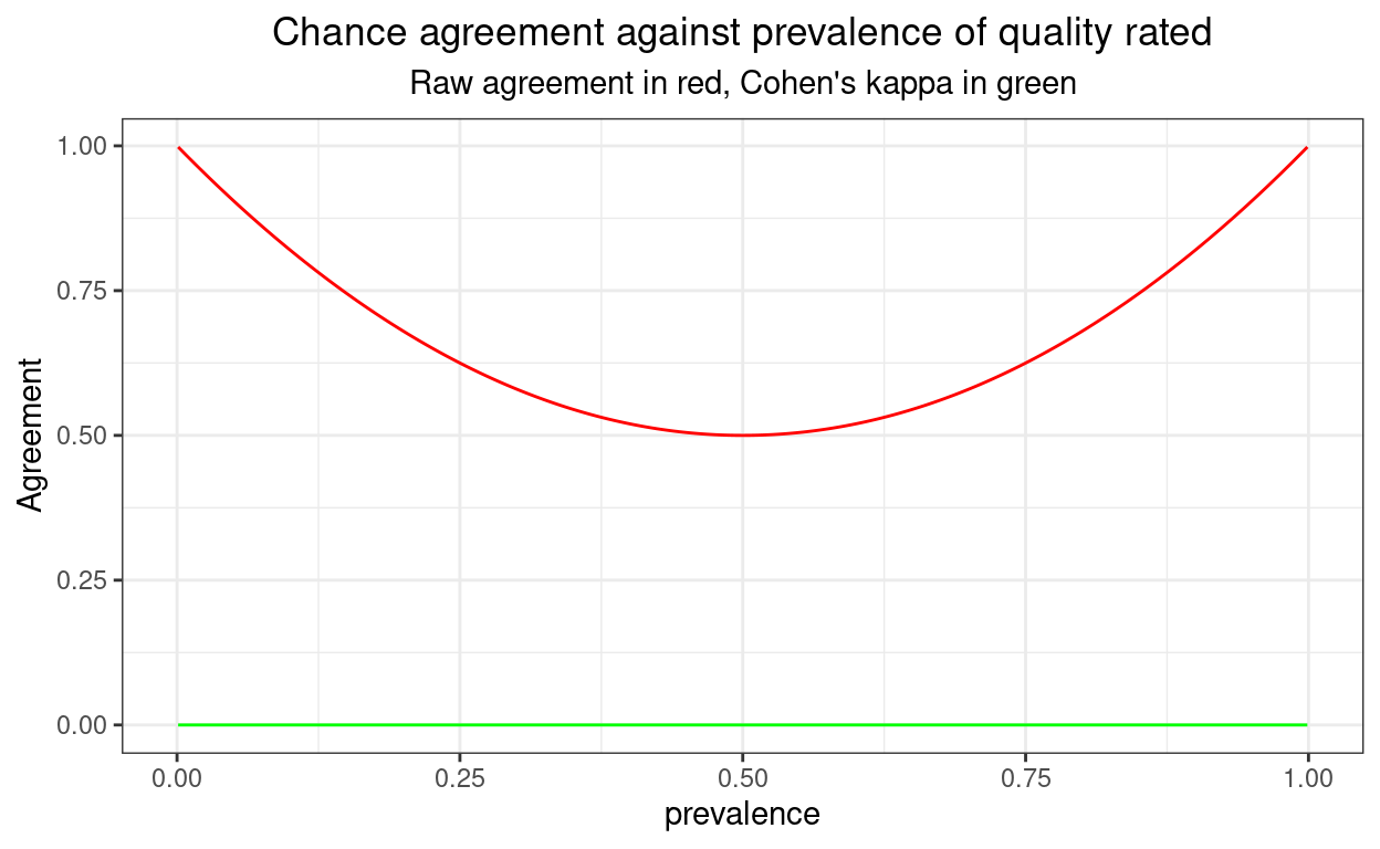
Adding confidence interval around the observed kappa
Confidence intervals (CIs) are of course informative about imprecision of estimation, here of kappa and I love them for that. However, sometimes they can also alert you that something is being stretched to implausibilty in what you are trying to learn from your data. Here they are for a sample size of 1000.
Show code
ggplot(data = tibDat,
       aes(x = prevalence, y = rawAgreement)) +
  geom_line(colour = "red") +
  geom_linerange(aes(ymax = upr.ci, ymin = lwr.ci), colour = "palegreen") +
  geom_line(aes(y = kappa), colour = "green") +
  ylab("Agreement") +
  ggtitle("Chance agreement against prevalence of quality rated",
          subtitle = "Raw agreement in red, Cohen's kappa in green")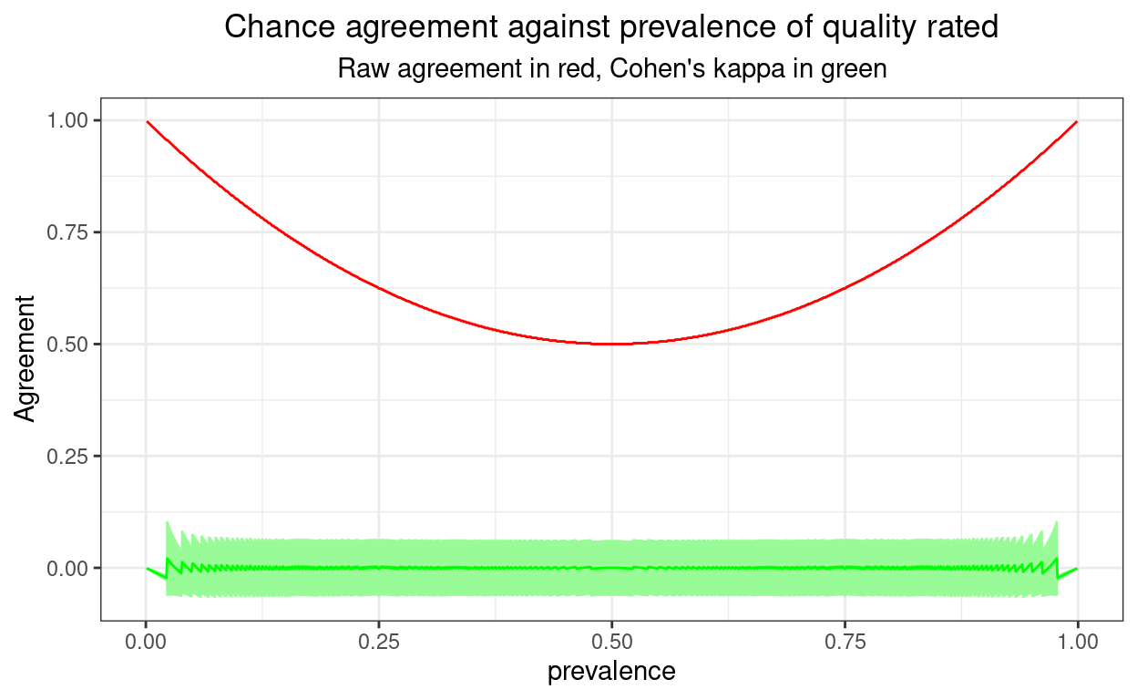
Between say a prevalence of .1 and .9 things are sensible there: the confidence interval around the observed kappa widens as the smallest cell sizes in the 2x2 crosstabulation get smaller. That’s because, as with most statistics, it’s the smallest cell size, rather than the total sample size (which is of course constant here), that determine precision of estimation.
However, going out towards a prevalence of .01 or of .99 something is very clearly wrong there as we have confidence limits on kappa that go above 1 and below -1: values that are impossible for a “real” kappa. Here the CI is telling us that it can’t give us real world answers for the CI: one or more cell sizes are simply too small. These impossible kappa confidence limits actually occur when one of the cell sizes is zero.
Here are the confidence intervals if push the sample size up to 10^{6}.
Show code
ggplot(data = tibDat2,
       aes(x = prevalence, y = rawAgreement)) +
  geom_line(colour = "red") +
  geom_linerange(aes(ymax = upr.ci, ymin = lwr.ci), colour = "palegreen") +
  geom_line(aes(y = kappa), colour = "green") +
  ylab("Agreement") +
  ggtitle("Chance agreement against prevalence of quality rated",
          subtitle = "Raw agreement in red, Cohen's kappa in green")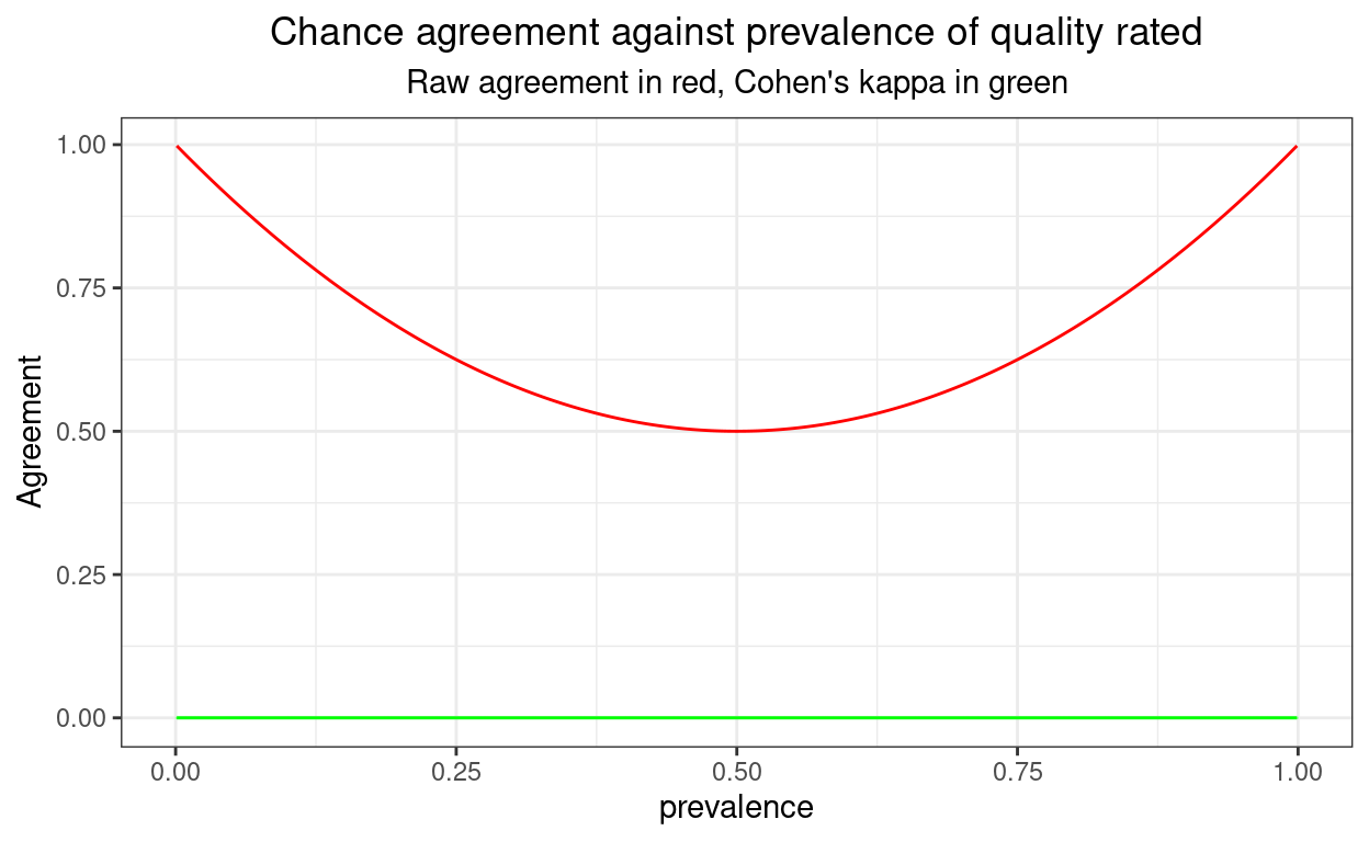
Very tight and no confidence limits impossible.
What happens with better than chance agreement?
Here I am looking at agreement rates from .6 up to .90 with the agreement imposed on the sample and the cell sizes worked out to the nearest integer, all given the sample size of 1,000.
Show code
valN <- 1000
vecAgreeRate <- c(seq(60, 90, 10)) / 100
1:valN %>%
  as_tibble() %>%
  rename(prevalence = value) %>%
  mutate(posA = prevalence, # so change number of positives for rater A
         negA = valN - posA, # and negative
         prevalence = prevalence / valN, # get prevalence as a rate not a count
         ### now put in the agreement rates from vecAgreeRate
         agreeRate = list(vecAgreeRate)) %>%
  unnest_longer(agreeRate) %>%
  ### now create the rater B counts using those agreement rates
  mutate(posAposB = round(posA * agreeRate),
         posAnegB = round(posA * (1 - agreeRate)),
         negAposB = round(negA * (1 - agreeRate)),
         negAnegB = round(negA * agreeRate),
         checkSum = posAposB + posAnegB + negAposB + negAnegB,
         rawAgreement = (posAposB + negAnegB) / valN) %>%
  rowwise() %>%
  mutate(kappa = list(DescTools::CohenKappa(matrix(c(posAposB,
                                                     negAposB,
                                                     posAnegB,
                                                     negAnegB),
                                                   ncol = 2),
                                            conf.level = .95))) %>%
  ungroup() %>%
  unnest_wider(kappa) -> tibDat3

tibDat3 %>%
  mutate(txtAgree = str_c("Sample agreement: ", agreeRate)) -> tibDat3

ggplot(data = tibDat3,
       aes(x = prevalence, y = rawAgreement)) +
  facet_wrap(facets = vars(txtAgree),
             ncol = 2) +
  geom_line(colour = "red") +
  geom_linerange(aes(ymin = lwr.ci, ymax = upr.ci),
                 colour = "palegreen") +
  geom_line(aes(y = kappa),
            colour = "green") +
  geom_hline(yintercept = 0)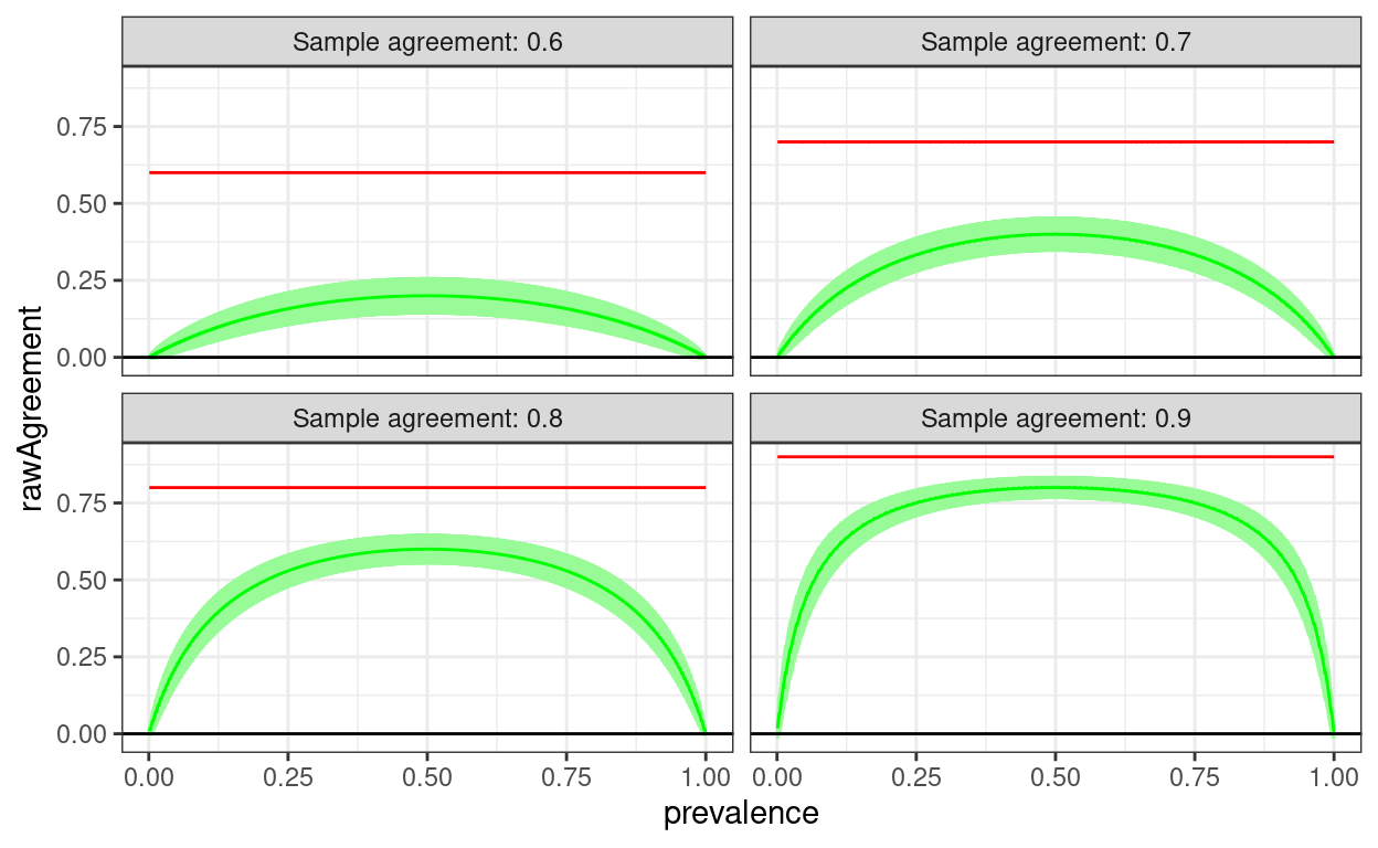
Of course agreement wouldn’t be exactly the same for every sample, this is a slightly more realistic simulation treating the actually sample agreement as a binomial variable with population value
Show code
valN <- 1000
vecAgreeRate <- c(seq(50, 90, 10)) / 100
1:valN %>%
  as_tibble() %>%
  rename(prevalence = value) %>%
  mutate(agreeRate = list(vecAgreeRate)) %>%
  unnest_longer(agreeRate) %>%
  rowwise() %>%
  mutate(prevalence = prevalence / valN,
         posA = rbinom(1, valN, prevalence),
         negA = valN - posA,
         posAposB = rbinom(1, posA, agreeRate),
         posAnegB = posA - posAposB,
         negAnegB = rbinom(1, negA, agreeRate),
         negAposB = negA - negAnegB,
         checkSum = posAposB + posAnegB + negAnegB + negAposB,
         rawAgreement = (posAposB + negAnegB) / valN,
         kappa = list(DescTools::CohenKappa(matrix(c(posAposB,
                                                     negAposB,
                                                     posAnegB,
                                                     negAnegB),
                                                   ncol = 2),
                                            conf.level = .95))) %>%
  ungroup() %>%
  unnest_wider(kappa) -> tibDat4

tibDat4 %>%
  mutate(txtAgree = str_c("Population agreement: ", agreeRate)) -> tibDat4


ggplot(data = tibDat4,
       aes(x = prevalence, y = rawAgreement)) +
  facet_wrap(facets = vars(txtAgree),
             ncol = 2) +
  geom_line(colour = "red") +
  geom_linerange(aes(ymin = lwr.ci, ymax = upr.ci),
                 colour = "palegreen") +
  geom_line(aes(y = kappa),
            colour = "green") +
  geom_hline(yintercept = 0)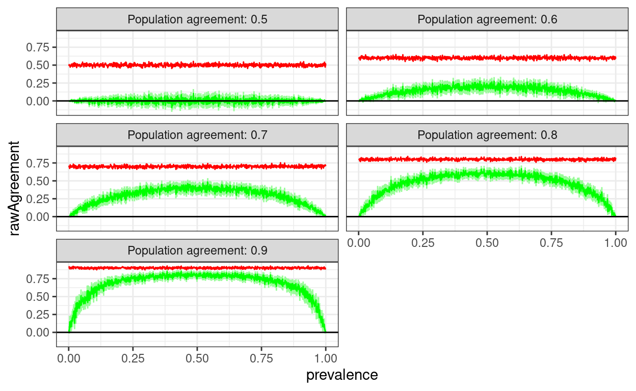
But those are fixed agreement rates
You may have been wondering why the raw agreement rates don’t show the U shaped relationship with prevalence as they do, must do, when I modelled random agreement earlier. That’s because this was modelling a agreement rate in the sample so, even when I treated the agreement as a binomial distribution rather than a fixed rate, the relationship with prevalence was removed. It’s really a completely artificial representation of raw agreement.
So let’s have a population model. This was a bit more challenging to program. What I have done is first to simulate samples with bivariate Gaussian distributions from populations with fixed correlations between those Gaussian variables. I have set the population correlations at 0, .3, .6 and .9 (Pearson correlations). Then I created the binary data for different prevalences simply by dichotomising the Gaussian variables at the appropriate cuttings points on the Gaussian cumulative density curve setting prevalences of .01 to .99. The sample size is set at 10,000.
That gets us this.
Show code
makeCorrMat <- function(corr) {
  matrix(c(1, corr, corr, 1), ncol = 2)
}
# makeCorrMat(0)
# makeCorrMat(.5)

# valN <- 1000
valN <- 10000
# vecCorr <- seq(0, .9, .1)
vecCorr <- c(0, .3, .6, .9)
vecMu <- c(0, 0) # set means for mvrnorm
vecPrevalence <- 1:99 / 100

### test
# cor(MASS::mvrnorm(100, mu = vecMu, Sigma = makeCorrMat(.9)))

set.seed(12345)
vecPrevalence %>% # start from the prevalences to build tibble
  as_tibble() %>%
  rename(prevalence = value) %>%
  ### get the cutting points on the cumulative Gaussian distribution per prevalence
  mutate(cutPoint = qnorm(prevalence),
         ### input the vector of correlations
         corr = list(vecCorr)) %>%
  ### unnest to create a row for each correlation
  unnest_longer(corr) %>%
  rowwise() %>%
  ### now create a bivariate Gaussian distribution sample from those population correlations
  mutate(rawDat = list(MASS::mvrnorm(valN, mu = vecMu, Sigma = makeCorrMat(corr))),
         obsCorr = cor(rawDat)[1, 2]) %>%
  ungroup() %>%
  unnest(rawDat, names_repair = "universal") %>%
  rowwise() %>%
  ### I'm sure I ought to be able to do this more elegantly but this gets from the embedded dataframe to two column vectors
  mutate(rawA = rawDat[[1]],
         rawB = rawDat[[2]]) %>%
  select(-rawDat) %>%
  ### end of that mess!
  mutate(binaryA = if_else(rawA > cutPoint, 1, 0),
         binaryB = if_else(rawB > cutPoint, 1, 0),
         sumBinaries = binaryA + binaryB,
         posAposB = if_else(sumBinaries == 2, 1, 0),
         negAnegB = if_else(sumBinaries == 0, 1, 0),
         negAposB = if_else(binaryA == 0 & binaryB == 1, 1, 0),
         posAnegB = if_else(binaryA == 1 & binaryB == 0, 1, 0),
         checkSum = sum(posAposB:posAnegB)) %>%
  ungroup() -> tibBigDat

tibBigDat %>%
  group_by(prevalence, corr) %>%
  summarise(obsCorr = first(obsCorr),
            across(posAposB:posAnegB, sum)) %>%
  ungroup() %>%
  rowwise() %>%
  mutate(rawAgreement = (posAposB + negAnegB) / valN,
         kappa = list(DescTools::CohenKappa(matrix(c(posAposB, posAnegB,
                                                   negAposB, negAnegB),
                                                   ncol = 2),
                                            conf.level = .95))) %>%
  ungroup() %>%
  unnest_wider(kappa) -> tmpTib

### improve labelling of corr for facets
tmpTib %>%
  mutate(txtCorr = str_c("Population correlation: ", corr)) -> tmpTib

ggplot(data = tmpTib,
       aes(x = prevalence, y = rawAgreement)) +
  facet_wrap(facets = vars(txtCorr)) +
  geom_point(colour = "red",
             size = 1) +
  geom_linerange(aes(ymin = lwr.ci, ymax = upr.ci),
                 colour = "palegreen") +
  geom_point(aes(y = kappa),
             colour = "green",
             size = 1) +
  geom_hline(yintercept = c(0, 1)) +
  ylab("Agreement") +
  ggtitle("Chance agreement against prevalence of quality rated",
          subtitle = "Raw agreement in red, Cohen's kappa in green")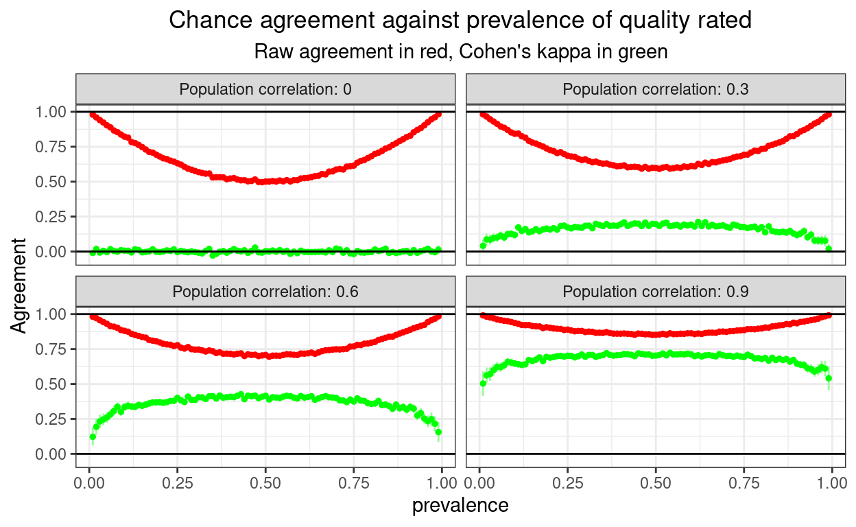
That shows correctly that the U shaped and misleading relationship between raw agreement and prevalence is not only true for random agreement, but is there as some real agreement is there, though the more the real agreement, the shallower the U curve as you’d expect.
This last is just me checking how tightly sample correlations approximate the population correlations (for n = 10,000).
Show code
### how well did the correlations work?
set.seed(12345) # fix the jittering
ggplot(data = tmpTib,
       aes(x= corr, y = obsCorr)) +
  geom_jitter(height = 0, width = .05, alpha = .4) +
  geom_smooth(method = "lm") +
  xlab("Population correlation") +
  ylab("Observed correlation") +
  ggtitle("Scatterplot: observed correlations against the population correlations",
          subtitle = "Horizontal jittering and transparency used to handle overprinting.  Blue line is linear fit")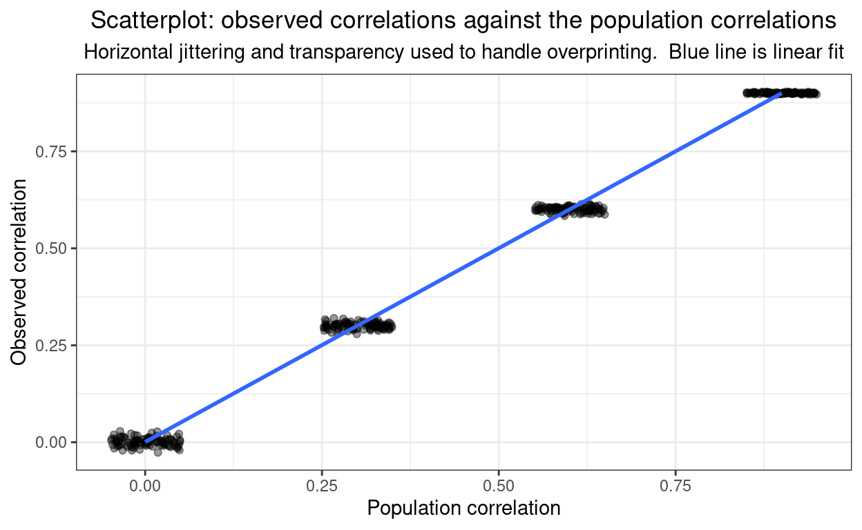
Here’s the raw linear of the observed correlations on the population ones.
Show code
lm(obsCorr ~ corr, data = tmpTib)
Call:
lm(formula = obsCorr ~ corr, data = tmpTib)

Coefficients:
(Intercept)         corr
  0.0007104    0.9991870
Fine!
OK. I hope all this is useful in explaining these issues. Do contact me if you have questions or suggestions for improvements.
website hits counter