Header graphic for the fun of it!
Show code
### just creating a graphic for the post
### get a tibble with the density of the standard Gaussian distribution from -3 to 3
tibble(x = seq(-3, 3, .05),
       y = dnorm(x)) -> tibDnorm

### now generate a tibble of n = 350 sampling from the standard Gaussian distribution
set.seed(12345) # make it replicable
tibble(x = rnorm(350)) -> tibRnorm

# png(file = "KStest.png", type = "cairo", width = 6000, height = 4800, res = 300)
ggplot(data = tibRnorm,
       aes(x = x)) +
  geom_histogram(aes(x = x,
                     after_stat(density)),
                 bins = 20,
                 alpha = .6) +
  geom_line(data = tibDnorm,
            inherit.aes = FALSE,
            aes(x = x, y = y))  +
  geom_vline(xintercept = 0) +
  ### paramters work for knitted output
  annotate("text",
           label = "Distribution plots",
           x = -2.8,
           y = .07,
           colour = "red",
           size = 19,
           angle = 29,
           hjust = 0)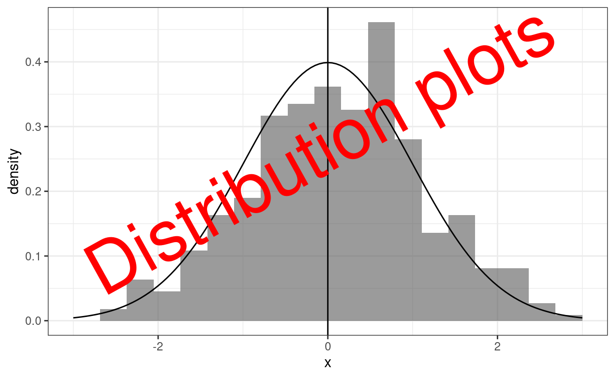
Show code
# dev.off()

### different sizing to get nice png
# png(file = "distPlots.png", type = "cairo", width = 6000, height = 4800, res = 300)
# ggplot(data = tibRnorm,
#        aes(x = x)) +
#   geom_histogram(aes(x = x,
#                      after_stat(density)),
#                  bins = 20,
#                  alpha = .6) +
#   geom_line(data = tibDnorm,
#             inherit.aes = FALSE,
#             aes(x = x, y = y))  +
#   geom_vline(xintercept = 0) +
#   ### changed parameters for the png
#   annotate("text",
#            label = "Dist. plots",
#            x = -2.5,
#            y = .1,
#            colour = "red",
#            size = 95,
#            angle = 32,
#            hjust = 0)
# dev.off()
This follows on from my recent post about the Kolmogorov-Smirnov test and then Tests of fit to Gaussian distribution. In many ways it would have been more logical to have started with this post as generally visual inspection should precede testing but I got down this rabbit hole from testing many distributions in simulations where visual inspection wasn’t realistically possible. All three of these posts link with and expand upon entries in my online glossary for the OMbook.
OK, that header graphic with the theoretical density curve for the Gaussian distribution superimposed on a histogram is probably the classic graphical exploration of distribution and I grew up on this in SPSS and I still like it as it’s easy to understand. However, it’s a very poor real test of fit betwen distributions as our visual system simply doesn’t do similarity of arbitrary curves well. (There may be cultural aspects to this as my “we” is a global north one growing up in very rectilinear spaces, sorry if that’s underselling the abilities of people growing up in spaces with few straight lines to compare curves. Some old but I suspect still valid transcultural studies of perception of perspective and distance coming back to me from student days!)
The next sensible graphic to use when looking at distributions is the ecdf (empirical cumulative distribution function).
Show code
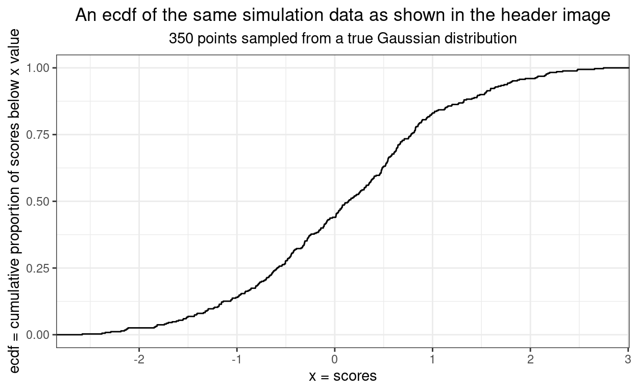
This next ecdf shows the empirical plot for our data in black and the expected curve from a truly Gaussian distribution of the same size. It’s getting easier to assess fit.
Show code
tibble(x = seq(-3, 3, .05),
       y = pnorm(x)) -> tibPnorm


ggplot(data = tibRnorm,
       aes(x = x)) +
  geom_point(data = tibPnorm,
             aes(x = x, y = y),
            colour = "green") +
  stat_ecdf() +
  ylab("ecdf = cumulative proportion of scores below x value") +
  xlab("x = scores") +
  ggtitle("An ecdf of the same simulation data as shown in the header image",
          subtitle = "350 points sampled from a true Gaussian distribution")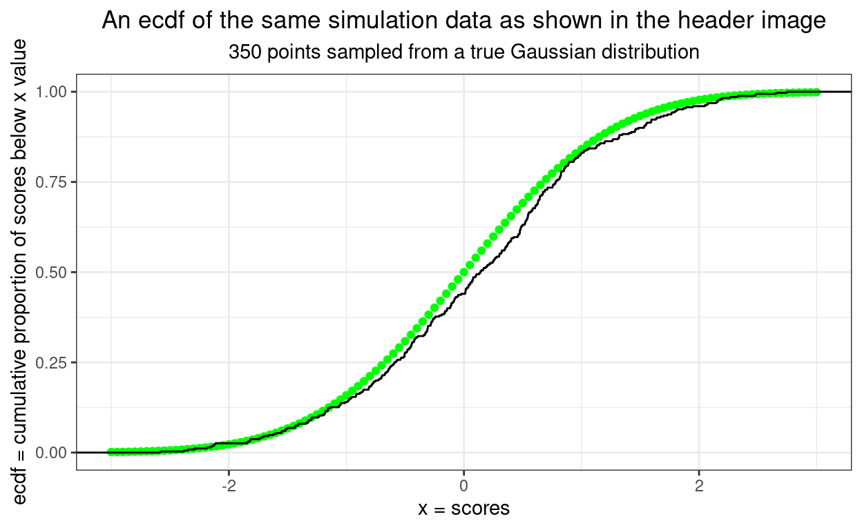
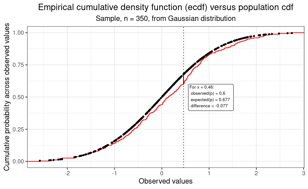
In fact, this next plot shows how the maximum discrepancy between those two curves is the misfit criterion in the Kolmogorov-Smirnov test. Back to this post for all about that.
However, there’s an even better way to compare distributions: the qq plot.
Show code
ggplot(data = tibRnorm,
       aes(sample = x)) +
  stat_qq() +
  stat_qq_line() +
  ylab(paste0("Observed values for same quantile",
              "\nas for perfect Gaussian score (x-axis)")) +
  xlab(paste0("Values for the true Gaussian distribution",
              "\nfor same quantile as for observed point on y-axis")) +
  ggtitle("A qq plot of the same simulation data as shown in the header image",
          subtitle = paste0("350 points sampled from a true Gaussian distribution",
                            "\nReference line based on true Gaussian distribution"))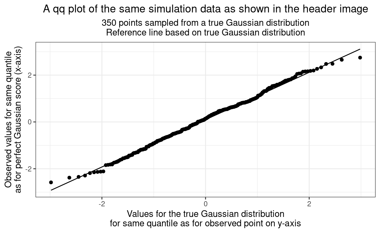
That very close fit to the straight line is what our visual systems are very good at assessing but what is going on here. I’ve replaced the usual rather uninformative “y” and “x” labels on the axes but what is really creating this? It’s a “parametric plot”: it sweeps through some parameter of the data to create the x and y values. The parameter here is the quantile, or the index number of the sorted data. We have 350 observations so what’s happening is that they are being put in order of increasing value so the first value is at the 1/350th quantile. Here are the first ten observed values after sorting to perhaps make this clearer.
Show code
y | index | quantile | quantileN |
|---|---|---|---|
-2.582 | 1 | 1/350 | 0.003 |
-2.380 | 2 | 2/350 | 0.006 |
-2.347 | 3 | 3/350 | 0.009 |
-2.290 | 4 | 4/350 | 0.011 |
-2.186 | 5 | 5/350 | 0.014 |
-2.150 | 6 | 6/350 | 0.017 |
-2.135 | 7 | 7/350 | 0.020 |
-2.124 | 8 | 8/350 | 0.023 |
-2.113 | 9 | 9/350 | 0.026 |
-1.845 | 10 | 10/350 | 0.029 |
So that shows the smallest ten observed values (y) and I’ve given them an index (just their order!), and their quantile as a fraction and as a decimal value. Now we can get from that to the x values from the Gaussian distribution.
Small print alert
However, a slight tweak is needed to find the correct matching quantile to look up in the standard Gaussian distribution. We have seen the lowest score has quantile 1/350 ≃ 0.00286, that’s the upper limit of quantile. Had we had a slightly different sample size, say 351, we would have had the upper limit as 1/351, one fewer and it would have been 1/349. If we are matching to the perfect Gaussian the thing to match to is the point halfway between zero and that quantile, i.e. so .5(0 + 1/350), the point for the next observed quantile is halfway between 1/350 and 2/350, generally we use the centre point of range of quantiles up to our observed one, so not the index number divided by the sample size, i.e. i/350 here, i/n generically, but (i - .5)/350 here, (i - .5)/n generically. These values are shown as centreQuantileN in the table below.
Sorry about that, I only got understand that when I found what I was doing wasn’t matching the points in the qqplot and had to search around to get to understand why. It’s really very small print so just skip on if it’s puzzling.
End of small print alert!
So we look up the value of the standard Gaussian (the x values in the histogram at top of this post) to get the x value to plot for each observed value in our dataset. Like this for the first ten observations.
Show code
tibRnorm %>%
  summarise(mean = mean(x), sd = sd(x)) -> tibRnormStats

tmpTib %>%
  mutate(centreQuantileN = (index - .5) / 350,
         # x = qnorm(centreQuantileN, mean = tibRnormStats$mean, sd = tibRnormStats$sd)) %>%
         x = qnorm(centreQuantileN)) %>%
  filter(index <= 10) -> tmpTib

tmpTib %>%
  filter(index <= 10) %>%
  flextable() %>%
  align(j = 3, align = "right") %>%
  colformat_double(digits = 3)
y | index | quantile | quantileN | centreQuantileN | x |
|---|---|---|---|---|---|
-2.582 | 1 | 1/350 | 0.003 | 0.001 | -2.983 |
-2.380 | 2 | 2/350 | 0.006 | 0.004 | -2.629 |
-2.347 | 3 | 3/350 | 0.009 | 0.007 | -2.450 |
-2.290 | 4 | 4/350 | 0.011 | 0.010 | -2.326 |
-2.186 | 5 | 5/350 | 0.014 | 0.013 | -2.230 |
-2.150 | 6 | 6/350 | 0.017 | 0.016 | -2.152 |
-2.135 | 7 | 7/350 | 0.020 | 0.019 | -2.084 |
-2.124 | 8 | 8/350 | 0.023 | 0.021 | -2.025 |
-2.113 | 9 | 9/350 | 0.026 | 0.024 | -1.972 |
-1.845 | 10 | 10/350 | 0.029 | 0.027 | -1.925 |
We can see from the table that those ten x and y values are not radically dissimilar. These ten points are shown in red in the qqplot below.
Show code
ggplot(data = tibRnorm,
       aes(sample = x)) +
  geom_point(data = tmpTib,
             aes(x = x, y = y),
             # shape = 4,
             colour = "red",
             size = 4) +
  stat_qq() +
  stat_qq_line() +
  ylab(paste0("Observed values for same quantile",
              "\nas for perfect Gaussian score (x-axis)")) +
  xlab(paste0("Values for the true Gaussian distribution",
              "\nfor same quantile as for observed point on y-axis")) +
  ggtitle("A qq plot of the same simulation data as shown in the header image",
          subtitle = paste0("350 points sampled from a true Gaussian distribution",
                            "\nReference line based on true Gaussian distribution"))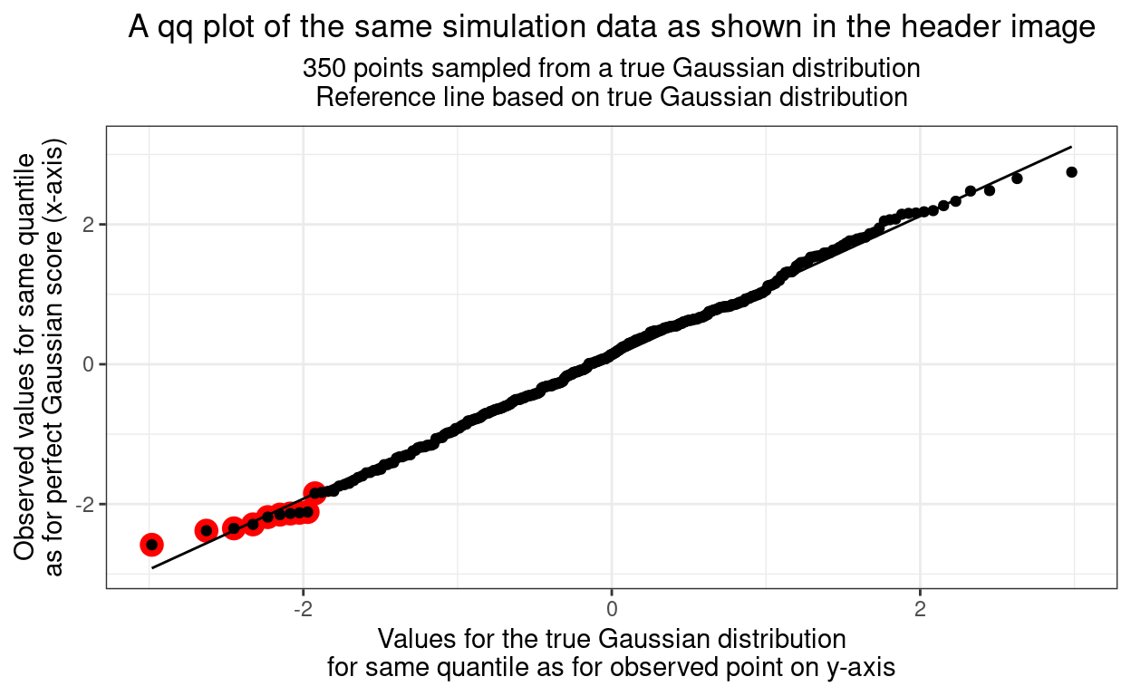
So we can see that the qqplot is created by sweeping up through the all the ordered observed values creating the corresponding, expected, quantiles from the true Gaussian distribution. Now we have a visual comparison that people who grew up in a rectilinear world around them find very easy: eyeball fit to a straight line.
Of course, even though we’re good at eyeballing misfit to a straight line, we’re not good at assessing the statistical probability of seeing deviations as big as we are by chance alone. ggqqplot{ggpubr}, i.e. ggqqplot() from the ggpubr R package helps with this by adding a 95% confidence envelope to the plot.
Show code
ggpubr::ggqqplot(tibRnorm, x = "x") +
  ggtitle("A qq plot of the same simulation data as shown in the header image",
          subtitle = paste0("350 points sampled from a true Gaussian distribution",
                            "\nReference line based on true Gaussian distribution")) +
  theme(plot.title = element_text(hjust = .5),
plot.subtitle = element_text(hjust = .5)) 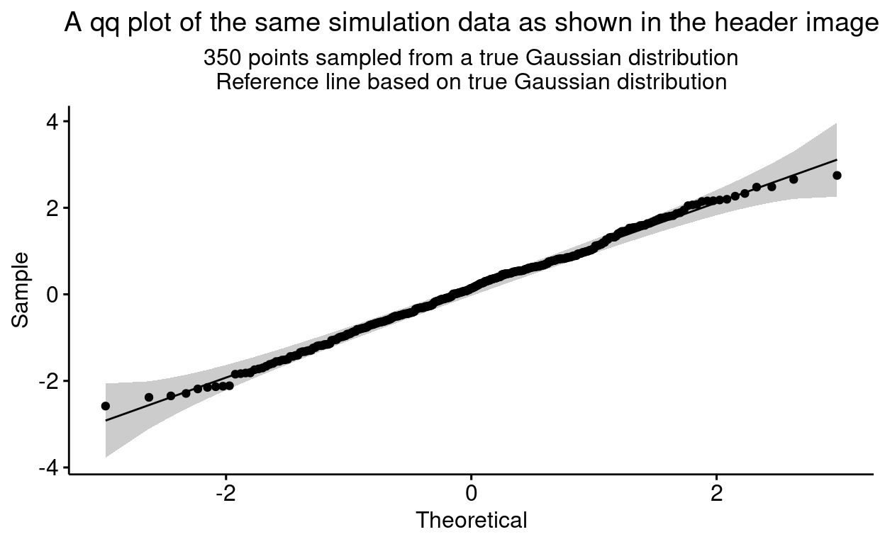
We can see that all the points seem to lie inside the 95% confidence interval envelope here so we would be behaving sensibly, statistically, to accept that they may well have come from random sampling from a true Gaussian distribution. This was very easy, there is still a bit of a questionmark when a few points lie outside the envelope, then we turn to (good) tests of misfit to the Gaussian distribution as in the last post here: Tests of fit to Gaussian distribution!
Using the qq plot to diagnose types of misfit
I won’t go into this is detail here but the ways in which the points in a qq plot fall away from the line of perfect fit tells you about the nature of the misfit, but that’s getting way beyond what we need here!
Orientation of the qq plot
I’m used to the orientation I’ve used here, with the observed quantiles on the y axis and the expected ones on the x axis. Apparently this can vary and the switched orientation can be used and a tantalising comment I saw somewhere suggested that countries differ in the orientation they use … but it didn’t say which countries use which orientation!
Related resources
Local shiny app(s)
- App creating samples from Gaussian distribution showing histogram, ecdf and qqplot