Show code
### this is just the code that creates the "copy to clipboard" function in the code blocks
htmltools::tagList(
  xaringanExtra::use_clipboard(
    button_text = "<i class=\"fa fa-clone fa-2x\" style=\"color: #301e64\"></i>",
    success_text = "<i class=\"fa fa-check fa-2x\" style=\"color: #90BE6D\"></i>",
    error_text = "<i class=\"fa fa-times fa-2x\" style=\"color: #F94144\"></i>"
  ),
  rmarkdown::html_dependency_font_awesome()
)
Introduction
In an earlier post here (Explore distributions with plots) I superimposed a Gaussian distribution curve on a histogram and the method used there, of creating a tibble with a Gaussian distribution using dnorm() and then superimposing a plot of that distribution on the histogram does work but is a bit tedious if you want to facet your plot. This method does adapt to facetting fine using stat_function() and reminds me about using after_stat() rather than the denigrated double dot “..density..” syntax (many internet pages about using ggplot to superimpose distribution lines on plots still show the ..density.. syntax).
It started with this code which I used to create an OMbook glossary entry: “The” seven number summary.
Show code
### set sample size
n <- 5000
### set seed for reproducible results
set.seed(12345)
### create tibble of data
tibble(x = rnorm(n, mean = 10)) %>%
  ### mutate to cube those values
  mutate(xcubed = x^3,
         ### and transform to mean 10 and SD 1
         xcubed = 10 + (xcubed - mean(xcubed)) / sd(xcubed)) -> tmpTib

### pivot longer to get in form that's nice for facetting
tmpTib %>%
  pivot_longer(cols = everything(), names_to = "variable") -> tmpTibLong


### this is a key bit for use of stat_function():
### get  the statistics for each variable
tmpTibLong %>%
  group_by(variable) %>%
  summarise(mean = mean(value),
            median = median(value),
            sd = sd(value)) %>%
  ungroup() -> tmpTibStats


### now the plot!
ggplot(data = tmpTibLong,
       aes(x = value)) +
  ### facet by variable of interest
  facet_grid(rows = vars(variable)) +
  ### now use after_stat() to get density not count
  ### that's sensible given the aim to superimpose the
  ### Gaussian distribution curve fitting each variable
  geom_histogram(aes(y = after_stat(density)),
                 bins = 50,
                 fill = "grey") +
  ### now use stat_function() to generate the curves
  ### using the means and sds per variable
  ### and fitting with the facetting
  stat_function(data = tmpTibStats,
                inherit.aes = FALSE,
                fun = dnorm,
                ### one thing that surprised me was that I had to use
                ### the explicit "tmpTibStats$" here
                args = list(mean = tmpTibStats$mean,
                            sd = tmpTibStats$sd),
                ### this tells stat_function() the number of points to
                ### create
                            n = 1500,
                colour = "red") +
  ### very ordinary stuff from here on!
  geom_vline(data = tmpTibStats,
             aes(xintercept = mean),
             colour = "green") +
  geom_vline(data = tmpTibStats,
             aes(xintercept = median),
             colour = "blue") +
  ggtitle("Histograms of Gaussian and standardised cubed Gaussian distributions",
          subtitle = "Blue reference lines mark means, green lines mark medians")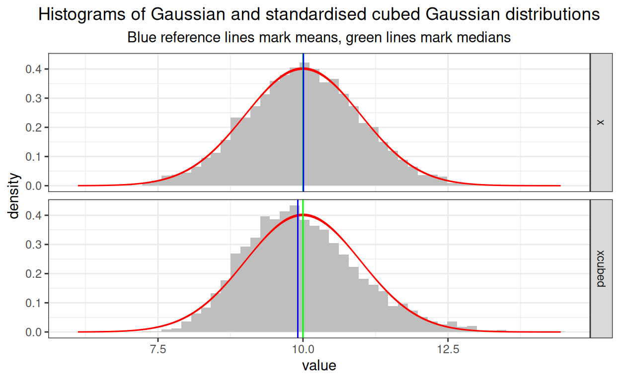
There are a couple of slightly odd things to me in there:
I had to use the explicit “tmpTibStats\(" syntax to avoid getting an error message about supplying a non-numeric argument to a mathematical function in `stat_function()`. I had thought I could just name the variable directly, i.e. "mean" rather than "tmpTibStats\)mean” or that I could use
vars(mean)but neither worked.The superimposed curve seems to have non-constant thickness, using the “n = 1500” has some impact on this. Low values unsurprisingly give bumpy lines and very high values don’t remove the thickening where the values from dnorm() are changing more slowly. On balance I don’t dislike the non-constant thickness but I guess if it offends you you have to go back to generating Gaussian density distributions before running
ggplot()and pulling the data in as I was doing in my Explore distributions with plots post here. Clearly you can do that and create a set ofdnorm()distributions that will fit with the facetting. Here’s how I have done that for this particular example dataset.
Show code
### find the limits of the values in the datasets to know what range of
### of Gaussian density values you need to generate
tmpTibLong %>%
  summarise(minX = min(value),
            maxX = max(value)) -> tmpTibXlimits
### how many points do you want
### I have chose this to match what I had in stat_function() above
nPoints <- 1500

### now generate those density values for each variable
tmpTibStats %>%
  ### for each valuable (not really necessary here but would be in general
  ### where we would be comparing different variables not ones standardised
  ### to have essentially the same mean and SD)
  group_by(variable) %>%
  mutate(xVals = list(seq(tmpTibXlimits$minX,
                          tmpTibXlimits$maxX,
                          length.out = nPoints))) %>%
  ungroup() %>%
  ### unnest to get in long format
  unnest_longer(xVals) %>%
  ### prune to only the variables we need
  select(variable, mean, sd, xVals) %>%
  ### generate the Gaussian density values
  ### using the observed mean and SD for each variable
  mutate(dGauss = dnorm(xVals,
                        mean = mean,
                        sd = sd)) -> tmpTibLineValues


### now do the plot!
ggplot(data = tmpTibLong,
       aes(x = value)) +
  ### facet by variable of interest
  facet_grid(rows = vars(variable)) +
  ### now use after_stat() to get density not count
  ### that's sensible given the aim to superimpose the
  ### Gaussian distribution curve fitting each variable
  geom_histogram(aes(y = after_stat(density)),
                 bins = 50,
                 fill = "grey") +
  ### this replaces the stat_function() call
  ### and uses the Gaussian data generated above
  ### to get the density lines per facet
  geom_line(data = tmpTibLineValues,
            aes(x = xVals, y = dGauss),
            colour = "red") +
  ### very ordinary stuff from here on!
  geom_vline(data = tmpTibStats,
             aes(xintercept = mean),
             colour = "green") +
  geom_vline(data = tmpTibStats,
             aes(xintercept = median),
             colour = "blue") +
  ggtitle("Histograms of Gaussian and standardised cubed Gaussian distributions",
          subtitle = "Blue reference lines mark means, green lines mark medians")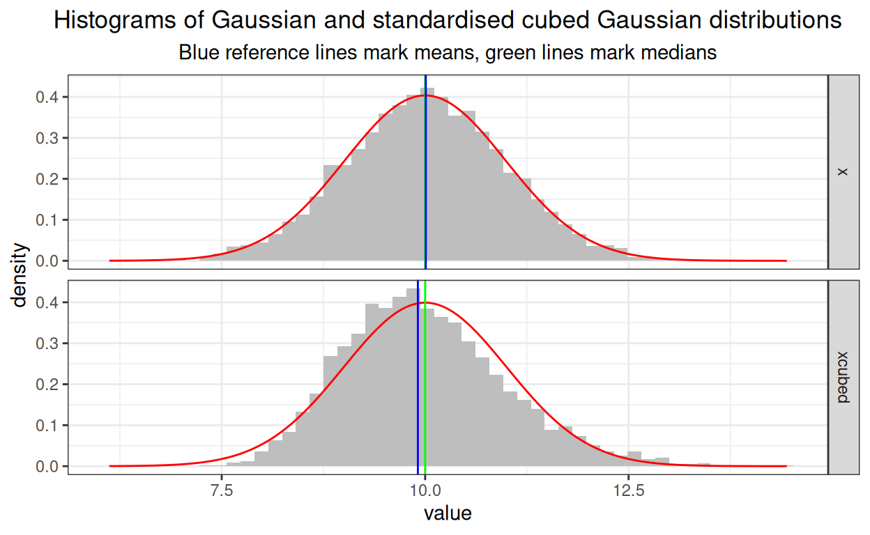
Summary/moral
There are many ways to do most things in R and sometimes I forget the one I used last and keep looking it up and finding outdated information on the internet so here’s this wityh two slightly cosmetically different ways of superimposing a density curve on a histogram.
History
- 5.v.25: created.
web counter
Last updated
04/05/2025 at 12:37