Show code
### this is just the code that creates the "copy to clipboard" function in the code blocks
htmltools::tagList(
  xaringanExtra::use_clipboard(
    button_text = "<i class=\"fa fa-clone fa-2x\" style=\"color: #301e64\"></i>",
    success_text = "<i class=\"fa fa-check fa-2x\" style=\"color: #90BE6D\"></i>",
    error_text = "<i class=\"fa fa-times fa-2x\" style=\"color: #F94144\"></i>"
  ),
  rmarkdown::html_dependency_font_awesome()
)
Background
This is my first post here for a long time so it’s serving a lot of purposes:
Reminding me how to use the R distill package to add things here!
It’s been triggered by excellent peer reviews to a paper of ours so it uses real data and may be a “supplementary” to that paper.
More importantly I hope it will take people through the construction of the Jacobson plot of start/finish therapy change scores showing the logic.
That expands on, but links to, what Jo-anne and I had about the RCSC and Jacobson plot in the OMbook and its slowly expanding online glossary. If you don’t know about the book and glossary, I recommend that you look at the pages about the book at some point as it could help go beyond the particulars here to wider issues about therapy change data.
I am putting some cautions in about the assumptions in the RCSC model and about some of the intentions behind it, i.e. to make therapy research change data more meaningful to clinicians and some of the value of the plot to contextualise individual client change data can get lost.
I hope that writing the code for the plots and tables will be a major step to putting a set of RCSC/Jacobson functions to generate the plots and tables into the CECPfuns R package.
Technicalities
I don’t think this presentation is going to work on a mobile ’phone and you may need to play around resizing you browser window to get the best visibility for you. The other technical point is that you will see buttons saying “Show code”. If you’re not interested in R code, just ignore those; if you are interested in the R code then just clicking on those will show you the code which you are welcome to copy and amend as much as you like but please if you are publishing something that was helped by the code, then please put a link back to this post acknowledging this.
Introduction
OK. Here is a simple Jacobson plot of our data from the paper.
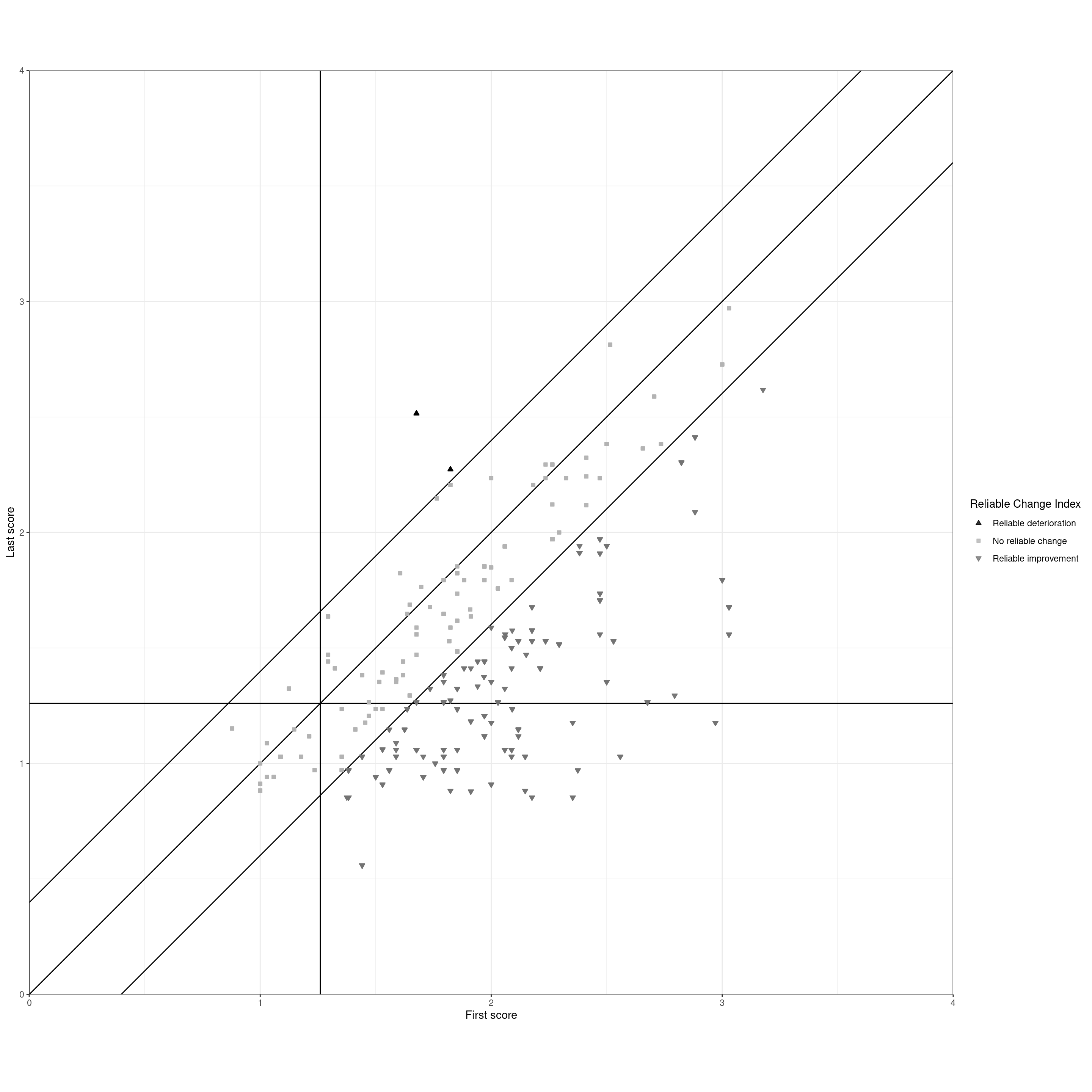
That shows data for 182 clients from our paper. Let’s go into the construction of the plot starting without the clients’ data. The Jacobson plot creates a map with the x axis (horizontal axis) being the clients’ first assessment score and the y, the vertical, axis being the finishing score.
History
The plot was first described in (Jacobson et al., 1984). Jacobson and colleagues had a mistake in one of the calculations that was pointed out (Christensen & Mendoza, 1986) and accepted (Jacobson et al., 1986) (more that below). Although it’s not the historically canonical reference for the plot, (Jacobson & Truax, 1991) is a nice summary of the method that is often cited for it. I’ve contributed to the literature on it with our attempt to make it easier to follow in (Evans et al., 1998) which a lot of people have told me they found helpful! There is also a shorter explanation of the plot than this one here in Chapter 5 of (Evans & Carlyle, 2021).
That’s the beginning of the plot in history but this blog post is about building the its beginnings as blank graph. So this is the canvas onto which we put our change scores.
Show code
### set the score limits (implicit in previous plot from the polygon vertices there)
valMinPoss <- 0
valMaxPoss <- 4

ggplot(tibData,
       aes(x = firstScore,
           y = lastScore)) +
  ### put in CSC lines
  geom_vline(xintercept = csc) +
  geom_hline(yintercept = csc) +
  ### label those
  geom_text(inherit.aes = FALSE,
            x = csc, y = valMaxPoss - ((valMaxPoss - valMinPoss) / 45) ,
            label = paste0("CSC = ", csc, "   "),
            size = 6,
            hjust = 1) +
  geom_text(inherit.aes = FALSE,
            x = valMaxPoss, y = csc - ((valMaxPoss - valMinPoss) / 45),
            label = paste0("  CSC = ", csc),
            hjust = 1,
            size = 6,
            vjust = 0) +
  ### set limits (this way of setting the axis limits doesn't clip the plotting area)
  xlim(c(valMinPoss, valMaxPoss)) +
  ylim(c(valMinPoss, valMaxPoss)) +
  ### axis labels
  xlab("First score") +
  ylab("Last score") +
  theme_bw() +
  ### crucial setting to get square plot
  theme(aspect.ratio = 1) +
  theme(plot.title = element_text(hjust = .5),
        plot.subtitle = element_text(hjust = .5)) +
  ggtitle("Skeleton of the Jacobson plot",
          subtitle = "The vertical and horizontal reference lines mark the CSC criterion")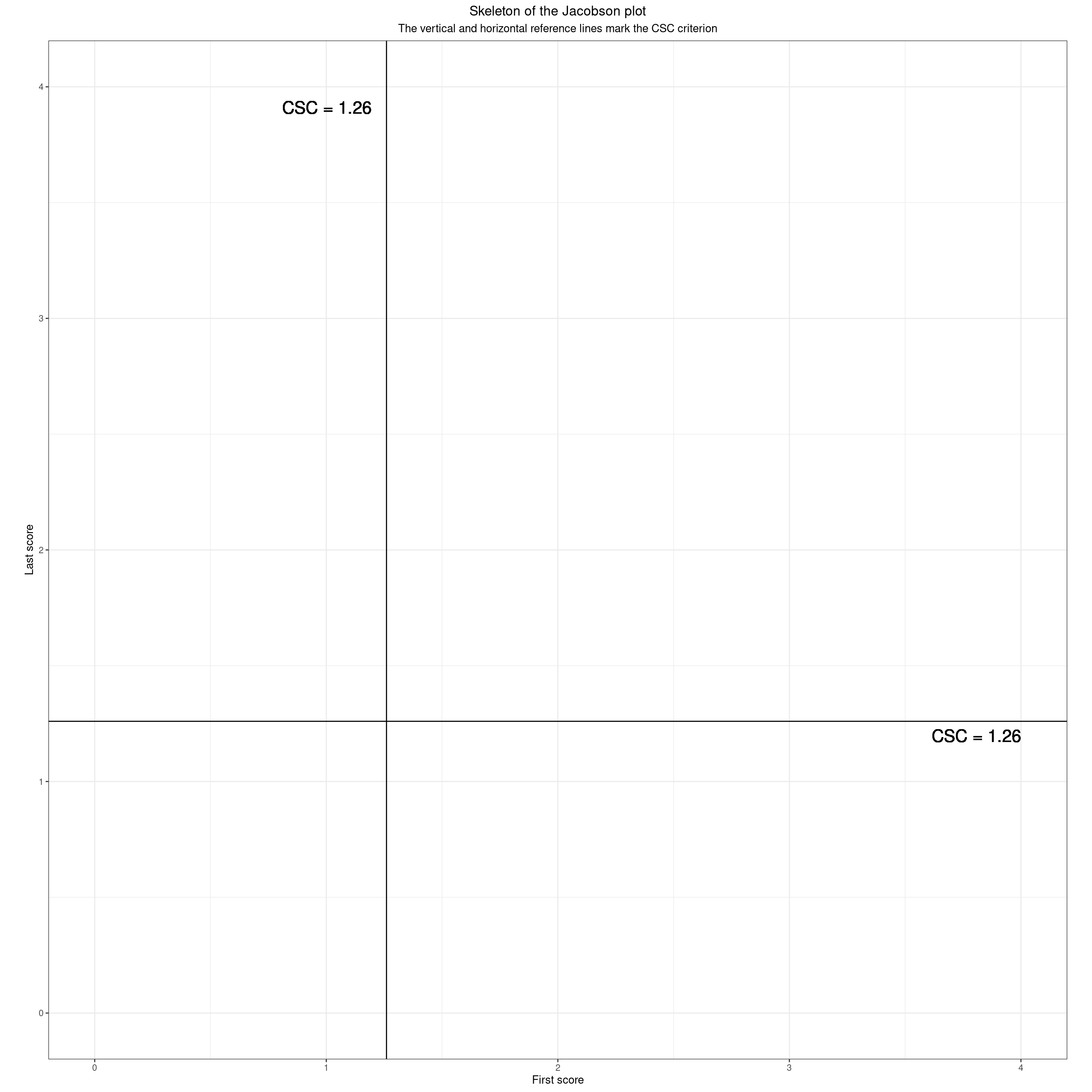
Those lines are used to dichotomise the scores, starting and finishing scores into “clinical” and “non-clinical” (>= CSC and < CSC respectively). That means the area is split into four quadrants by those two lines which mark the CSC (Clinically Significant Change) criterion for the measure (here it was the CORE-OM but the principles apply to any measure of change.) There are many ways to split scores into two levels: “clinical” and “non-clinical” and many, many reasons to be cautious about such dichotomisation. Having said that, it seems that there is a huge and diverse wish to have such categories and Jacobson and his colleagues based their “RCSC” (Reliable and Clinically Significant Change) on such dichotomisation. (And they proposed three ways to determine the CSC score for any measure, one of which, their method c, has pretty overwhelming advantages on their other two and has become very widely used.) Here’s how those lines dichotomise the field.
Show code
### more polygon vertices
datPolyStartedHigh <- data.frame(x = c(csc, csc, valMaxPoss, valMaxPoss),
                                 y = c(valMinPoss, valMaxPoss, valMaxPoss, valMinPoss))
datPolyStartedLow <- data.frame(x = c(valMinPoss, valMinPoss, csc, csc),
                                y = c(valMinPoss, valMaxPoss, valMaxPoss, valMinPoss))

ggplot(tibData,
       aes(x = firstScore,
           y = lastScore)) +
  ### starting scores high
  geom_polygon(data = datPolyStartedHigh,
               inherit.aes = FALSE,
               aes(x = x, y = y),
               fill = "red") +
  ### label that
  annotate("label",
           x = csc + ((valMaxPoss - csc) / 2),
           y = ((valMinPoss + valMaxPoss) / 2),
           size = 6,
           label = "Points in here mark clients who\n started above the CSC") +
  ### starting scores low
  geom_polygon(data = datPolyStartedLow,
               inherit.aes = FALSE,
               aes(x = x, y = y),
               fill = "green") +
  ### label that
  annotate("label",
           x = csc / 2,
           y = ((valMinPoss + valMaxPoss) / 2),
           size = 6,
           label = "Points in here mark clients who\n started below the CSC") +
  ### put in CSC lines
  geom_vline(xintercept = csc) +
  # geom_hline(yintercept = csc) +
  ### label those
  geom_text(inherit.aes = FALSE,
            x = csc, y = valMaxPoss - ((valMaxPoss - valMinPoss) / 45) ,
            label = paste0("CSC = ", csc, "   "),
            size = 6,
            hjust = 1) +
  ### set limits
  xlim(c(valMinPoss, valMaxPoss)) +
  ylim(c(valMinPoss, valMaxPoss)) +
  ### axis labels
  xlab("First score") +
  ylab("Last score") +
  theme_bw() +
  ### crucial setting to get square plot
  theme(aspect.ratio = 1) +
  theme(plot.title = element_text(hjust = .5),
        plot.subtitle = element_text(hjust = .5)) +
  ggtitle("Skeleton of the Jacobson plot",
          subtitle = "Clients starting scores against the CSC")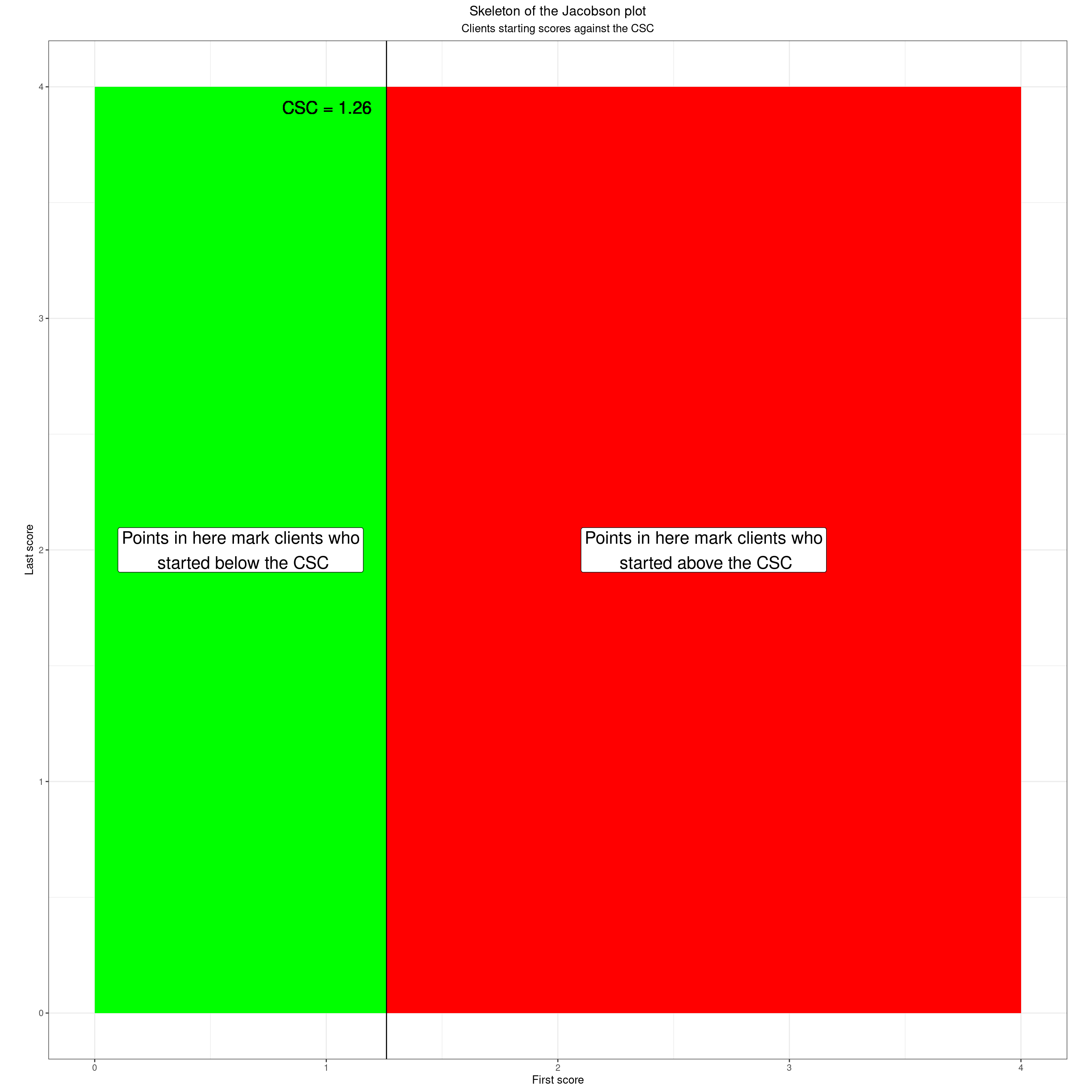
The same applies for the finishing scores.
Show code
### more vertices for geom_poly()
datPolyFinishedHigh <- data.frame(x = c(valMinPoss, valMinPoss, valMaxPoss, valMaxPoss),
                                  y = c(csc, valMaxPoss, valMaxPoss, csc))
datPolyFinishedLow <- data.frame(x = c(valMinPoss, valMinPoss, valMaxPoss, valMaxPoss),
                                 y = c(valMinPoss, csc, csc, valMinPoss))

ggplot(tibData,
       aes(x = firstScore,
           y = lastScore)) +
  ### starting scores high
  geom_polygon(data = datPolyFinishedHigh,
               inherit.aes = FALSE,
               aes(x = x, y = y),
               fill = "red") +
  ### label that
  annotate(geom = "label",
           x = (valMinPoss + valMaxPoss) / 2,
           y = (csc + valMaxPoss) / 2,
           size = 6,
           label = "Points in here mark clients who\n finished above the CSC") +
  ### starting scores low
  geom_polygon(data = datPolyFinishedLow,
               inherit.aes = FALSE,
               aes(x = x, y = y),
               fill = "green") +
  ### label that
  annotate(geom = "label",
           x = (valMinPoss + valMaxPoss) / 2,
           y = csc / 2,
           size = 6,
           label = "Points in here mark clients who\n finished below the CSC") +
  ### put in CSC line
  geom_hline(yintercept = csc) +
  ### label that
  geom_text(inherit.aes = FALSE,
            x = valMaxPoss, y = csc - ((valMaxPoss - valMinPoss) / 45),
            label = paste0("  CSC = ", csc),
            size = 6,
            hjust = 1,
            vjust = 0) +
  ### set limits
  xlim(c(valMinPoss, valMaxPoss)) +
  ylim(c(valMinPoss, valMaxPoss)) +
  ### axis labels
  xlab("First score") +
  ylab("Last score") +
  theme_bw() +
  ### crucial setting to get square plot
  theme(aspect.ratio = 1) +
  theme(plot.title = element_text(hjust = .5),
        plot.subtitle = element_text(hjust = .5)) +
  ggtitle("Skeleton of the Jacobson plot",
          subtitle = "Clients finishing scores against the CSC")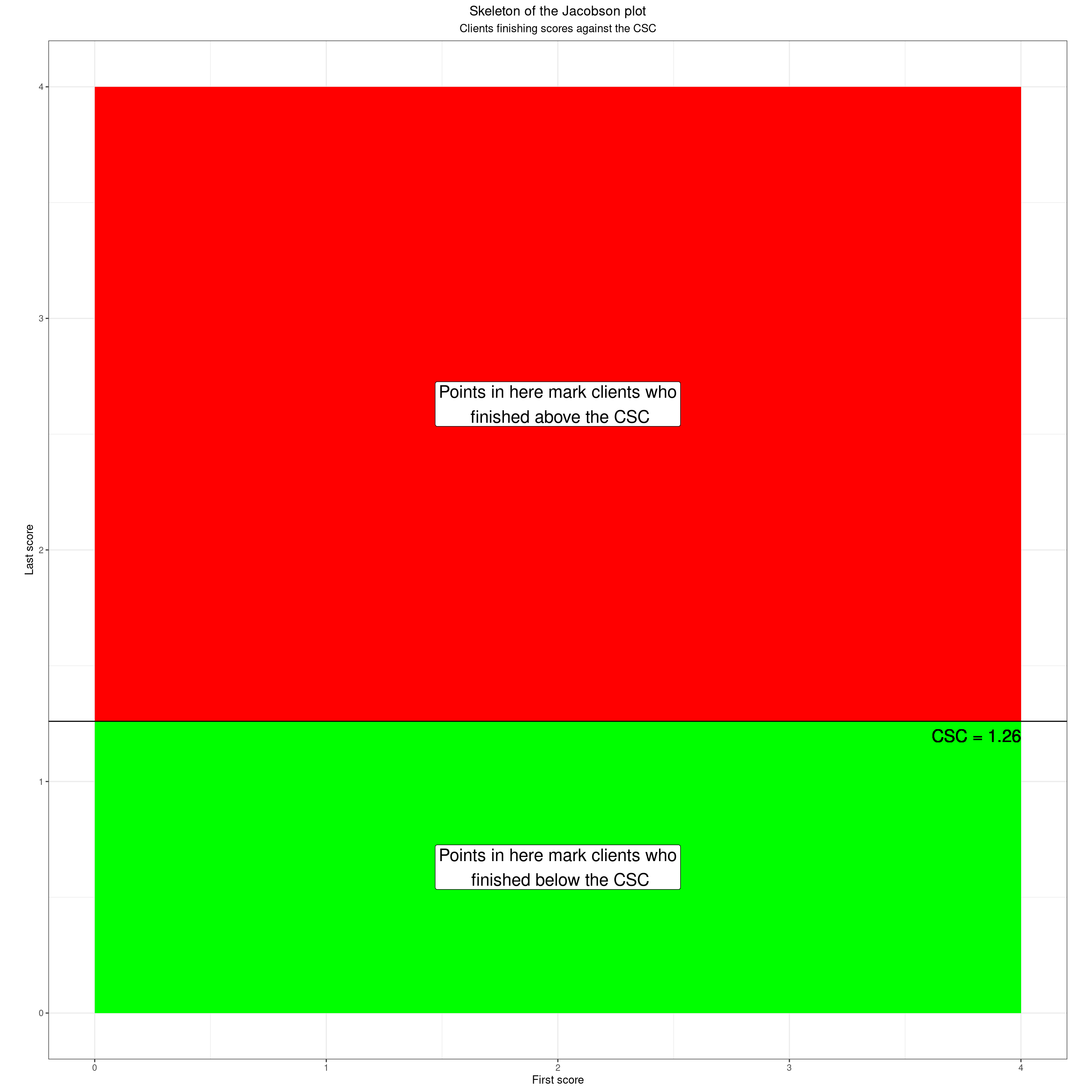
Of course the actual scores remain the actual scores! One thing to watch with all dichotomisation is not to lose sight of that. That will be a theme through this post. If we think of the scores as continuous this shows the starting scores as a colour gradient
Show code
datPolyAll <- data.frame(x = c(valMinPoss, valMinPoss, valMaxPoss, valMaxPoss),
                         y = c(valMinPoss, csc, csc, valMinPoss))

### The CORE-OM has 41 possible score levels
valNlevels <- 41
### rather crude way to create a full range of possible first/last score pairs
as_tibble(data.frame(x = rep(seq(valMinPoss, valMaxPoss, length = valNlevels), each = valNlevels),
                     y = rep(seq(valMinPoss, valMaxPoss, length = valNlevels), times = valNlevels))) -> tibFill

ggplot(tibFill,
       aes(x = x,
           y = y)) +
  ### starting score gradient
  geom_raster(aes(fill = x)) +
  scale_fill_gradient(low = "green", high = "red") +
  ### put in CSC lines
  geom_vline(xintercept = csc) +
  geom_hline(yintercept = csc) +
  ### label those
  geom_text(inherit.aes = FALSE,
            x = csc, y = valMaxPoss - ((valMaxPoss - valMinPoss) / 45) ,
            label = paste0("CSC = ", csc, "   "),
            size = 6,
            hjust = 1) +
  geom_text(inherit.aes = FALSE,
            x = valMaxPoss, y = csc - ((valMaxPoss - valMinPoss) / 45),
            label = paste0("  CSC = ", csc),
            size = 6,
            hjust = 1,
            vjust = 0) +
  ### axis labels
  xlab("First score") +
  ylab("Last score") +
  theme_bw() +
  ### crucial setting to get square plot
  theme(aspect.ratio = 1) +
  theme(plot.title = element_text(hjust = .5),
        plot.subtitle = element_text(hjust = .5)) +
  ggtitle("Skeleton of the Jacobson plot",
          subtitle = "Continuous starting scores")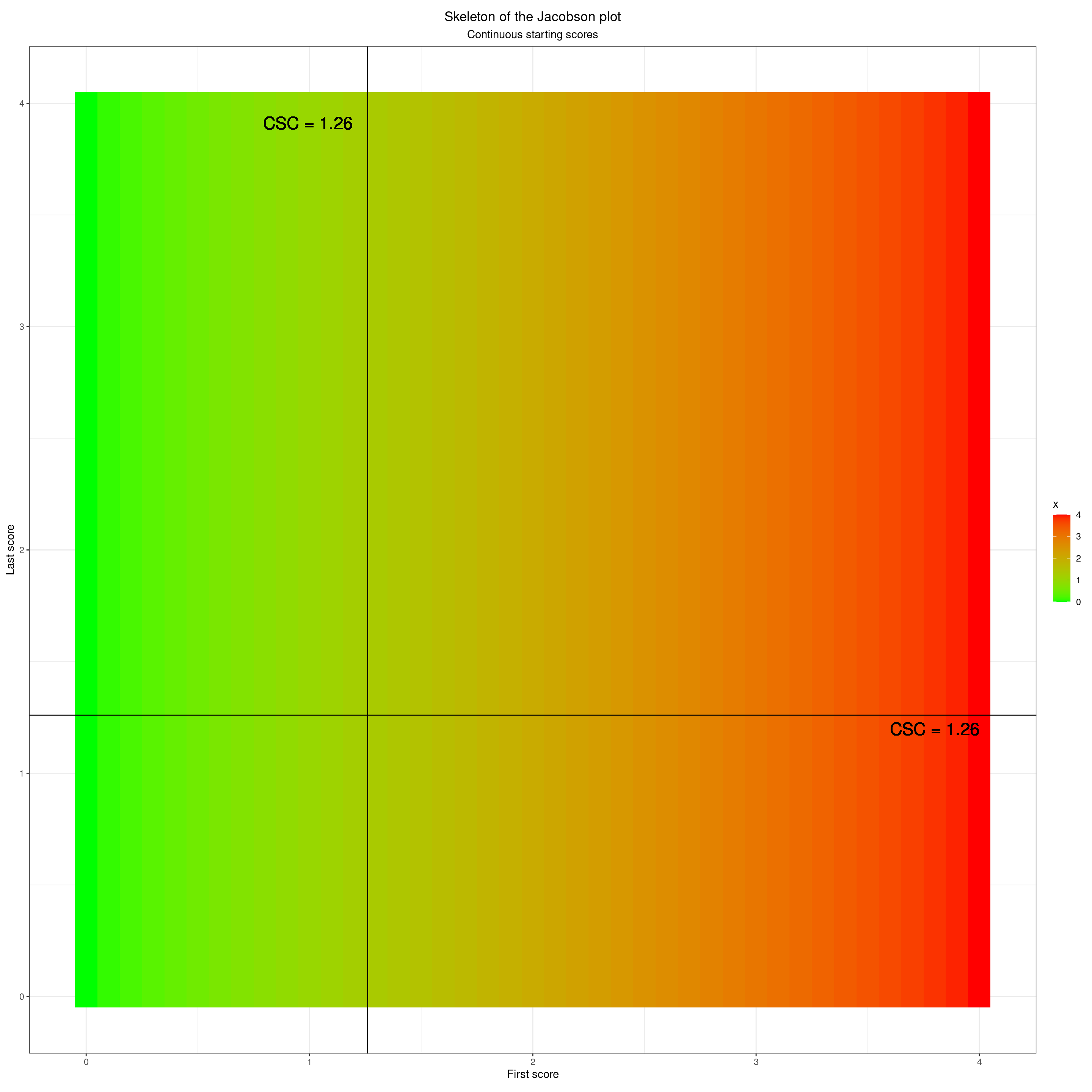
Another thing to remember is that our scores aren’t truly continuous. Here are the possible scores for the CORE-10 with no prorating.
Show code
ggplot(tibFill,
       aes(x = x,
           y = y)) +
  geom_point(aes(colour = y),
             size = 3) +
  scale_colour_gradient(low = "green", high = "red") +
  ### put in CSC lines
  geom_vline(xintercept = csc) +
  geom_hline(yintercept = csc) +
  ### label those
  geom_text(inherit.aes = FALSE,
            x = csc, y = 1.05 * valMaxPoss - ((valMaxPoss - valMinPoss) / 45) ,
            label = paste0("CSC = ", csc, "   "),
            size = 6,
            hjust = 1) +
  geom_text(inherit.aes = FALSE,
            x = valMaxPoss, y = csc - ((valMaxPoss - valMinPoss) / 45),
            label = paste0("  CSC = ", csc),
            size = 6,
            hjust = 1,
            vjust = 0) +
  ### axis labels
  xlab("First score") +
  ylab("Last score") +
  theme_bw() +
  ### crucial setting to get square plot
  theme(aspect.ratio = 1) +
  theme(plot.title = element_text(hjust = .5),
        plot.subtitle = element_text(hjust = .5)) +
  ggtitle("Skeleton of the Jacobson plot",
          subtitle = "Discrete starting scores (model of CORE-10 with no prorating)")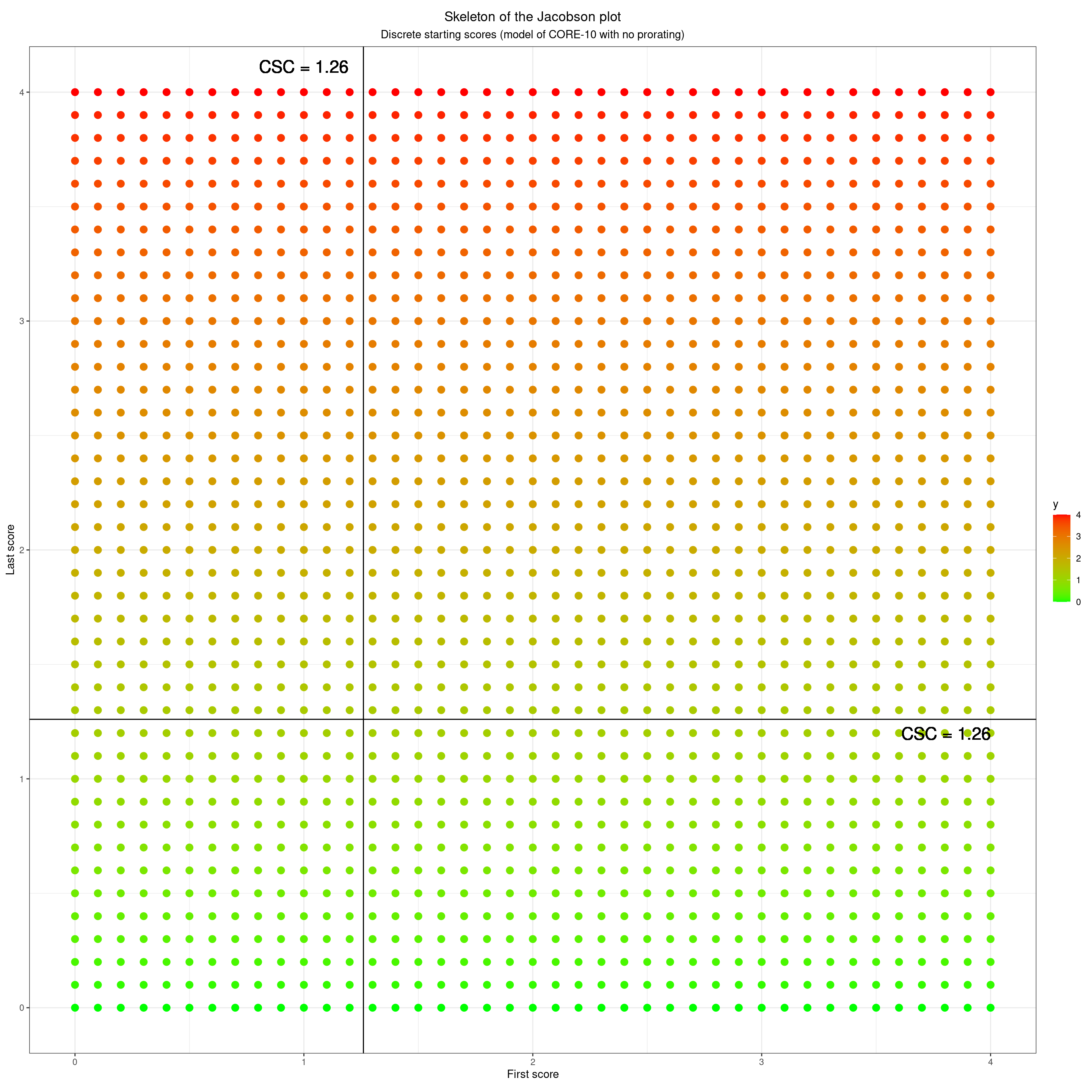
This next shows the same but for the CORE-OM with the full 34 items completed, no prorating again. The granularity is clearly much greater. The issue about our scores not being truly continuous does start to be an issue to hold in mind but only when the number of possible scores gets quite low. Here are the possible scores with no pro-rating for the GAD-7 with the UK IAPT cutting score of 8.
Show code
### compute the number of possible scores on the GAD-7
valNlevels <- 4 * 7 + 1
### reset limits
valMinPoss <- 0
valMaxPoss <- 21
csc <- 8
### and now create the full set of possible first/last scores for the GAD-7
as_tibble(data.frame(x = rep(seq(valMinPoss, valMaxPoss, length = valNlevels), each = valNlevels),
                     y = rep(seq(valMinPoss, valMaxPoss, length = valNlevels), times = valNlevels))) -> tibFill

ggplot(tibFill,
       aes(x = x,
           y = y)) +
  geom_point(aes(colour = y),
             size = 3) +
  scale_colour_gradient(low = "green", high = "red") +
  ### put in CSC lines
  geom_vline(xintercept = csc) +
  geom_hline(yintercept = csc) +
  ### label those
  geom_text(inherit.aes = FALSE,
            x = csc, y = 1.05 * valMaxPoss - ((valMaxPoss - valMinPoss) / 45) ,
            label = paste0("CSC = ", csc, "   "),
            size = 6,
            hjust = 1) +
  geom_text(inherit.aes = FALSE,
            x = valMaxPoss, y = csc - ((valMaxPoss - valMinPoss) / 45),
            label = paste0("  CSC = ", csc),
            size = 6,
            hjust = 1,
            vjust = 0) +
  ### axis labels
  xlab("First score") +
  ylab("Last score") +
  theme_bw() +
  ### crucial setting to get square plot
  theme(aspect.ratio = 1) +
  theme(plot.title = element_text(hjust = .5),
        plot.subtitle = element_text(hjust = .5)) +
  ggtitle("Skeleton of the Jacobson plot",
          subtitle = "Discrete starting scores (model of GAD-7 with no prorating)")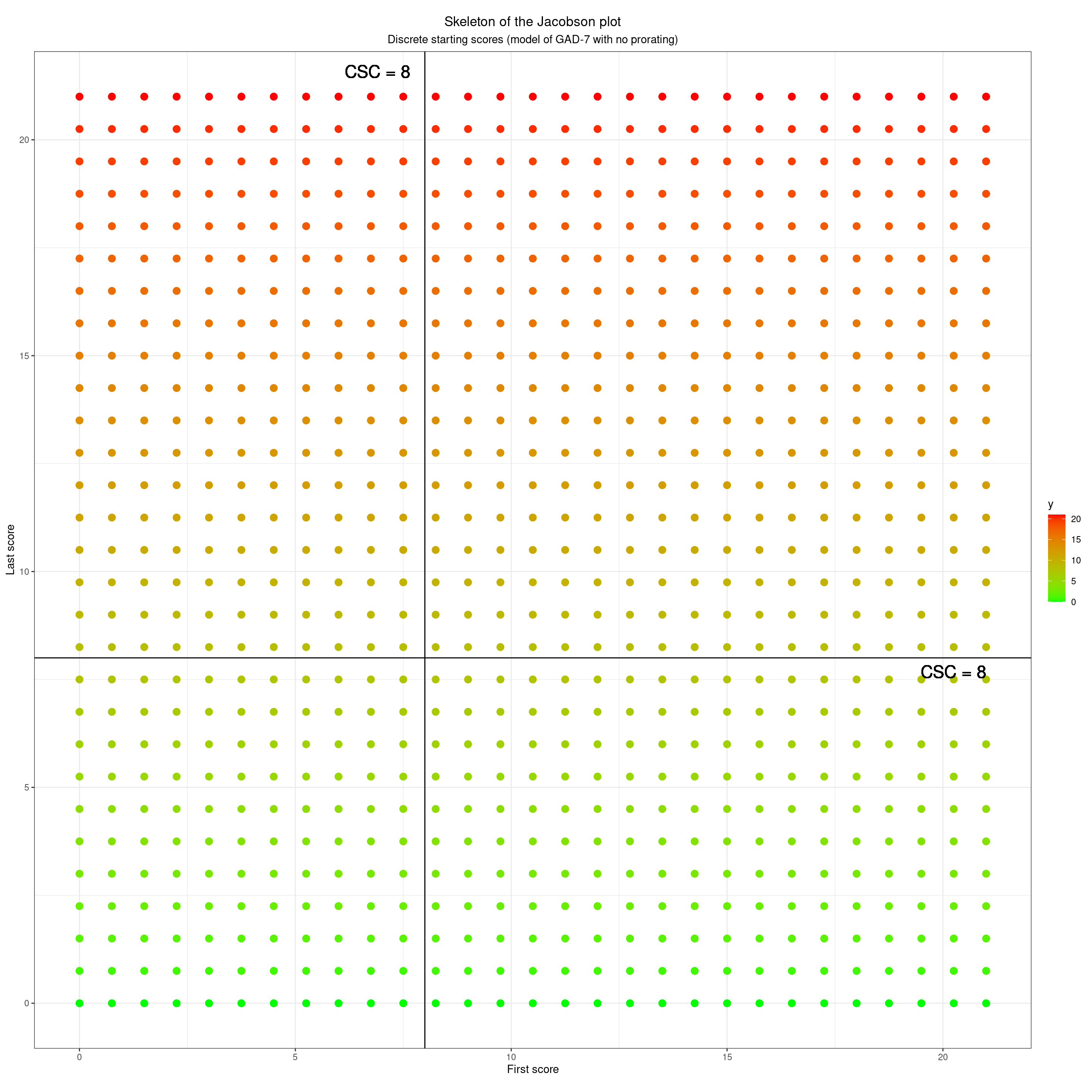
Even with only seven items and four response levels we have 22 possible scores, 14 about that cutting point and eight below it.
Show code
### reset things to the CORE-OM
valNlevels <- 4 * 34 + 1
### reset limits
valMinPoss <- 0
valMaxPoss <- 4
csc <- 1.26

as_tibble(data.frame(x = rep(seq(valMinPoss, valMaxPoss, length = valNlevels), each = valNlevels),
                     y = rep(seq(valMinPoss, valMaxPoss, length = valNlevels), times = valNlevels))) -> tibFill

ggplot(tibFill,
       aes(x = x,
           y = y)) +
  geom_point(aes(colour = y),
             size = 1) +
  scale_colour_gradient(low = "green", high = "red") +
  ### put in CSC lines
  geom_vline(xintercept = csc) +
  geom_hline(yintercept = csc) +
  ### label those
  geom_text(inherit.aes = FALSE,
            x = csc,
            y = 1.03 * valMaxPoss,
            label = paste0("CSC = ", csc, "   "),
            size = 6,
            hjust = 1) +
  geom_text(inherit.aes = FALSE,
            x = valMaxPoss, y = csc - ((valMaxPoss - valMinPoss) / 45),
            label = paste0("  CSC = ", csc),
            size = 6,
            hjust = 1,
            vjust = 0) +
  ### axis labels
  xlab("First score") +
  ylab("Last score") +
  theme_bw() +
  ### crucial setting to get square plot
  theme(aspect.ratio = 1) +
  theme(plot.title = element_text(hjust = .5),
        plot.subtitle = element_text(hjust = .5)) +
  ggtitle("Skeleton of the Jacobson plot",
          subtitle = "Discrete starting scores (model of CORE-OM with no prorating)")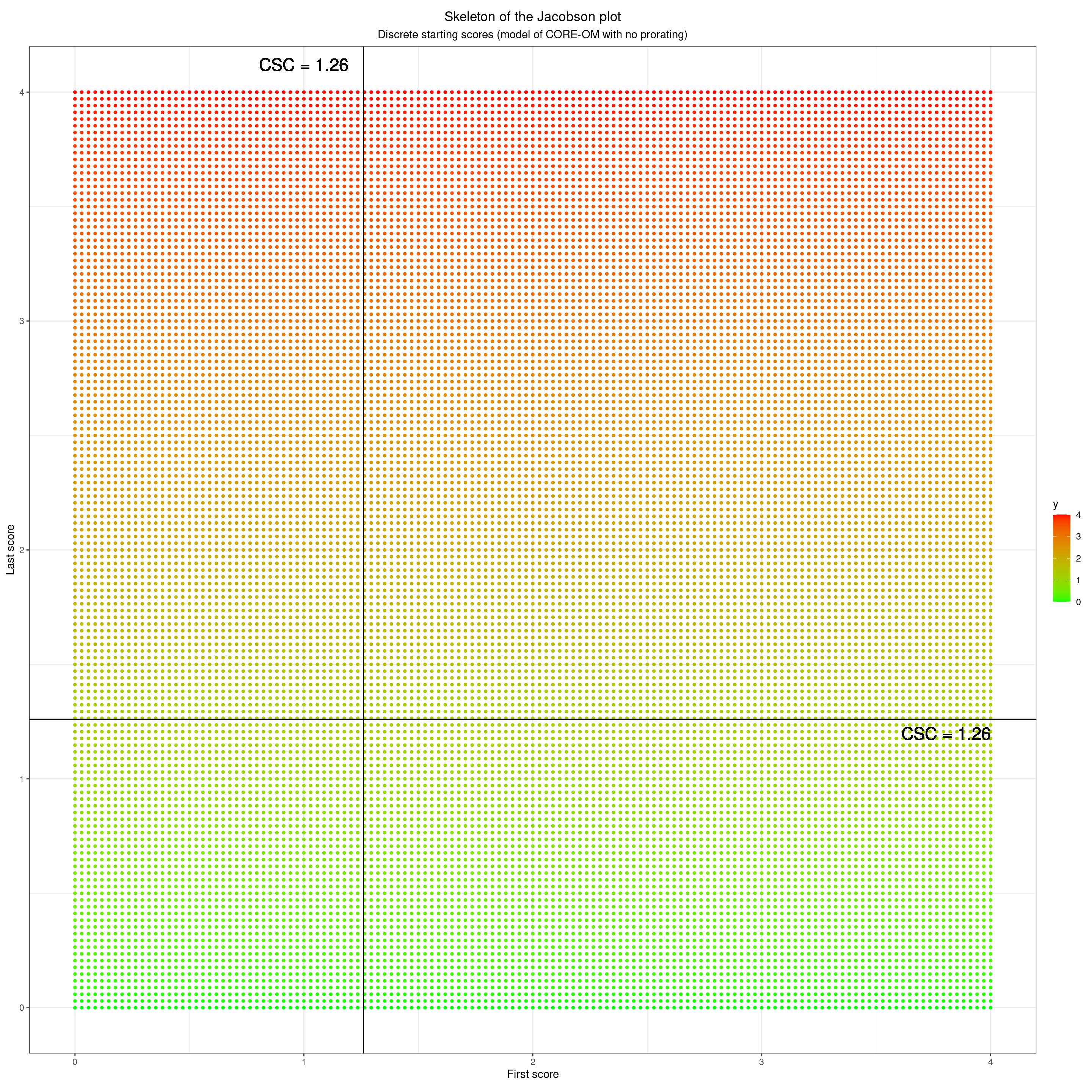
So that’s how the plot relates to the starting and finishing scores. When we look at both scores we have four quadrants. These next four blocks show each quadrant.
Starting high and finishing high
Show code
### another polygon
datPolyStayedHigh <- data.frame(x = c(csc, csc, valMaxPoss, valMaxPoss),
                                y = c(csc, valMaxPoss, valMaxPoss, csc))

ggplot(tibData,
       aes(x = firstScore,
           y = lastScore,
           shape = RCIchange,
           colour = RCIchange,
           fill = RCIchange)) +
  ### quadrants
  geom_polygon(data = datPolyStayedHigh,
               inherit.aes = FALSE,
               aes(x = x, y = y),
               fill = "orange") +
  ### label that
  annotate(geom = "label",
           x = csc + ((valMaxPoss - csc) / 2),
           y = csc + ((valMaxPoss - csc) / 2),
           size = 6,
           label = "Points in here mark clients who\n started above CSC and ended above CSC") +
  ### put in CSC lines
  geom_vline(xintercept = csc) +
  geom_hline(yintercept = csc) +
  ### label those
  geom_text(inherit.aes = FALSE,
            x = csc, y = valMaxPoss - ((valMaxPoss - valMinPoss) / 45) ,
            label = paste0("CSC = ", csc, "   "),
            size = 6,
            hjust = 1) +
  geom_text(inherit.aes = FALSE,
            x = valMaxPoss, y = csc - ((valMaxPoss - valMinPoss) / 45),
            label = paste0("  CSC = ", csc),
            size = 6,
            hjust = 1,
            vjust = 0) +
  ### set limits
  xlim(c(valMinPoss, valMaxPoss)) +
  ylim(c(valMinPoss, valMaxPoss)) +
  ### axis labels
  xlab("First score") +
  ylab("Last score") +
  theme_bw() +
  ### crucial setting to get square plot
  theme(aspect.ratio = 1) +
  theme(plot.title = element_text(hjust = .5),
        plot.subtitle = element_text(hjust = .5)) +
  ggtitle("Skeleton of the Jacobson plot",
          subtitle = "'Stayed high' quadrant")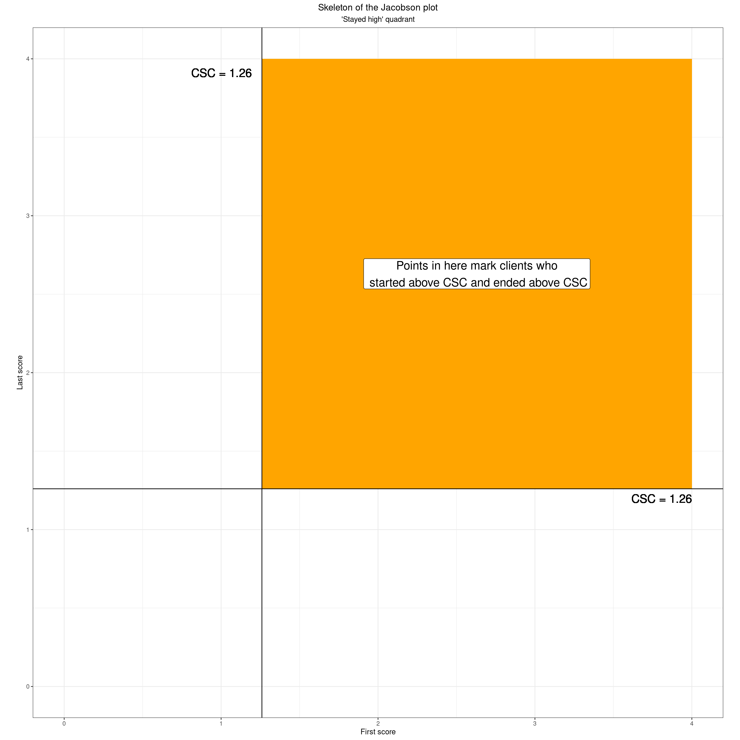
Started high but finished low
Show code
datPolyHighToLow <- data.frame(x = c(csc, csc, valMaxPoss, valMaxPoss),
                               y = c(valMinPoss, csc, csc, valMinPoss))

ggplot(tibData,
       aes(x = firstScore,
           y = lastScore,
           shape = RCIchange,
           colour = RCIchange,
           fill = RCIchange)) +
  ### quadrants
  geom_polygon(data = datPolyHighToLow,
               inherit.aes = FALSE,
               aes(x = x, y = y),
               fill = "green") +
  ### label that
  annotate(geom = "label",
           x = csc + ((valMaxPoss - csc) / 2),
           y = (csc / 2),
           size = 6,
           label = "Points in here mark clients who\n started above CSC and ended below CSC") +
  ### put in CSC lines
  geom_vline(xintercept = csc) +
  geom_hline(yintercept = csc) +
  ### label those
  geom_text(inherit.aes = FALSE,
            x = csc, y = valMaxPoss - ((valMaxPoss - valMinPoss) / 45) ,
            label = paste0("CSC = ", csc, "   "),
            size = 6,
            hjust = 1) +
  geom_text(inherit.aes = FALSE,
            x = valMaxPoss, y = csc - ((valMaxPoss - valMinPoss) / 45),
            label = paste0("  CSC = ", csc),
            size = 6,
            hjust = 1,
            vjust = 0) +
  ### set limits
  xlim(c(valMinPoss, valMaxPoss)) +
  ylim(c(valMinPoss, valMaxPoss)) +
  ### axis labels
  xlab("First score") +
  ylab("Last score") +
  theme_bw() +
  ### crucial setting to get square plot
  theme(aspect.ratio = 1) +
  theme(plot.title = element_text(hjust = .5),
        plot.subtitle = element_text(hjust = .5)) +
  ggtitle("Skeleton of the Jacobson plot",
          subtitle = "'High to low' quadrant")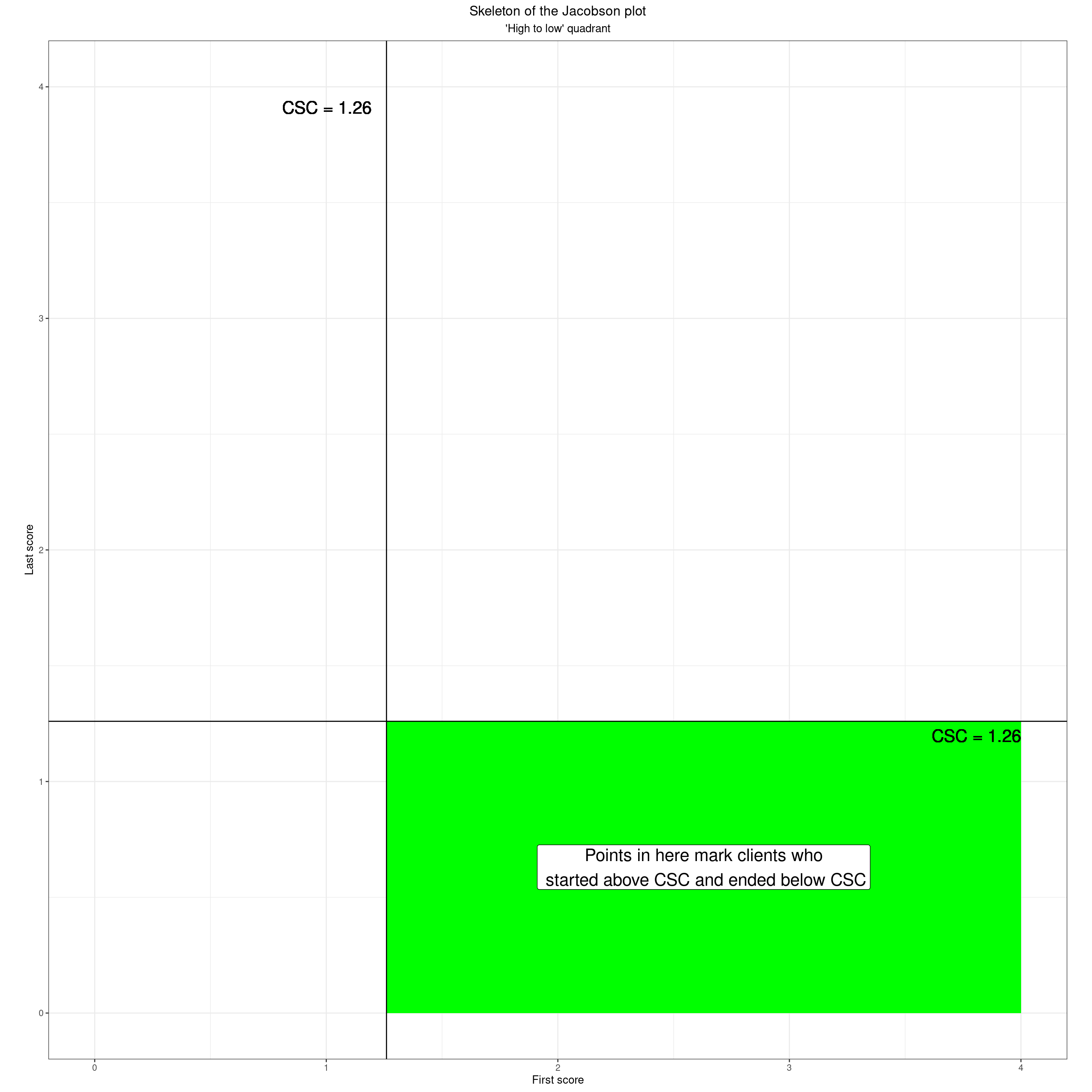
Low to high
Show code
datPolyLowToHigh <- data.frame(x = c(valMinPoss, valMinPoss, csc, csc),
                               y = c(csc, valMaxPoss, valMaxPoss, csc))

ggplot(tibData,
       aes(x = firstScore,
           y = lastScore,
           shape = RCIchange,
           colour = RCIchange,
           fill = RCIchange)) +
  ### quadrants
  geom_polygon(data = datPolyLowToHigh,
               inherit.aes = FALSE,
               aes(x = x, y = y),
               fill = "red") +
  ### label that
  annotate(geom = "label",
           x = csc / 2,
           y = csc + (valMaxPoss - csc) / 2,
           size = 6,
           label = "Points in here mark clients\n who started below CSC\nand ended above CSC") +
  ### put in CSC lines
  geom_vline(xintercept = csc) +
  geom_hline(yintercept = csc) +
  ### label those
  geom_text(inherit.aes = FALSE,
            x = csc, y = valMaxPoss - ((valMaxPoss - valMinPoss) / 45) ,
            label = paste0("CSC = ", csc, "   "),
            size = 6,
            hjust = 1) +
  geom_text(inherit.aes = FALSE,
            x = valMaxPoss, y = csc - ((valMaxPoss - valMinPoss) / 45),
            label = paste0("  CSC = ", csc),
            size = 6,
            hjust = 1,
            vjust = 0) +
  ### set limits
  xlim(c(valMinPoss, valMaxPoss)) +
  ylim(c(valMinPoss, valMaxPoss)) +
  ### axis labels
  xlab("First score") +
  ylab("Last score") +
  theme_bw() +
  ### crucial setting to get square plot
  theme(aspect.ratio = 1) +
  theme(plot.title = element_text(hjust = .5),
        plot.subtitle = element_text(hjust = .5)) +
  ggtitle("Skeleton of the Jacobson plot",
          subtitle = "'Low to high' quadrant")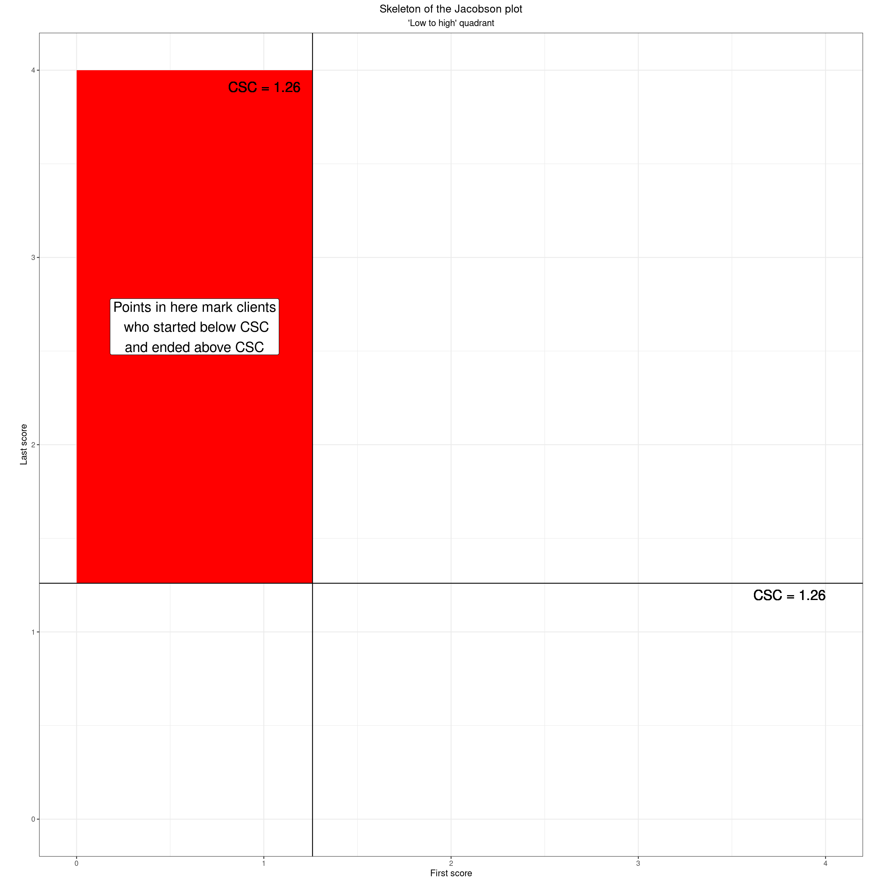
Stayed low
Show code
datPolyStayedLow <- data.frame(x = c(valMinPoss, valMinPoss, csc, csc),
                               y = c(valMinPoss, csc, csc, valMinPoss))

ggplot(tibData,
       aes(x = firstScore,
           y = lastScore,
           shape = RCIchange,
           colour = RCIchange,
           fill = RCIchange)) +
  ### quadrants
  geom_polygon(data = datPolyStayedLow,
               inherit.aes = FALSE,
               aes(x = x, y = y),
               fill = "yellow") +
  ### label that
  annotate(geom = "label",
           x = csc / 2,
           y = csc / 2,
           size = 6,
           label = "Points in here mark clients\n who started below CSC\nand ended below CSC") +
  ### put in CSC lines
  geom_vline(xintercept = csc) +
  geom_hline(yintercept = csc) +
  ### label those
  geom_text(inherit.aes = FALSE,
            x = csc, y = valMaxPoss - ((valMaxPoss - valMinPoss) / 45) ,
            label = paste0("CSC = ", csc, "   "),
            size = 6,
            hjust = 1) +
  geom_text(inherit.aes = FALSE,
            x = valMaxPoss, y = csc - ((valMaxPoss - valMinPoss) / 45),
            label = paste0("  CSC = ", csc),
            size = 6,
            hjust = 1,
            vjust = 0) +
  ### set limits
  xlim(c(valMinPoss, valMaxPoss)) +
  ylim(c(valMinPoss, valMaxPoss)) +
  ### axis labels
  xlab("First score") +
  ylab("Last score") +
  theme_bw() +
  ### crucial setting to get square plot
  theme(aspect.ratio = 1) +
  theme(plot.title = element_text(hjust = .5),
        plot.subtitle = element_text(hjust = .5)) +
  ggtitle("Skeleton of the Jacobson plot",
          subtitle = "Stayed low quadrant")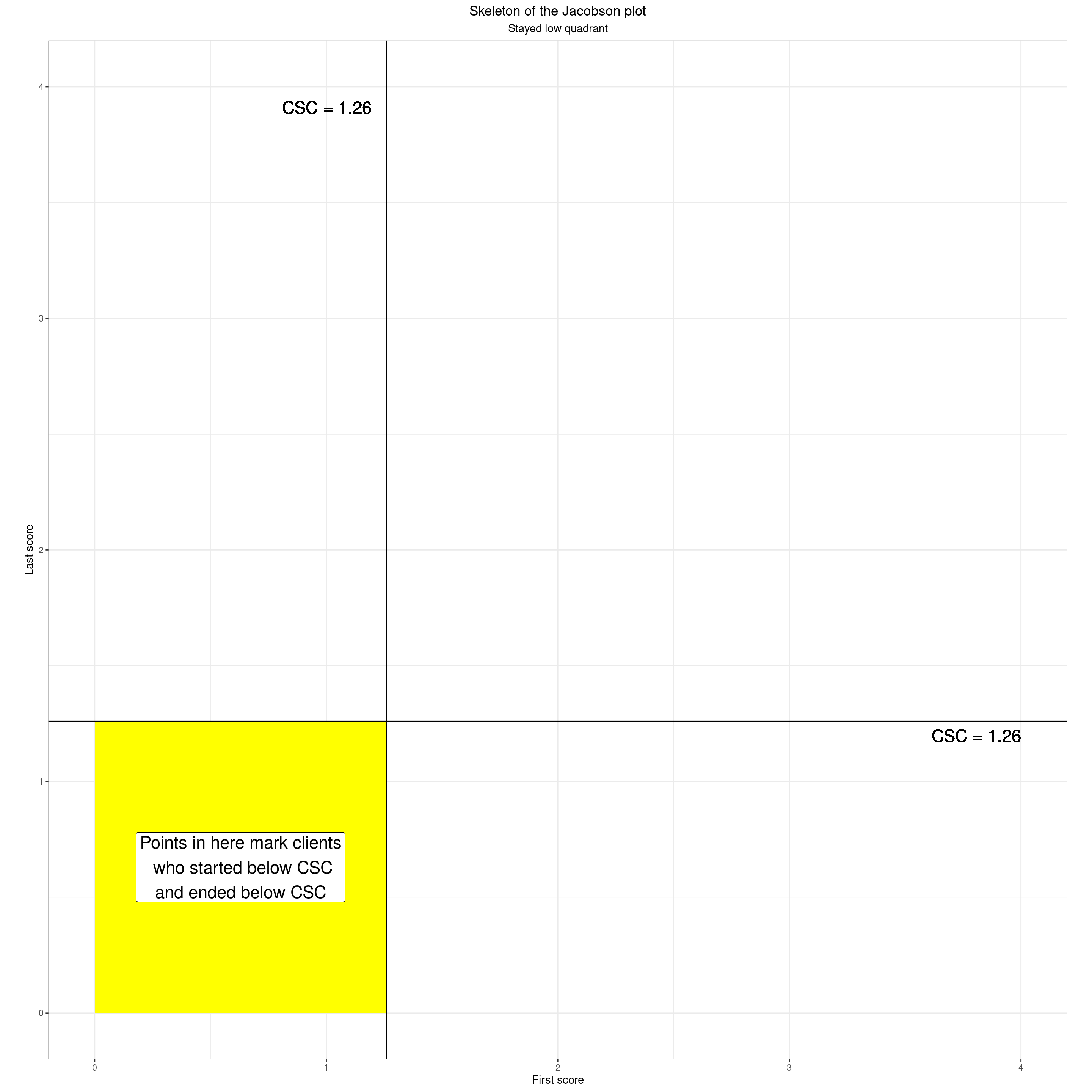
Here’s what that looks like for our real data.
Show code
ggplot(tibData,
       aes(x = firstScore,
           y = lastScore)) +
  ### quadrants
  geom_polygon(data = datPolyStayedLow,
               inherit.aes = FALSE,
               aes(x = x, y = y),
               fill = "yellow") +
  geom_polygon(data = datPolyStayedHigh,
               inherit.aes = FALSE,
               aes(x = x, y = y),
               fill = "orange") +
  geom_polygon(data = datPolyHighToLow,
               inherit.aes = FALSE,
               aes(x = x, y = y),
               fill = "green") +
  geom_polygon(data = datPolyLowToHigh,
               inherit.aes = FALSE,
               aes(x = x, y = y),
               fill = "red") +
  ### put in the points
  geom_point(alpha = .5) +
  ### put in CSC lines
  geom_vline(xintercept = csc) +
  geom_hline(yintercept = csc) +
  ### label those
  geom_text(inherit.aes = FALSE,
            x = csc, y = valMaxPoss - ((valMaxPoss - valMinPoss) / 45) ,
            label = paste0("CSC = ", csc, "   "),
            size = 6,
            hjust = 1) +
  geom_text(inherit.aes = FALSE,
            x = valMaxPoss, y = csc - ((valMaxPoss - valMinPoss) / 45),
            label = paste0("  CSC = ", csc),
            size = 6,
            hjust = 1,
            vjust = 0) +
  ### set limits
  xlim(c(valMinPoss, valMaxPoss)) +
  ylim(c(valMinPoss, valMaxPoss)) +
  ### axis labels
  xlab("First score") +
  ylab("Last score") +
  theme_bw() +
  ### crucial setting to get square plot
  theme(aspect.ratio = 1) +
  theme(plot.title = element_text(hjust = .5),
        plot.subtitle = element_text(hjust = .5)) +
  ggtitle("Skeleton of the Jacobson plot",
          subtitle = "Real data")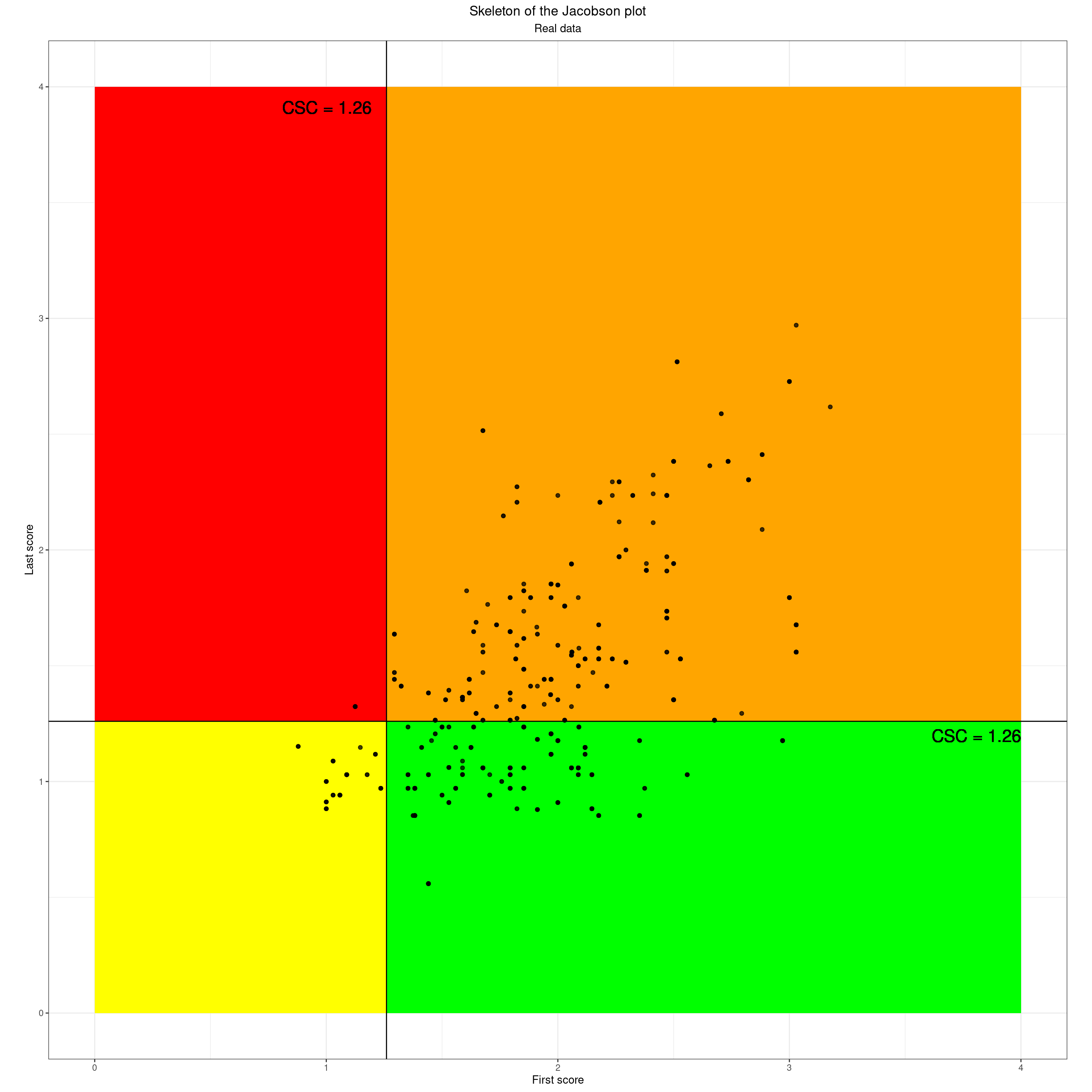
Dichotomising the two scores using the CSC gives us those four quadrants and what one sometimes sees is the data being tabulated by those quadrants either as a first/last crosstabulation like this.
Show code
tibData %>%
  filter(occasion == 1) %>%
  select(id, firstScore, lastScore) %>%
  ### categorise change
  mutate(firstCSCcategory = if_else(firstScore >= csc, "startHigh", "startLow"),
         lastCSCcategory = if_else(lastScore >= csc, "endHigh", "endLow"),
         CSCchangeCategory = case_when(
           firstCSCcategory == "startHigh" & lastCSCcategory == "endHigh" ~ "Stayed high",
           firstCSCcategory == "startHigh" & lastCSCcategory == "endLow" ~ "Clinically improved",
           firstCSCcategory == "startLow" & lastCSCcategory == "endHigh" ~ "Clinically deteriorated",
           firstCSCcategory == "startLow" & lastCSCcategory == "endLow" ~ "Stayed low")) -> tmpTibCSC

tmpTibCSC %>%
  tabyl(firstCSCcategory, lastCSCcategory) %>%
  adorn_percentages() %>%
  adorn_pct_formatting(digits = 1) %>%
  adorn_ns() %>%
  flextable() %>%
  ### flextable::flextable() uses bg() to set background colour i are rows, j are columns
  bg(i = 1, j = 2, bg = "orange") %>%
  bg(i = 1, j = 3, bg = "green") %>%
  bg(i = 2, j = 2, bg = "red") %>%
  bg(i = 2, j = 3, bg = "yellow")
firstCSCcategory | endHigh | endLow |
|---|---|---|
startHigh | 66.9% (113) | 33.1% (56) |
startLow | 7.7% (1) | 92.3% (12) |
Or just listing the categories.
Show code
tmpTibCSC %>%
  mutate(CSCchangeCategory = ordered(CSCchangeCategory,
                                     levels = c("Stayed high",
                                                "Stayed low",
                                                "Clinically improved",
                                                "Clinically deteriorated"),
                                     labels = c("Stayed high",
                                                "Stayed low",
                                                "Clinically improved",
                                                "Clinically deteriorated"))) %>%
  tabyl(CSCchangeCategory) %>%
  adorn_pct_formatting(digits = 1) %>%
  flextable() %>%
  bg(i = 1, j = 1:3, bg = "orange") %>%
  bg(i = 2, j = 1:3, bg = "yellow") %>%
  bg(i = 3, j = 1:3, bg = "green") %>%
  bg(i = 4, j = 1:3, bg = "red")
CSCchangeCategory | n | percent |
|---|---|---|
Stayed high | 113 | 62.1% |
Stayed low | 12 | 6.6% |
Clinically improved | 56 | 30.8% |
Clinically deteriorated | 1 | 0.5% |
From CSC dichotomisation and the quadrants to add reliable change: from CSC to RCSC
However, that clearly reduces the complexity of the scores perhaps a bit too far even for a quadrant classification based on dichotomising the first and last scores. The key thing that fails to consider is whether the changes, whatever quadrant they put the client into, are large enough that we should be interested!
The first step really is just add the no change line to the plot.
Show code
as_tibble(data.frame(x = seq(0, 4, length = 41),
                     y = seq(0, 4, length = 41))) -> tibNoChange

ggplot(tibData,
       aes(x = firstScore,
           y = lastScore)) +
  ### quadrants
  geom_polygon(data = datPolyStayedLow,
               inherit.aes = FALSE,
               aes(x = x, y = y),
               fill = "yellow") +
  geom_polygon(data = datPolyStayedHigh,
               inherit.aes = FALSE,
               aes(x = x, y = y),
               fill = "orange") +
  geom_polygon(data = datPolyHighToLow,
               inherit.aes = FALSE,
               aes(x = x, y = y),
               fill = "green") +
  geom_polygon(data = datPolyLowToHigh,
               inherit.aes = FALSE,
               aes(x = x, y = y),
               fill = "red") +
  ### put in the points
  geom_point(alpha = .5) +
  ### put in no change line
  geom_line(data = tibNoChange,
            aes(x = x, y = y)) +
  ### label that
  ggtext::geom_richtext(inherit.aes = FALSE,
                       x = .9 * valMaxPoss,
                       y = .9 * valMaxPoss,
                       label = "Line of no change",
                       angle = 45,
                       hjust = 1,
                       vjust = .5) +
  ### put in CSC lines
  geom_vline(xintercept = csc) +
  geom_hline(yintercept = csc) +
  ### label those
  geom_text(inherit.aes = FALSE,
            x = csc, y = valMaxPoss - ((valMaxPoss - valMinPoss) / 45) ,
            label = paste0("CSC = ", csc, "   "),
            size = 6,
            hjust = 1) +
  geom_text(inherit.aes = FALSE,
            x = valMaxPoss, y = csc - ((valMaxPoss - valMinPoss) / 45),
            label = paste0("  CSC = ", csc),
            size = 6,
            hjust = 1,
            vjust = 0) +
  ### set limits
  xlim(c(valMinPoss, valMaxPoss)) +
  ylim(c(valMinPoss, valMaxPoss)) +
  ### axis labels
  xlab("First score") +
  ylab("Last score") +
  theme_bw() +
  ### crucial setting to get square plot
  theme(aspect.ratio = 1) +
  theme(plot.title = element_text(hjust = .5),
        plot.subtitle = element_text(hjust = .5)) +
  ggtitle("Skeleton of the Jacobson plot",
          subtitle = "Real data with no change line")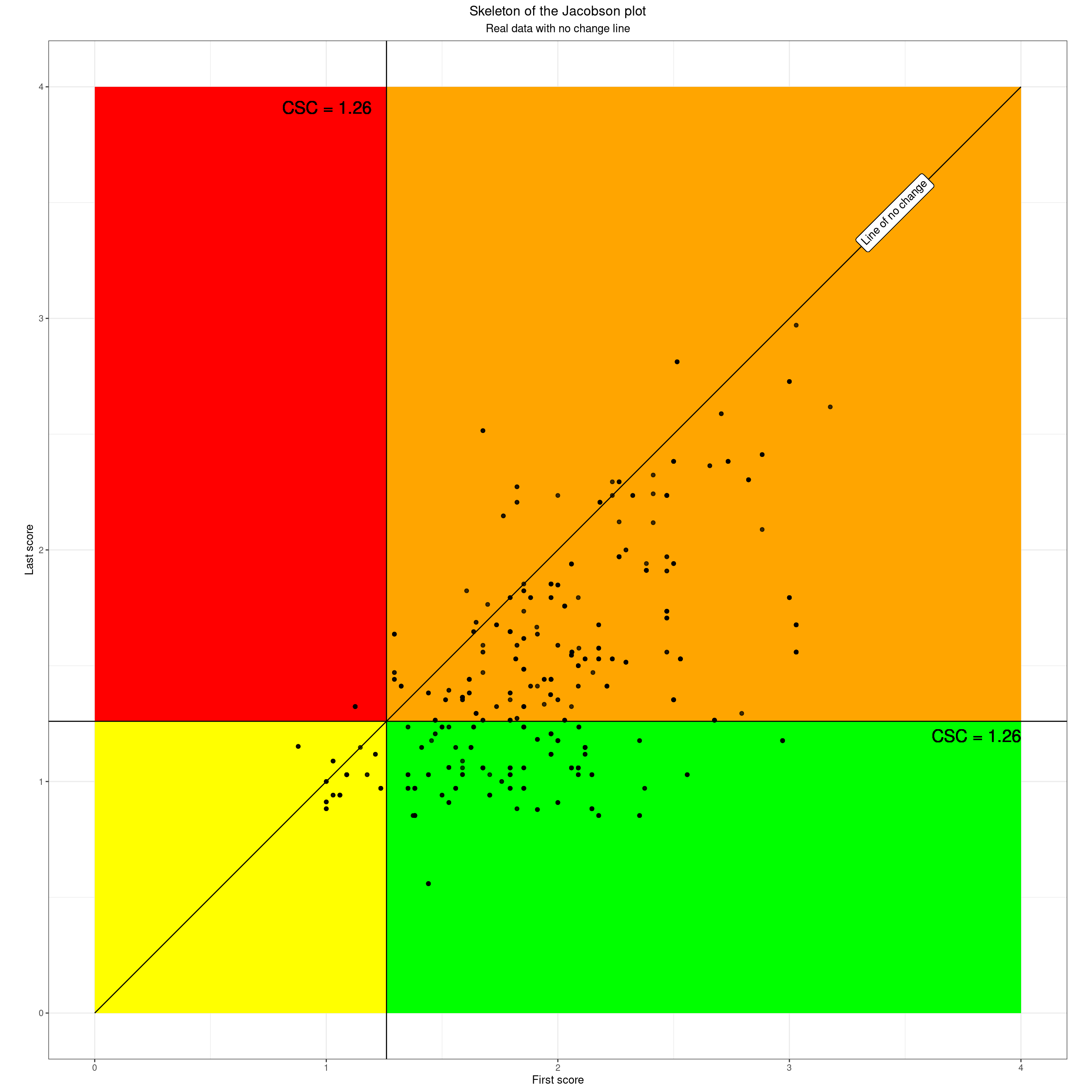
OK so we can now see that the emerging Jacobson plot contextualises each client’s start and finish scores into the quadrants and adding the no change line clarifies which people showed no change (here there are five) with the same starting and ending scores and lying on that no change line.
However, just being reminded that points lying exactly on that line had exactly the same first and last scores would add little to our understanding of our data. Fortunately, there is more to the Jacobson plot. The next important aspect of the Jacobson plot addresses the question of how much change is meaningful. There are no perfect answers to this, just as there are no perfect ways to set the CSC cutting point, but the Jacobson plot uses a method called the Reliable Change Index (RCI). This was where there was the error in the original paper, leaving out the square root of two, sqrt(2) in R code, or 1.414 to three decimal places so making the criterion quite a bit easier to exceed than it is. The beauty of the method is that it allows us to add “tramlines” either side of the no change line like this.
Show code
ggplot(tibData,
       aes(x = firstScore,
           y = lastScore,
           shape = RCIchange,
           colour = RCIchange,
           fill = RCIchange)) +
  ### put in CSC lines
  geom_vline(xintercept = csc) +
  geom_hline(yintercept = csc) +
  ### add leading diagonal of no change
  geom_abline(slope = 1, intercept = 0) +
  ### add RCI tramlines
  geom_abline(slope = 1, intercept = -rci) +
  geom_abline(slope = 1, intercept = rci) +
  ### axis labels
  xlab("First score") +
  ylab("Last score") +
  ### scales
  ### need to change or remove these if doing monochrome version
  scale_color_manual(values = vecColoursRCI, name = "Reliable Change Index") +
  scale_fill_manual(values = vecColoursRCI, name = "Reliable Change Index") +
  scale_shape_manual(values = vecShapesRCI, name = "Reliable Change Index") +
  scale_x_continuous(limits = c(0, 4), expand = c(0,0) ) +
  scale_y_continuous(limits = c(0, 4), expand = c(0,0) ) +
  scale_size(guide="none") +
  ### theme
  theme_bw() +
  ### crucial setting to get square plot
  theme(aspect.ratio = 1)
Those tramlines are where the change was less than the RCI, here a change of less than 0.398 and it tells us that this amount of change could very possibly have arisen simply from the fact that all our measures are imperfect: “unreliable” in psychometric jargon. Strictly the RCI says that given the unreliability of the particular measure used and the scatter of the starting scores you would expect 95% of the changes to lie within those tramlines *had nothing else been impinging” … including had therapy had no impact.
So now we can colour areas in terms of the level of change.
Show code
data.frame(x = c(0, 0, valMaxPoss - rci, valMaxPoss - rci),
           y = c(rci, valMaxPoss, valMaxPoss, valMaxPoss)) -> datRelDetVertices
data.frame(x = c(rci, valMaxPoss, valMaxPoss),
           y = c(0, valMaxPoss - rci, 0)) -> datRelImpVertices

### create data frame for the RCI tramlines
datTramlineVertices <- data.frame(x = c(0, 0, rci, 4, 4, 4 - rci),
                           y = c(rci, 0, 0, 4 - rci, 4, 4))
### create data frame for the recovered area of the plot
datRecoveredVertices <- data.frame(x =c(csc, csc, 4, 4, csc + rci),
                            y = c(csc - rci, 0, 0, csc, csc))
c("Reliable deterioration" = 24,
  "No reliable change" = 22,
  "Reliable improvement" = 25) -> vecShapesRCI

c("Reliable deterioration" = "black",
  "No reliable change" = "grey70",
  "Reliable improvement" = "grey45") -> vecColoursRCI

ggplot(tibData,
       aes(x = firstScore,
           y = lastScore,
           shape = RCIchange,
           colour = RCIchange,
           fill = RCIchange)) +
  ### add reliable change polygons
  geom_polygon(inherit.aes = FALSE,
               data = datRelDetVertices,
               aes(x = x, y = y),
               fill = "red") +
  geom_polygon(inherit.aes = FALSE,
               data = datRelImpVertices,
               aes(x = x, y = y),
               fill = "green") +
  ### put in CSC lines
  geom_vline(xintercept = csc) +
  geom_hline(yintercept = csc) +
  ### add leading diagonal of no change
  geom_abline(slope = 1, intercept = 0) +
  ### add RCI tramlines
  geom_abline(slope = 1, intercept = -rci) +
  geom_abline(slope = 1, intercept = rci) +
  ### axis labels
  xlab("First score") +
  ylab("Last score") +
  ### scales
  ### need to change or remove these if doing monochrome version
  scale_color_manual(values = vecColoursRCI, name = "Reliable Change Index") +
  scale_fill_manual(values = vecColoursRCI, name = "Reliable Change Index") +
  scale_shape_manual(values = vecShapesRCI, name = "Reliable Change Index") +
  scale_x_continuous(limits = c(0, 4), expand = c(0,0) ) +
  scale_y_continuous(limits = c(0, 4), expand = c(0,0) ) +
  scale_size(guide="none") +
  ### theme
  theme_bw() +
  ### crucial setting to get square plot
  theme(aspect.ratio = 1)
So here is the same with the real data.
Show code
ggplot(tibData,
       aes(x = firstScore,
           y = lastScore,
           shape = RCIchange,
           colour = RCIchange,
           fill = RCIchange)) +
  ### add reliable change polygons
  geom_polygon(inherit.aes = FALSE,
               data = datRelDetVertices,
               aes(x = x, y = y),
               fill = "red") +
  geom_polygon(inherit.aes = FALSE,
               data = datRelImpVertices,
               aes(x = x, y = y),
               fill = "green") +
  ### put in CSC lines
  geom_vline(xintercept = csc) +
  geom_hline(yintercept = csc) +
  ### add leading diagonal of no change
  geom_abline(slope = 1, intercept = 0) +
  ### add RCI tramlines
  geom_abline(slope = 1, intercept = -rci) +
  geom_abline(slope = 1, intercept = rci) +
  geom_point(alpha = .5) +
  ### axis labels
  xlab("First score") +
  ylab("Last score") +
  ### scales
  ### need to change or remove these if doing monochrome version
  scale_color_manual(values = vecColoursRCI, name = "Reliable Change Index") +
  scale_fill_manual(values = vecColoursRCI, name = "Reliable Change Index") +
  scale_shape_manual(values = vecShapesRCI, name = "Reliable Change Index") +
  scale_x_continuous(limits = c(0, 4), expand = c(0,0) ) +
  scale_y_continuous(limits = c(0, 4), expand = c(0,0) ) +
  scale_size(guide="none") +
  ### theme
  theme_bw() +
  ### crucial setting to get square plot
  theme(aspect.ratio = 1)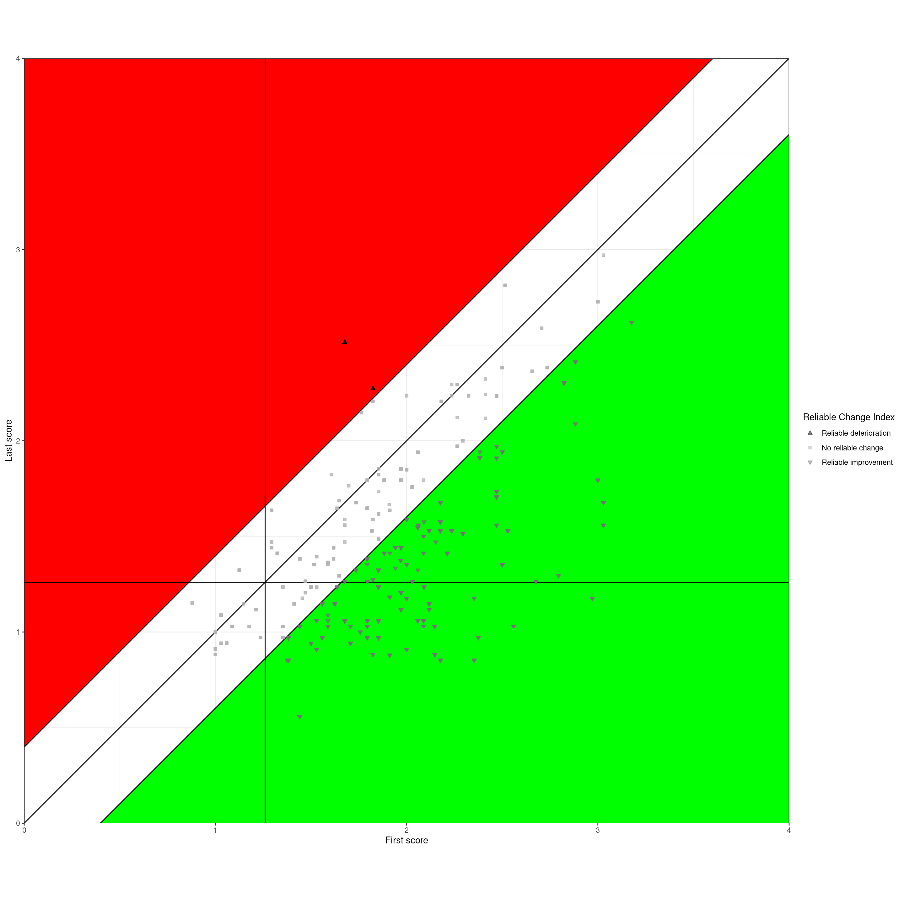
Not infrequently the three reliable change categories are tabulated.
Show code
tibData %>%
  filter(occasion == 1) %>%
  select(id, RCIchange) %>%
  tabyl(RCIchange) %>%
  adorn_pct_formatting(digits = 1) %>%
  flextable() %>%
  bg(i = 1, j = 1:3, bg = "red") %>%
  bg(i = 2, j = 1:3, bg = "grey") %>%
  bg(i = 3, j = 1:3, bg = "green")
RCIchange | n | percent |
|---|---|---|
Reliable deterioration | 2 | 1.1% |
No reliable change | 83 | 45.6% |
Reliable improvement | 97 | 53.3% |
Dual plot: trajectory plot and Jacobson
This next plot recaps on how the Jacobson plot is formed from the first and last scores. I have taken a few clients from different areas of the Jacobson plot. The left hand plot shows their start and finish scores as a very simple “cat’s cradle plot” and the same clients’ scores are shown on the Jacobson plot on the right so you can map between the two plots.
Show code
### To create a spurious ID code (probably excessive anonymisation)
### create tibble of the numbers from 1 to the number of clients in the data
valNtot <- n_distinct(tibData$id)
1:valNtot %>%
  as_tibble() %>%
  ### randomise those
  mutate(id2 = sample(value, valNtot)) -> tmpIDs ### checking ### count(id2) %>% count(n)

### I want an example from within each change category
tibData %>%
  filter(occasion == 1) %>%
  ### now merge in the CSC categories
  select(-c(firstScore, lastScore)) %>% # they get reinserted by the left_join()
  left_join(tmpTibCSC, by = "id") %>%
  ### create a spurious ID code (probably excessive anonymisation)
  mutate(id2 = tmpIDs$id2) %>% ### checking ### count(id2) %>% count(n)
  ### get rid of old ID codes
  select(-id) %>%
  mutate(absChange = abs(firstLastChange)) %>%
  select(id2, firstScore, lastScore, firstLastChange, absChange, occasion, RCIchange, CSCchangeCategory) %>%
  ### get for each RCSC category
  group_by(RCIchange, CSCchangeCategory) %>%
  mutate(minChange = min(firstLastChange),
         maxChange = max(firstLastChange),
         maxAbsChange = max(absChange)) %>%
  ungroup() %>%
  filter(absChange == maxAbsChange) -> tmpTib2

### obsessionall, purge tmpIDs
rm(tmpIDs)

### pivot longer to get a simple cat's cradle plot
tmpTib2 %>%
  select(id2, firstScore, lastScore) %>%
  pivot_longer(cols = -id2, names_to = "whichOcc", values_to = "score") %>%
  ### clean up occasion name and get numeric code for it
  mutate(whichOcc = str_to_sentence(whichOcc),
         whichOcc = str_replace(whichOcc, fixed("score"), ""),
         whichOccN = if_else(whichOcc == "First", 1, 2)) -> tmpTib2long

### using tribble() to create polygon vertices, nicer than my earlier method
tribble(~x, ~y,
        .9, 0,
        .9, csc,
        2.1, csc,
        2.1, 0) -> tmpTibLowVertices

tribble(~x, ~y,
        .9, csc,
        .9, valMaxPoss,
        2.1, valMaxPoss,
        2.1, csc) -> tmpTibHighVertices

ggplot(data = tmpTib2long,
       aes(x = whichOccN, y = score,
           group = id2)) +
  ### colour the plot area
  geom_hline(yintercept = csc) +
  geom_polygon(inherit.aes = FALSE,
               data = tmpTibLowVertices,
               aes(x = x, y = y),
                fill = "green") +
  geom_polygon(inherit.aes = FALSE,
               data = tmpTibHighVertices,
               aes(x = x, y = y),
                fill = "red") +
  geom_point() +
  ### now label the points with their id2 values
  ### rather clumsy to get justification different for first and last points
  geom_text(data = filter(tmpTib2long, whichOcc == "First"),
            aes(label = id2),
            colour = "black",
            size = 6,
            hjust = 1,
            nudge_x = -.02,
            size = 4) +
  ### but actually I dropped these labels on the last scores
  # geom_text(data = filter(tmpTib2long, whichOcc == "Last"),
  #           aes(label = id2),
  #           colour = "black",
  #           size = 6,
  #           hjust = 0,
  #           nudge_x = .02,
  #           size = 4) +
  geom_line() +
  ylim(c(0, 4)) +
  ylab("Score") +
  xlab("Occasion") +
  ### colour RCI categories of improvement
  scale_color_manual(values = vecColoursRCI) +
  scale_x_continuous(breaks = 1:2,
                     limits = c(.90, 2.1),
                     labels = c("First", "Last")) +
  theme(legend.position = "none") +
  theme(aspect.ratio = 1) -> ggplot1

tribble(~x, ~y,
        rci, 0,
        csc, csc - rci,
        csc, 0) -> tibRelImpStayedLow

tribble(~x, ~y,
        csc + rci,csc,
        valMaxPoss, valMaxPoss - rci,
        valMaxPoss, csc) -> tibRelImpStayedHigh

tribble(~x, ~y,
       csc, 0,
       csc, csc - rci,
       csc + rci, csc,
       valMaxPoss, csc,
       valMaxPoss, 0) -> tibRelClinSig

ggplot(tmpTib2,
       aes(x = firstScore,
           y = lastScore)) +
  ### add reliable change polygons
  geom_polygon(inherit.aes = FALSE,
               data = tibRelImpStayedLow,
               aes(x = x, y = y),
               fill = "yellow") +
  geom_polygon(inherit.aes = FALSE,
               data = tibRelClinSig,
               aes(x = x, y = y),
               fill = "green") +
  geom_polygon(inherit.aes = FALSE,
               data = tibRelImpStayedHigh,
               aes(x = x, y = y),
               fill = "#8BC34A") +
  geom_polygon(inherit.aes = FALSE,
               data = datRelDetVertices,
               aes(x = x, y = y),
               fill = "red") +
  ### put in CSC lines
  geom_vline(xintercept = csc) +
  geom_hline(yintercept = csc) +
  ### no change line
  geom_segment(inherit.aes = FALSE,
               x = valMinPoss, xend = valMaxPoss, y = valMinPoss, yend = valMaxPoss) +
  ### upper tramline
  geom_segment(inherit.aes = FALSE,
               x = valMinPoss, xend = valMaxPoss - rci, y = valMinPoss + rci, yend = valMaxPoss) +
  ### lower tramline
  geom_segment(inherit.aes = FALSE,
               x = valMinPoss + rci, xend = valMaxPoss, y = valMinPoss, yend = valMaxPoss - rci) +
  geom_point() +
  geom_text(aes(label = id2),
            colour = "black",
            size = 6,
            hjust = 0,
            nudge_x = .03,
            size = 3) +
  ### axis labels
  xlab("First score") +
  ylab("Last score") +
  ### scales
  scale_x_continuous(limits = c(0, 4)) +
  scale_y_continuous(limits = c(0, 4)) +
  scale_size(guide="none") +
  ### theme
  theme_bw() +
  ### crucial setting to get square plot
  theme(aspect.ratio = 1) -> ggplot2

### patchwork is a package in the tidyverse that allows you to combine ggplot grobs
### with hindsight I could have done this with cowplot or ggextra::grid()
library(patchwork)
ggplot1 + ggplot2 -> patchwork1

patchwork1 +
  plot_annotation(title = "Selected data in a cat's cradle plot (left) and in a Jacobson plot (right)",
                  theme = theme(plot.title = element_text(size = 20)))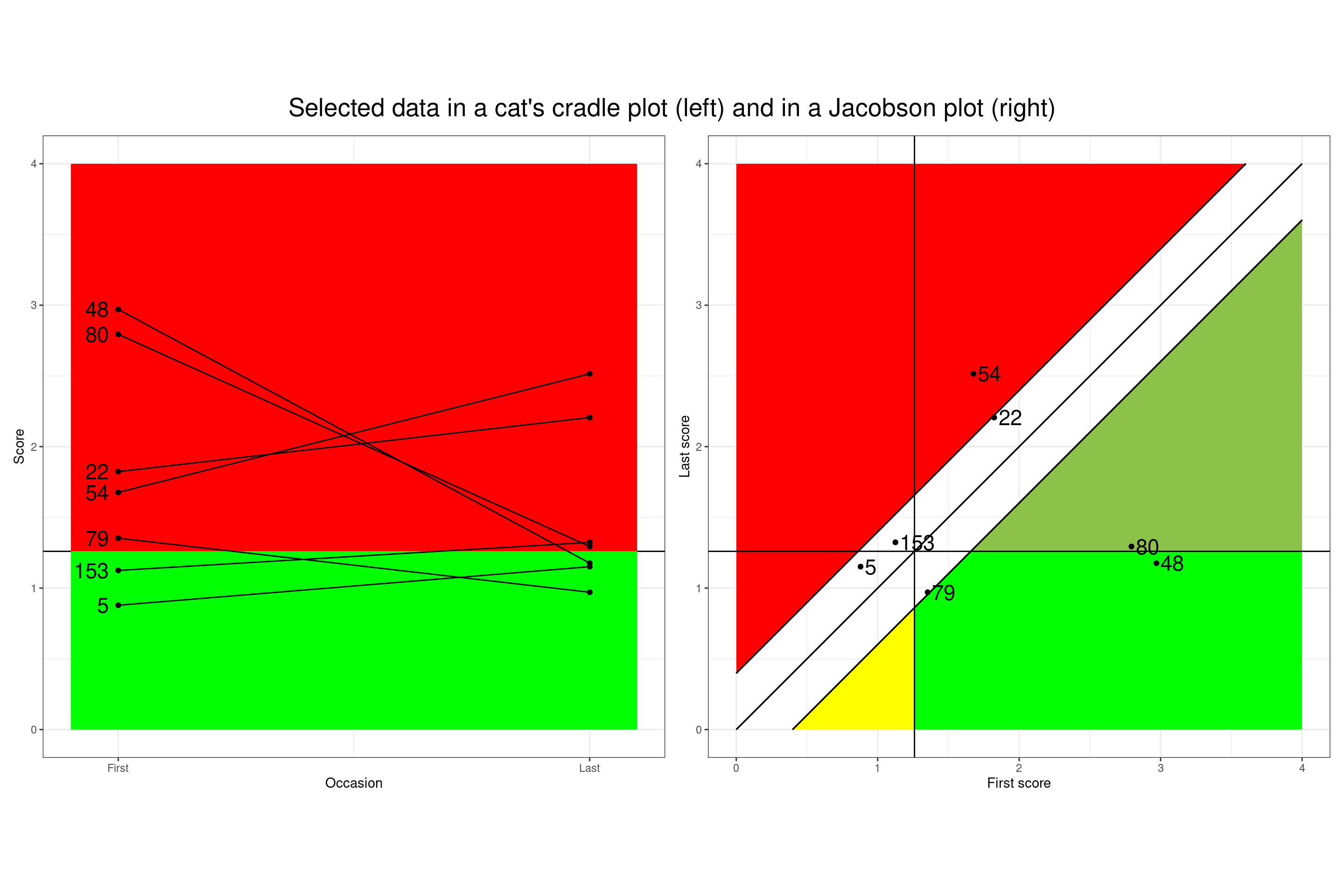
Reading from the top left in the cat’s cradle plot, that client showed a dramatic improvement in score, from above the CSC to just below it and you can see how that maps into the Jacobson plot from the ID code (I can’t reference the ID codes here as I have, ultra obsessionally, randomised them). The next from the top again shows a large score drop but stays above the CSC so mapping to a different quadrant … and so on.
Typical Jacobson summary table
And the tabulation most often give is the full Jacobson table of clinical change and reliable change.
Show code
tibData %>%
  filter(occasion == 1) %>%
  select(id, RCIchange) %>%
  left_join(tmpTibCSC, by = "id") %>%
  mutate(CSCchangeCategory = ordered(CSCchangeCategory,
                                     levels = c("Clinically deteriorated",
                                                "Stayed low",
                                                "Stayed high",
                                                "Clinically improved"),
                                     labels = c("Clinically deteriorated",
                                                "Stayed low",
                                                "Stayed high",
                                                "Clinically improved"))) %>%
  tabyl(CSCchangeCategory, RCIchange) %>%
  adorn_totals(where = c("row", "col")) %>%
  adorn_percentages(denominator = "all") %>%
  adorn_pct_formatting(digits = 1) %>%
  adorn_ns() %>%
  flextable() %>%
  ### this is a way that flextable allows you to reset the contents of individual cells
  flextable::compose(i = 1, j = 4, as_paragraph(as_chunk(''))) %>%
  flextable::compose(i = 4, j = 2, as_paragraph(as_chunk(''))) %>%
  bg(i = 1, j = 2, bg = "red") %>%
  bg(i = 4, j = 4, bg = "green") %>%
  bg(i = 1:4, j = 3, bg = "grey") %>%
  bg(i = 2:3, j = 4, bg = "#8BC34A") %>%
  bg(i = 2:3, j = 2, bg = "#EF6C00")
CSCchangeCategory | Reliable deterioration | No reliable change | Reliable improvement | Total |
|---|---|---|---|---|
Clinically deteriorated | 0.0% (0) | 0.5% (1) | 0.5% (1) | |
Stayed low | 0.0% (0) | 6.6% (12) | 0.0% (0) | 6.6% (12) |
Stayed high | 1.1% (2) | 34.1% (62) | 26.9% (49) | 62.1% (113) |
Clinically improved | 4.4% (8) | 26.4% (48) | 30.8% (56) | |
Total | 1.1% (2) | 45.6% (83) | 53.3% (97) | 100.0% (182) |
The blank cells are logically impossible: no-one can show reliable improvement and clinical deterioration nor vice versa.
Final Jacobson plot
This next plot shows a five area (five polygon if you’re feeling geometrical) summary of our data.
Show code
ggplot(tibData,
       aes(x = firstScore,
           y = lastScore,
           shape = RCIchange,
           colour = RCIchange,
           fill = RCIchange)) +
  ### add reliable change polygons
  geom_polygon(inherit.aes = FALSE,
               data = tibRelImpStayedLow,
               aes(x = x, y = y),
               fill = "yellow") +
  geom_polygon(inherit.aes = FALSE,
               data = tibRelClinSig,
               aes(x = x, y = y),
               fill = "green") +
  geom_polygon(inherit.aes = FALSE,
               data = tibRelImpStayedHigh,
               aes(x = x, y = y),
               fill = "#8BC34A") +
  geom_polygon(inherit.aes = FALSE,
               data = datRelDetVertices,
               aes(x = x, y = y),
               fill = "red") +
  ### put in CSC lines
  geom_vline(xintercept = csc) +
  geom_hline(yintercept = csc) +
  ### add leading diagonal of no change
  geom_abline(slope = 1, intercept = 0) +
  ### add RCI tramlines
  geom_abline(slope = 1, intercept = -rci) +
  geom_abline(slope = 1, intercept = rci) +
  geom_point(alpha = .5) +
  ### axis labels
  xlab("First score") +
  ylab("Last score") +
  ### scales
  ### need to change or remove these if doing monochrome version
  scale_color_manual(values = vecColoursRCI, name = "Reliable Change Index") +
  scale_fill_manual(values = vecColoursRCI, name = "Reliable Change Index") +
  scale_shape_manual(values = vecShapesRCI, name = "Reliable Change Index") +
  scale_x_continuous(limits = c(0, 4), expand = c(0,0) ) +
  scale_y_continuous(limits = c(0, 4), expand = c(0,0) ) +
  scale_size(guide="none") +
  ### theme
  theme_bw() +
  ### crucial setting to get square plot
  theme(aspect.ratio = 1)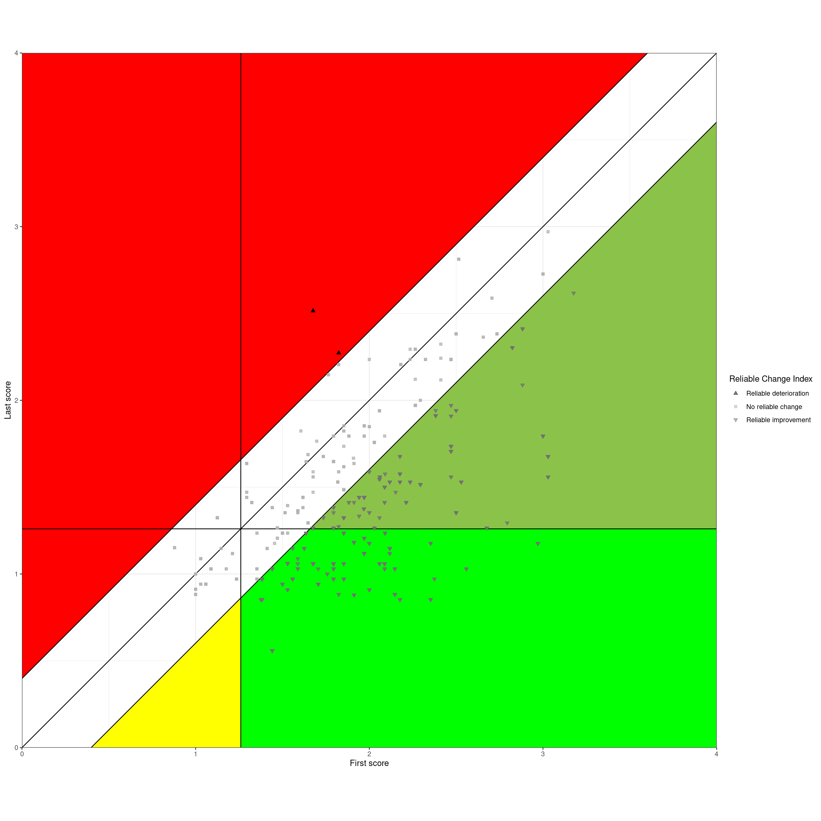
That shows these areas:
[White] No reliable change. The level of change fell within the tramlines, so the absolute change (i.e. ignoring the sign/direction of change) fell below the RCI, here 0.398.
[Red] Reliable deterioration. The scores got worse and by more than the RCI. Regardless of where the client started and finished on the measure, a therapist or service might want to think hard about these.
The next three all shows reliable improvement but fall into three groups:
[Pale green] Reliable improvement but stayed above the CSC. Clearly there can be many reasons for this but again, these bear some thought.
[Yellow] Reliable improvement but stayed below CSC. We didn’t have any of these but they certainly do occur, at least in services that don’t, utterly wrongly in my view, simply refuse to offer therapies to clients starting below the CSC. Clearly one important question is about why the starting score was below the CSC, were the client’s problems ones not covered well or at all by the measure used?
[Bright green] Reliable improvement and score moved from above the CSC to below it. “Reliable and clinical improvement” or “Clinical and reliable improvement”. These are now, e.g. in the UK IAPT programme, called “reliably recovered” a term I dislike for many reasons. Certainly these are good outcomes in terms of the measure used and that’s not nothing but even here it is probably wise for therapists/services to consider these clients. One way to conduct a service/therapist audit can be to look at the red reliable deterioration cases and an equal number of those in this reliably and clinically improved group, perhaps the ones who showed the greatest score improvement. That can help a case review audit becoming persecutory.
Summary
I hope this is useful for anyone puzzled by the RCSC framework and tabulations and the Jacobson plot. If you feel that there could be improvements do contact me and I’d be happy to discuss the issues and very happy to improve this.
I also hope that it may help people who understand the framework and plot but want code to implement it and find that that code is not readily available in statistics packages and not that easy to implement in spreadsheets (heaven forbid!) If you are in this category you will want to look at the next section about the code and I hope that better things, like functions that just do all this, will appear in CECPfuns and that online interactive shiny apps will follow those.
More generally I was struck going back to the basics myself that I think there are two viewpoints on the RCSC framework, or really, on the Jacobson plot:
It can be used simply to summarise bodies of first/last change data and generally that is just done by presenting the final table, or even by reducing this to counts of “reliably recovered” (ugh, horrible term).
Not to discourage a full RCSC table, there is much more that a service or therapist can get from looking at their Jacobson plot: it puts individual clients’ change into a very simple but actually very useful 2D map and allows people to think more about their clients in the context of all the other clients in the plot and the referential lines.
That could take us into some serious thinking about the CSC and even more about the RCI but I will keep that for other posts and, I hope, papers. I have touched on the issue of our scores being discrete not continuous not to open up the statistical issues that creates (which are not severe even for short measures) but to remind us of the realities of our data, which I think are often hidden in tabulations and plots.
We should always remember that these are just questionnaire scores: we should neither undervalue, nor overvalue them, striking that balance is an ongoing process for our field.
Notes on the code for users of R
I’m absolutely not a professional statistician nor a good programmer. As with all of my code I provide zero guarantees about it. If you find errors please tell me and I will fix it (and credit you somehow).
I now use R in the tidyverse way so the code may seem very strange if you don’t. Sorry, but it works for me.
Generally the style I use conforms to the typical tidyverse but there are few deviations, for instance I tend to prefix the names of objects with “tmp” if they are not intended to persist across code blocks and then I prefix with three letters describing the object: “val” for a value (i.e. a vector of length 1), “vec” for longer vectors and “tib” for a tibble.
I have peppered the code with comments, too many by the rules of formal style, but I think people likely to look at this code will be, like me, not trained R coders and they will probably appreciate the comments.
Looking forward things to add to the final code here for the tables and the plot include:
There were few overprinting clients with the same first and last scores in this dataset so I chose not to handle those. Clearly options are to jitter, use transparency or to use geom_count() to scale the points. No one of those is perfect for all datasets so best to allow for all three (and combinations of jittering and transparency?)
I have ignored gender but there can be situations in which gender, and age, change the CSC (or, in principle the RCI). Tables can be aggregate or separated by gender/age etc. but plots are a bit more complex.
If we only have referential data or binary gender can handle this with colour for points and lines, or shape and line type for monochrome. Can also facet by gender.
This gets more complicated if we ever have larger enough referential datasets to have three or more gender categories and it gets quite complicated for adolescents where the CSC and the RCI may vary quite markedly with both age, down to year, and gender. That needs a lookup table for the CSC and RCI and I think facetting becomes the only realistic way to plot things.
Update history of this post
* 17.iv.24 Tweaks to add copying to clipboard, visit counter and automatic “last updated” line
* 13.viii.23: Updated to add categories to the post.
* 15.vi.23: Updated to add citations and references.
* 14.vi.23: Updated to improve labelling in plots.
free web counter