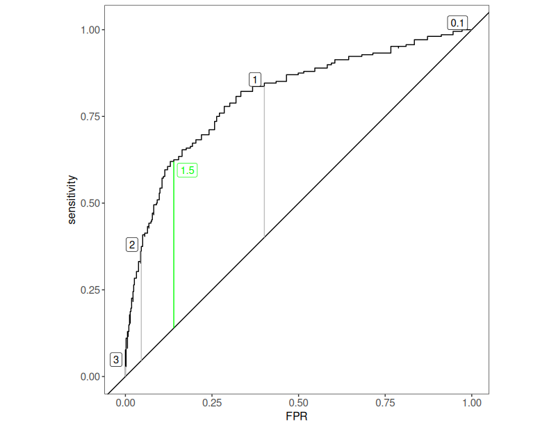
This is a mapping of the discrimation achieved using different cutting points along the range of possible values. Like this:
Details #
OK. That needs a bit of unpacking. That was created using data for the CORE-OM total score from Blerta Bodinaku’s excellent psychometric exploration of the Albanian translation. The criterion is not some rater judgement of whether the participant was a “case” or a “non-case” but whether they were from the sample of people attending mental health services versus those from a carefully balanced dataset of members of the general population in Tirana.
The plot, which I have cooked up in R for the glossary, does what all ROC plots do: it plots the sensitivity for each cutting point possible, against the “FPR”: false positive rate, i.e. 1 – specificity so the proportion of participants in the general population dataset who scored above the potential cutting point: “false positives”.
We were scoring the CORE-OM using the mean scoring so the possible range of scores was from zero to four. The observed range across the entire dataset was from .06 to 3.65, the range for the general population members was from .06 to 3.00 and for the service users was from .18 to 3.65.
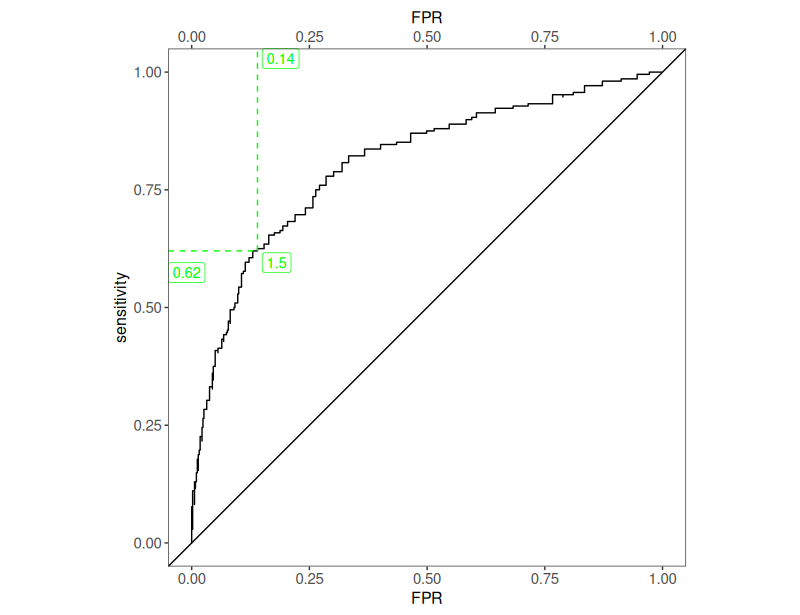
You would like to minimise the numbers of false positives as, particularly if the problem you are screening for is rare, you will be swamped by false positives if you are using the measures, the CORE-OM total score here, as a screening measure. If you, reductio ad absurdum, set the cutting point as over 4 (I did say reductio ad absurdum!) then no-one can score that high on the measure so you will have no false positives but you will have no true positives either. That’s the curve starting at the bottom left with zero FPR but zero sensitivity. If you go to the opposite extreme and set the cutting point to below zero you you will have perfect sensitivity as everyone scores more than this, however, you have zero specificity and a 100% FPR: the top end of the curve. What you are interesting in finding a good cutting point between those silly extremes. The grey vertical lines I have plotted show what you get for cutting points of .1, 1, 2 and 3. The green line marks the cutting point that maximises the difference between the sensitivity and the FPR and for these data that is at a cutting point of 1.5 and this, slightly changed version of the ROC plot shows that that cutting point gets you a sensitivity of only .62, i.e. 62% of “potential help seekers” being identified, and an FPR, False Positive Rate of .14, i.e. 14% of those in the general population score over that.
Incidentally, the length of these vertical lines between the curve and that leading diagonal are known as Youden’s index.
Based on these data, the Albanian CORE-OM on its own is not a good screening instrument for use in Albania. (The CORE-OM was never intended to be used as a screening measure!)
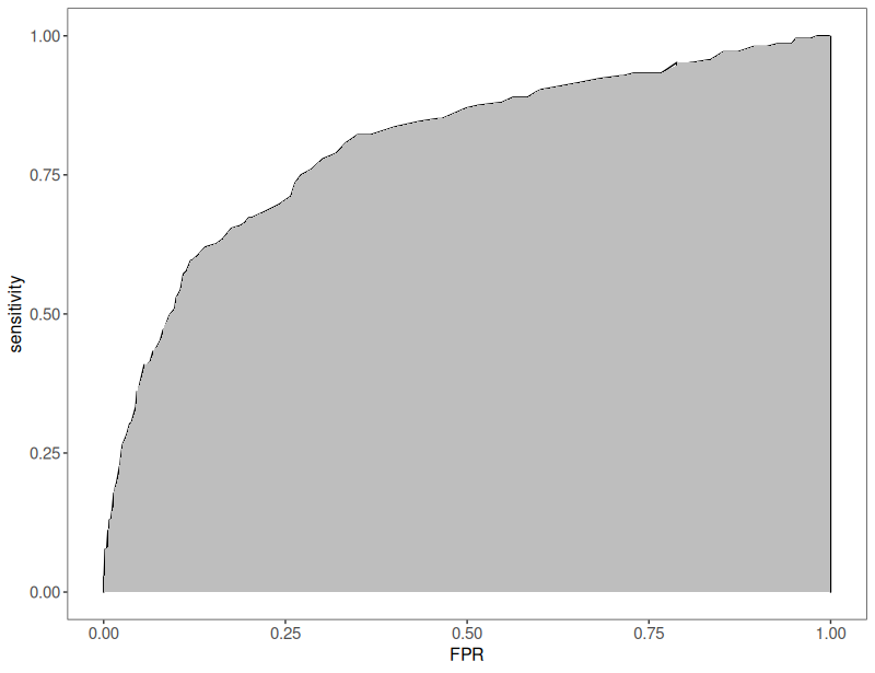
One important statistic comes out of the ROC: the area under the curve. Here it is .80 and here is that area shaded in the plot.
Try also #
- Cutting points
- False Positive Rate (FPR)
- Screening
- Sensitivity
- Specificity
- True positive rate (TPR = Sensitivity)
- Youden’s index
Chapters #
Not covered in the OMbook.
Online resources #
None currently.
Dates #
First created 20.vii.25.

