The idea comes out of medicine. Paradigmatic historical examples include the Guthrie heel prick test for phenylketonuria (PKU) and chest X-ray screening high risk populations such as miners in mid-20th Century UK for TB. The first allowed definitive identification of the few children who would grow up with severe intellectual disabilities if their PKU was not recognised early after birth. Starting them immediately on a (horrible) diet could completely prevent the brain damage caused because they couldn’t metabolise phenylalanine (an amino acid in most proteins). If they don’t get phenylalanine in their diet the toxicity of unmetabolised phenylalanine. The benefits outweighed the costs of the test being done all newborn babies. The second allowed the early TB to be treated as antibiotics effective against TB emerged.
The other use of screening is to replace a quick and affordable test with the definitive test but then perhaps to filter people scoring above a criterion on the quick (screening) test on towards the better but more costly or inconvenient test. Using a spot blood glucose estimation to screen for diabetes but then using a fasting glucose level if the spot glucose is above a certain value is one (probably out of date) example of that sort of screening from physical medicine.
Details #
One obvious issue is that screening works well when it’s easy to have a binary classification of the problem, in those examples PKU really is a binary: one either has the enzyme to digest phenylalanine or one doesn’t, pulmonary TB is more complex as there are grades of it but at the time when that screening was used the difference between visible X-ray evidence of TB and it not being visible (though perhaps many who were screened still carried the bacterium) was clear enough and the benefits of treatment regardless of the grade of the TB were clear. That brings us to the second issue: there has to be an intervention that can help.
For binary conditions screening gives us a 2×2 table which shows how the screening works for a given prevalence of the problem and sensitivity and specificity of the screening tool. The four values in the table are the number (or rate) of true positives, false positives, true negatives and false positives. See this app to play with creating screening tables for yourself. Here’s an example that’s a screenshot from that app.
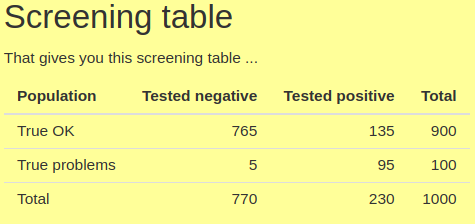
Sensitivity, the proportion of those with the problem in the population that the screening tool identifies, i.e. who score above some cut off on the tool tends to be very much in people’s minds when they think of a good screening tool. Here it’s a very high value for MH screening measures: .95 (as we can see as 95 of the 100 people with the problem scored positively on the measure). However, there is always a pay off: a measure (or cut-off point on a measure) with high sensitivity will have lower specificity than if the cut-off is set to reduce sensitivity. Specificity is the proportion of those who truly don’t have the the problem identified as such by the tool. Here it’s .85 (= 765/900). The catch with pushing sensitivity up and specificity down, particularly if the problem is not very prevalent, here .1, i.e. 10% , is that the number of false positives coming out of the screening can come to outnumber the true positives as we can see here with only 95 true positives and 135 false positives.
In many ways the two screening parameters:
(1) PPV, the positive predictive value of the screening tool given the prevalence, i.e. the proportion of those scoring above the cut off. Here it’s 4 = 95/230;
(2) and the NPV: the proportion of those scoring below the cut off who really don’t have the problem, here .99 = 765/770 (actually .99351)
are the important values, not the sensitivity and specificity of the screening tool.
An acronym that helps remember the implications of the screening properties of the tool is “SPIN and SNOUT” for ‘Specific test when Positive rules IN the disease’ and ‘Sensitive test when Negative rules OUT the disease’. Though this is very much a function of the prevalence of the problem: go and play with the app and see that for numbers you choose.
In physical medicine screening has moved on from binary, or effectively binary states to graded states such as risk of future heart attack and/or stroke and the presence of hypertension, or risk of the same based on blood tests (“blood lipid profile”) and other variables including obesity and lifestyle choices such as diet, exercise, smoking and alcohol consumption.
This takes us from simple sensitivity and specificity for a single cutting point on screening test with continuous scores to each score having a likelihood ratio (q.v.).
Even in physical medicine getting the evidence that screening’s benefits outweigh its costs as the ambition moves to these more complex scenarios remains a real challenge. There are real issues moving the screening idea over from binary problem categories and 2×2 tables.
Try also #
False/true negatives
False/true positives
Likelihood ratio
Modelling
NPV (Negative Predictive Value)
PPV (Positive Predictive Value)
Sensitivity
SpIn and SnOut
Specificity
Measure length
Chapters #
Not covered in the OMbook.
Online resources #
I now have a shiny app modelling the simple 2×2 screening table. Go there and see how tweaking the prevalence, sensitivity and specificity figures for a screening situation affect the PPV and NPV.
Dates #
First created 23.viii.23.

