Three months into 2026 and time to try to review where I am with my non-CORE work. As ever with me, this is a mix of looking back, looking further back and looking forward. I am slowly moving forward and trying to achieve more work outside the dominant grant funded and peer-review publication driven research world in our field.
Short view back: so far in 2026!
No peer-reviewed papers out. I can plead it’s been a tough six months personally and if anyone is interested in that have a look at my three posts in my personal site covering that: here, here and here. Having said that, Clara and I have a couple of OK papers out in review stages and we two more that I’ll be very proud of if they do get published. However, in my last post here, my review of 2025, I said:
“One reason I am a bit vague about my paper output is that I’ve become increasingly conscious of the problems of the 21st Century research/academic world being so organised around peer-reviewed journal publication and I’ve been trying to give more of my time and energy to creating other resources …“
And that remains true. I’m increasingly convinced that this research world, as it impinges on psychosocial interventions, is not how we should be working and is structured to keep moving away from what we need. I hope to be arguing more of that in the second half of 2026 with luck, but for now I’ll just summarise where I am getting to with the things I am trying to do that are outside that peer-reviewed publication driven world: the glossary to the “OMbook” that Jo-anne and got out in 2023, my “Rblog“, my shiny apps and, for the geeks, my R package: CECPfuns.
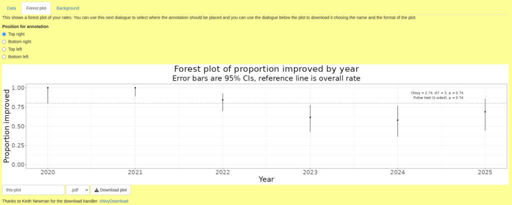
I’ve added nothing to the CECPfuns package in 2026, however the glossary has 22 new entries taking it to 437. The Rblog is only up by another one entry about weighted kappa (there’s another that seems to be broken and I haven’t had time to debug that!). I have only added one shiny app so far this year. That gives you a forest plot of rates if you give it your data. Here’s a small example.
Some time this year I noticed that back in 1998 I had added this to a forerunner of my shiny apps.
“Final caveat Always remember that measures only measure part of the human condition and don’t always do that well. Such methods should always be used in parallel with other ways of reviewing clinical work.“
I like that: short, important and to the point! It also touches one of the ways that I think our research world, at least in the global north, has lost its way. When I scan the journals, the Society for Psychotherapy Research conference presentations and the alerts that I get of new papers out from some of the leading researchers that I still follow I am sure we have lost our way. One issue, but not the main one, is that it is all so quantitative. My main research skills are quantitative so why am I criticising this? Because of that caution above that I felt the need to write nearly 30 years ago. We need quantitative research but it needs to be self-critical, to discuss its findings with some humility and more than just tokenistic reviews of the limitations. That’s not what I am seeing. I hope to be doing more, including in peer-reviewed papers, and in my other resources, to articulate these issues.
Looking forward: Q3 and Q4 of 2026
So that takes me nicely to looking forward: to where I hope to be working in the second half of this year. The eagle eyed among you will immediately ask “what about Q2?!” … well I hope to be moving house, switching my “semigration” base in France from up in the Alps to the Charente (I hope). If all the formalities and legalities go to plan that should happen in May and I am telling myself that if I put most of my energies in Q2 into relocating and reorienting myself then I will achieve more beyond that. Fingers crossed!
Wow I really haven’t been posting here have I?! I see that I started quite a substantial post back in May but never came back to it. Looking at it now I think I decided it was getting dangerously closer to being a draft paper rather than a blog post. OK, 2025 was a difficult year for me, my personal blog post here summarises that for anyone interested in back stories. That did impact on my work and particularly on the non-CORE work that I try to focus on here. I am interested, having spent an hour or so collating this, to feel that it’s not so shabby a package of work. That wasn’t what I felt as I started on this!
Papers
I think I got out six peer-reviewed papers but I think it says much about 2025 that I’m not 100% certain that that’s the full count! Anyway, here are the ones I’m sure of!
Areas, M., Varela, C., Roussos, A. J., Paz, C., Evans, C., & Gómez Penedo, J. M. (2025). Propiedades psicométricas del Clinical Outcomes in Routine Evaluation (CORE-10) en Argentina. Revista Argentina de Ciencias Del Comportamiento, 17(1), 61–71. https://doi.org/10.32348/1852.4206.v17.n1.37272
Paz, C., Saúl, L. Á., Lafuente, P. R., & Evans, C. (2025). Psychometric properties and score distributions of the Clinical Outcomes in Routine Evaluation measures within a non-help-seeking population from Spain. Psicologia: Reflexão e Crítica, 38(1), 25. https://doi.org/10.1186/s41155-025-00341-6
Paz, C., Unda-López, A., Valdiviezo-Oña, J., Fernando Chávez, J., Elias Herrera Criollo, J., Toscano-Molina, L., & Evans, C. (2025). Mapping the growth of the CORE system tools in psychotherapy research from 1998 to 2021: Learning from historical evidence. Psychotherapy Research, 1–12. https://doi.org/10.1080/10503307.2025.2457389
Shahid, E., Suneel, I. S., & Evans, C. (2025). Standardized Outcomes Measure in Urdu – Clinical Outcomes in Routine Evaluation Outcome Measure – Translation, Cultural Challenges and Implications. Journal of Professional & Applied Psychology, 6(2), 175–192. https://doi.org/10.52053/jpap.v6i2.364
Valdiviezo-Oña, J., Evans, C., Montesano, A., March-Llanes, J., & Paz, C. (2025). Exploring the Psychometric Properties of the Systemic Clinical Outcome and Routine Evaluation-15 in a Psychotherapy Training Service in Ecuador. Collabra: Psychology, 11(1), 147246. https://doi.org/10.1525/collabra.147246
Zurita‐Calderón, S., Valdiviezo‐Oña, J., Evans, C., & Paz, C. (2025). What Stories Does Routine Outcome Monitoring Tell? Contrasting Psychological Distress Scores With In‐Therapy Narratives. Counselling and Psychotherapy Research, 25(2), e70023. https://doi.org/10.1002/capr.70023
If any of them is not open access do just contact me giving me the reference and I will send you a copy.
We did also publish what I think is my first dataverse dataset:
Valdiviezo-Oña, J., Evans, C., & Paz, C. (2025). Data for Exploring the psychometric properties of the Systemic Clinical Outcome and Routine Evaluation-15 in a psychotherapy training service in Ecuador (Version 1.1, pp. 557368, 2230412, 12171, 11916) [Application/vnd.openxmlformats-officedocument.spreadsheetml.sheet,text/tab-separated-values,application/vnd.openxmlformats-officedocument.spreadsheetml.sheet,application/vnd.openxmlformats-officedocument.spreadsheetml.sheet]. Harvard Dataverse. https://doi.org/10.7910/DVN/NRIAHH
Technically it’s a product of 2026 but I’m also pleased that I now have a page on this site (https://www.psyctc.org/psyctc/root/stats/datasets/) collecting together datasets that relate to my shiny apps and/or Rblog posts. That should become a genuinely useful resource.
One reason I am a bit vague about my paper output is that I’ve become increasingly conscious of the problems of the 21st Century research/academic world being so organised around peer-reviewed journal publication and I’ve been trying to give more of my time and energy to creating other resources so, continuing from last year’s review here are summaries of what I’ve achieved in the OMbook glossary, the Rblog, my shiny apps and the CECPfuns R package.
I seem to have added 75 entries taking the glossary from 340 to 415 entries. Do have a look at it and see if it’s a useful resource for you and perhaps for your colleagues and students. If you don’t know the “OMbook” (Evans, C., & Carlyle, J. (2021). Outcome measures and evaluation in counselling and psychotherapy (1st edn). SAGE Publishing. https://ombook.psyctc.org/book/) that spawned the glossary, do have a look at that. If you are teaching a course I think I an arrange for SAGE to give you a free evaluation copy.
The title is a bit misleading, I have employed a bit of the R project (https://www.r-project.org), specifically the distill package to create all of the posts and some are specifically about how to do things using R, however, others are opportunities to develop more extensive explanations of things than I could in the OMbook glossary and a few are about how to do IT technical things that don’t involve R at all. I seem to have added seven posts in 2025:
Autocorrelation: an explanation of what autocorrelation is and how it matters, there’s more to come on this in 2026.
Mapping dates to episodes: this is a pure R technique piece about how to handle the situation in which you have dates for data and start and finish dates for episodes and need to map the data, per participant, to the episodes and identify any that don’t map. A bit specific but it’s a challenge you might well meet using routine service data and R can make it very easy.
F-measure: ‘positive specific agreement’ index: another explanation. The F-measure was new to me, it’s an index of agreement when you have occasions/objects rated by two people and you can see when both agreed about the rating and when only one gave the rating but you can’t know how often neither rater gave the rating.
League tables: these can be very helpful but they can also be very dangerously misleading, this post unpacks and illustrates some of the issues.
Pseudonymisation and hashing ID values: another “howto” piece showing how easy it is to pseudonymise data using R. Vital to understand if you are taking data protection and confidentiality seriously.
Distribution overlays in ggplot: after_stat(), stat_function() and facets: another “howto” showing how to overlay things, for example a best Gaussian (“Normal”) distribution fit to a histogram and to be able to do this cleanly even when facetting the histogram by other variables. There are several ways to approach it.
Modelling the CTT RCI (Reliable Change Index): (CTT = Classical Test Theory). This is explanatory. I like the RCI and have been using it probably for over 30 years but it is widely misused and misundertood and those uses of it can be quite misleading, this illustrates some of the issues.
Weighted kappa: this is typical of an Rblog post that allows me to expand on and clarify entries in the OMbook glossary.
Although some glossary entries and Rblog posts evolve a bit this is much more the case for shiny apps particularly now I am getting more confident of my shiny programming and am developing more sophisticated and complex than I was. I am happy to have a new page on this site (https://www.psyctc.org/psyctc/root/stats/datasets/) that holds datasets useful for people wanting to play with some of these shiny apps before using the app on their own data. I think the other main things to index here are as follows.
The CORE papers search interface: this was created in 2024 but tweaked a bit in 2025 but is probably stable now unless anyone asks for changes.
App that generates hash codes for IDs: this impletements the hash coding described in the Rblog post (Pseudonymisation and hashing ID values) so it makes it easy for anyone to upload their own dataset (in various formats) and to pull down the data with the hashed/pseudonymised ID codes. I think this may be the first example of an app that really does make it easy for someone to do something useful that they might otherwise have found impossible.
App that analyses datasets of one or two YP-CORE scores: another genuinely useful app I’d say. As that says it can take data with one or two (start/finish) YP-CORE scores from a few or many participants and gives analyses of the sociodemographics (if you had them), breakdowns by therapist (if multiple therapists), attendance breakdowns (if you …), score distributions and summaries and various analyses of change including RCSC categorisation and the Jacobson plot. This is an app that will definitely evolve and it will be complemented by another that will handle arbitrary numbers of YP-CORE completions per participant.
An app that scores CORE-OM item data: this takes an Excel file of the format I created to score CORE-OM data collected with Microsoft forms. This is proof of concept really and should be followed by apps allowing CORE-OM, and then other CORE measures’ item scores to be uploaded and scored. It gives all the CORE-OM scores including the CORE-6D utility score and also gives the scores for the embedded items of all the shorter adult measures that are derived from the CORE-OM.
App that gives correct overall (and non-risk) scores for the CORE-OM if you only have mean domain scores (and no missing data). I created this for an English NHS Trust where their software scored the CORE-OM returning mean domain scores but no overall or non-risk score. Simply taking the mean of the domain scores gives potentially quite incorrect overall and non-risk scores because of the varying numbers of items per domain and the arithmetic to get the correct scores is tedious. Others may find themselves in the same situation.
checkIsOneDim(): does what it says, pretty niche but there are occasions when you might need to check this and the immediately obvious ways to check this that cover the various data structures for which the test migth apply aren’t all robust to all situations.
checkIsVector(): similar need case to the above but a different issue.
convertVectorToSentence(): created in 2021, small tweak to improve warning/error handling.
getSvalFromPval(): trivial function that does what it says: you give it an observed p value and it returns the corresponding surprisal index. See glossary entry here, underpins the shiny app that gets the s value from p value.
Just over two months since my last post which was reviewing what I’d achieved in work terms in 2024 and now we’re already in the second month of 2025. I guess it’s not bad that it’s only been two months since I last set fingers to keyboard here: that’s much faster than usual. Also, as I am generally pairing posts with Emails through the, currently tiny, PSYCTC.org Email update list, I am not endangering my undertaking never to to Email more than once a month!
Originally the glossary to our book Evans, C., & Carlyle, J. (2021). Outcome measures and evaluation in counselling and psychotherapy (1st ed.). SAGE Publishing. https://ombook.psyctc.org/book/ it now covers a much wider collection of terms that come up in research and evidence production in relation to psychosocial interventions. Here are the additions from the last two months, you can see that they vary a lot in the complexity and size.
Qualitative psychometrics Censored data & censoring Right censored data Left censored data Interval censored data Type I censoring Type II censoring DALYs Derangements Clinical Outcome Assessments (COAs) WSAS performance outcome (PerfO) measures (PerfOMs, POMS) observer-reported outcome (ObsRO) measures and (ObsROMs, OROMs) Patient/client-reported outcome measures (PROMs) Covert vs. overt items rank correlation Projective tests Problem ratings Bifactor models Exploratory Factor Analysis (EFA) Hierarchical factor models Principal component analysis (PCA) Autocorrelation [and more in an Rblog post, see below] Markov/Markovian process Partial autocorrelation function (PACF) Partial correlation Cluster analysis Similarity indices/coefficients PHQ-8 PHQ-9
Apart from entries that are about how to do things in R (and occasionally other IT/s’ware things) this is mostly about issues that are too big to put into glossary entries. These take a bit of time. Two new ones:
Mapping dates to episodes (mostly a “howto” using tidyverse R code, quite a nice plot of the mapping with the code that makes this very easy in ggplot)
Only one new one and it’s actually been there for months so it’s quite well tested. A search interface to the database we built of all peer-reviewed papers relating to the CORE system published in English or Spanish up to the end of 2021. That is here. It complements the paper Paz, Unda-López, Valdiviezo-Oña, Fernando Chávez, Elias Herrera Criollo, Toscano-Molina & Evans (2025). Mapping the growth of the CORE system tools in psychotherapy research from 1998 to 2021: Learning from historical evidence. Psychotherapy Research, 1–12. Open access: https://doi.org/10.1080/10503307.2025.2457389.
I hope it’s going to make it easy for people thinking of using CORE instruments, or of publishing about their use of them, to find what has already been published. It was a huge job of essentially unfunded work (mostly not by me, though the app is by me!) Clara Paz and I will look into finding funding to update it and to keep it current but both finding funding, and the work involved, are substantial jobs. Any advice or offers of help, do contact me.
No new things here. What is there continues to pass all the built in tests but I know the whole package needs a bit of a rethink as it has evolved over nearly three years now and could do with some harmonisation of the function arguments and integration with the tidyverse. That overhaul is probably not going to happen this year but I do hope to add a few more functions during the year.
Yesterday I caught up a wonderful former PhD student and spent a couple of hours, mostly on the floor, with her and her one year old son. We talked mainly about families, children, parenting and grandparenting. (Ooh, now I remember there was a time when for me that word “grandparenting” meant the ways in which people with experience and skills but without the increasingly onerous and formalised therapy trainings could be admitted to the registers of therapists. Lovely to be out of all that organisational strife, nastiness and internecine warfare now!)
But, as usual, I digress! At one point E asked me “So what are you doing these days? Is it mostly CORE?” I paused, then said, in feeble tones “Well, yes a lot of it is still CORE but I am trying to do more of other things” and realised that, despite my “What do I do?!” post back in September that I had again fluffed an opportunity to say more. That was also fluffing an opportunity that would have helped me as E knows me well and would have had wise things to say. Aarghh! Hence this post, perhaps a bit early to review 2024 with three weeks left but here I go.
So I had a think about 2024 and went back to that post which gave me these headings.
CORE
Politically critical stance
Making tools available
Methods, particularly psychometrics
So what have I done in 2024?
Disclaimer
Very little of this was done by me working alone and the number of people who have helped is too great to list here. I can only ever help and steer translations and all my papers this year were co-authored (as almost all my papers). The infrastructure work (see below) is mostly mine but that would be much harder without practical and intellectual support from UDLA (Universidad de Las Américas, Quito, Ecuador) and from Professor Clara Paz there.
Top half of the Swedish translation of the YP-CORE
Earlier in the week I had tried to summarise my CORE work since 2022 in a “long overdue” post to the CORE update list (archive here, do sign up here if you are interested: never more than monthly posts). Looking at 2024 I think the key achievements are these.
Almost all the 40 or so translations of the CORE-OM (and its short forms) and the YP-CORE are now on the CORE web site in nice PDFs (around 240 separate PDFs).
I’ve kept the CORE site alive and developing (slower than I’d like but it is developing!) and it gets over 400 visits a day.
I’ve resuscitated the update list twice (!) but only just restarted posting to it.
New translations of the CORE-OM into Setswana and the YP-CORE into Swedish completed; Swahili & Dholuo translations of the CORE-OM and German translation of the YP-CORE underway.
Four peer-reviewed papers out about CORE in 2024 (see that CORE update post for details).
Yes there is that work around CORE and I am still hugely proud of CORE. However, narcissistically I’d be sorry to be remembered as “Oh, yes, didn’t he do things around CORE?” So …
Not CORE!
Well a huge amount of time has gone into this but so much of it has been infrastructure work. Most is on, or linked to, my non-CORE work site: https://www.psyctc.org/psyctc/. However, as it’s infrastructure it is hard to list simply quantifiable “impacts”. I plans emerging for how that will change in 2025.
Critical political stance
I have become clearer and clearer over recent years, but certainly through 2024, that we are doing devastating and often irreversible damage to our planet, that we are in an age of “enshittification” and what may be a terminal phase of capitalism. This has seen exploitation by the super wealthy and their corporations of the remaining 99% of the world’s population with a savage and often lethal impact on the poorest. In my research worlds I see a lot of “Lancet commissions” and other political hand wringing about aspects of this but I think they, and the wider research/academic publishing industry, are generally shoring up these horrors. I am chipping away at this in largely impotent ways partly by awareness of these issues in my writings, more usefully in my collaborations and partly by what I am making freely available: this next heading.
Making tools available
Well all the CORE instruments have always been copyleft and, as of 2015, formally located under the appropriate Creative Commons Attribution-NonCommercial-NoDerivatives 4.0 International (CC BY-NC-ND 4.0) licence. I’m hugely proud of that. Similarly, pretty much everything I put on the CORE and PSYCTC.org web sites is in the International (CC BY-ND 4.0) licence. (So you can reuse as much or as little of that, even commercially, whereas for the CORE instruments the conditions are that reproduction must not be just for profit and cannot involve any changes: that preserves comparability of findings.) In addition:
My online glossary for our book (Evans & Carlyle (2021) Outcome measures and evaluation in counselling and psychotherapy. SAGE Publishing. https://ombook.psyctc.org/book/) is at 329 entries and continues to expand.
My Rblog, which gives much more detailed expansion than the glossary of topics in psychometrics, therapy research, always with R code, is also continuing to expand. Have a look!
As well as the two CORE specific shiny apps, there are other interactive apps here and their number, power, sophistication and their wider usefulness is increasing … at least, I hope so!
For those who use the R system for their quantitative work my CECPfuns package of functions aimed particularly at supporting less geeky R users and people using R for therapy, mental health/well-being work has been expanding a bit again.
Methods and psychometrics
Nothing concrete out on this year other than things wrapped in the glossary, Rblog, shiny apps and CECPfuns package but I have managed to push forward with a lot of thinking and simulation work so a number of papers are, at last brewing up for submission in 2025 and Clara have a plan about how to keep me to task on this so it does at last start to deliver in that way.
Post created 7.xii.24. Author CE & creator of the header image (“mer de nuages”, “sea of clouds” and Mont Blanc from Aime2000, France) CE; licence for text and image: Attribution 4.0 International (CC BY 4.0).
This post is jumping in front of one, perhaps several, about my, our, work trip to Latin America earlier this year.
Photo of me cogitating on a LOT of data (from Casa del Alabado in Quito, Ecuador)
This one arose because I met with some friends a couple of weeks ago who asked, as I am sure they have before, “What do you do?” Sadly, again as I am sure I did before, I completely failed to give a sensible, succinct answer. I think the follow up question was “Is it all about CORE?” to which I had said something like “Some of it, still rather more than I want I guess” but again I dodged.
This won’t do! What do I do?! Can I for once find a fairly short, comprehensible answer?
No, I’m not good at short and comprehensible for things I care about deeply. Hence this isn’t all that short but it’s not War and Peace. Stay with me please!
My friends are also ex-colleagues but clinical ex-colleagues from when I was working as a therapist, from my best period of clinical work. That was in Nottingham from around 2007 to 2014. They know that I stopped clinical work back in 2016 and know that I have an NHS pension and know that I don’t work for pay now. Finally they know that I still work well over a 40 hour week. Before we come to “what” do I do, let’s look at “why”. What motivates me?
Since 1995 I have said, that my interest has been: “How do we know, or think we know, what we think we do?” and that’s been true ever since. Technically I think I am a methodologist but that’s a bit of a technical term and fails to convey the passion I feel about this!
However, it is an accurate label: I work on the methods we use to try to understand more about humans and particularly the methods we use to try to learn more about psychosocial interventions for human distress and dysfunction.
I am particularly interested in “psychometrics”, another technical and dry sounding term. So, coming to what I do: I analyse data mostly but not all from questionnaires. However, I believe strongly that many of the methods we use to analyse such data are widely misused or oversold. So as well as using these methods I also work on our understanding of our methods.
Much of what I do in this area is about the CORE system. That is logical as I was a co-creator of the system and now the main maintainer of its web presence (here). I do also continue to do a very little work around some other measures: the MIS and CAM that I co-developed, the BSQ for which I developed short forms, and I watch what goes on with the SCORE, a measure of family state that again I had a hand in developing. Moving away from more conventional questionnaires, I also work a bit with data from PSYCHLOPS which I helped with in its early stages (but didn’t design) and with data from repertory grids and other idiographic (i.e. purely personal) data collection tools (see the rigorous idiography bit of this site).
But back to this: “How do we know, or think we know, what we think we do?”
A natural exercise in complexity?
Writing this I realise that I am always trying both to distil out useful findings from such data and to improve our data analytic methods. I do want to have my cake and eat it!
Writing this I realised that there’s always another thread: I want the work to be politically aware. That has changed and developed over the 40+ years I’ve been doing this: at first a critical political concern was there but I was mostly seduced by the excitements of getting data, of sometimes having clear findings but also of learning about increasing diversity and increasing sophistication of the analytic methods. There was too much methodolatry in my work. I saw the methods, particularly statistical, quantitative methods as much more capable of telling us what we should think than they actually are and it stopped me really thinking critically both about the methods and about how they are embedded in power structures, economic differentials, inequities and politics.
How did I get here: personal background
Gaudi’s Parc Guell, touches of history and languages!
I am the child of a language teacher and a history teacher. The history teacher, my father, moved fairly early in his career from direct teaching to teaching teachers. I think five things came from that heritage.
A reverence for knowledge, any knowledge, though also for thinking critically.
An awareness of both language and history as vital aspects of any knowledge.
An interest in how things are learned, how they are taught and the whole meta-level of how we teach teaching, learn to teach, learn to promote learning.
An adolescent rebellion that my parents (and my two younger sisters) lived unequivocally in the arts so I would live in maths and “hard sciences”!
However, as I went through eight or so years of medical training and developing, largely self-taught, a fascination with statistical methods I was also, largely without realising it, looping back towards languages and histories. I am sure that brought me to psychiatry and psychotherapy. The rebellion and my loop back were caught beautifully at my interview for the group analytic training when the question I was asked almost before I sat down, by someone looking at my CV,was “Do you think hard science is a phallic metaphor?” I managed not to fall off the chair, took a couple of deep breaths and then almost burst out laughing as the wisdom of the question flooded over me. From there the interview was pretty much a pleasure as I remember it.
So my adolescent rebellion has continued, pretty gently, for another 30 years but I try to weave qualitative and quantitative.
The heritage of my mother’s love of languages meant that from my first use of questionnaires, I was interested in what happens as we move them across languages and cultures. Though I only speak English, poor French and write middling competent work in R, I have co-led over 35 translations of the CORE-OM, the self-report questionnaire for adults and rather fewer translations of the YP-CORE, the 10 item questionnaire for young people (roughly 11 to 20 year olds) and been involved in a few other measure translations. I am still, much of most weeks, working on data from the translation work and writing papers out of that.
However, that work across languages and across cultures has developed the political side and my awareness of the methodolatry and how so much in our field is oversold, and how we are encouraged to frame what we do and find as certain, as revealing clear and simple answers. I now see most of that as pretty illogical and work on the logic issues. Increasingly I also see it is shoring up economic and political systems that are deeply inequitable, dehumanising and destructive.
So what do I do?!
Being quizzed on lovely visit to ULatina, San Jose, Costa Rica
I still crunch datasets almost all of them arising from voluntary, very low cost, collaborative work with lovely people in many countries.
As I don’t have to work for money (thank you pensions) I have the wonderful liberty that I pretty much only work with people I like: people who are not just out for themselves, people who see this work as a relationship not just a contract.
Whenever I can, I try to ensure our publications don’t overclaim.
I try to make sure the papers raise questions about the methods we used.
Sometimes, sadly too rarely, I can write quite polemically about the problems of the methods and the politics behind modern healthcare and higher education, the problems of our societies and politics.
Sometimes, I hope increasingly, I use simulations and thought experiments to criticise but also to develop our methods.
Sometimes, but rarely, the work has a qualitative and/or a systemic, cultural, sociological, anthropological theme or themes.
As well as doing work that ends in papers in the modern academic systems of journals I try, increasingly to create other outputs:
Web pages of free resources and information that can be a bit more challenging to prevailing orthodoxies than papers or which makes information and methods available to anyone and for as near zero cost to them as possible:
A package of R functions that can help people who are not statisticians, not R gurus, use R (a free, open source software system largely for crunching data, including text data).
I try as in this post, and sometimes bridging across to my personal web pages, to locate this as my thinking but as open thinking, always owing 90-99% to others, sometimes others from centuries ago, sometimes others from very different cultures who spoke and wrote in other languages: that in the “human sciences”, in exploring psychosocial interventions for with, by, from people in distress, perhaps alienated from others, we only have woven understandings, no reductive simplicities or false certainties.
So that’s what I do! Not short but as clear as I could make it.
If you want to get updates, never more than monthly, on what I’m doing you have three options: sign up to one or more of these lists!
Bear in the Natural History Museum who made me feel welcomed to Helsinki
Copyright and formalities
Created 12/9/24 text by CE licensed under the Attribution 4.0 International (CC BY 4.0). Images a mix of mine and ones I am sure I can use but contact me if you want to use them so you can get the correct attributions.
I see my last post here was pretty much a month ago (33 days in fact!) That’s probably the rhythm I would always have liked to have achieved but mostly I’m either working too hard on things with deadlines to put time into posts, or else I feel there’s nothing very interesting to say!
So, I certainly have been busy and a few papers are finally getting submitted or resubmitted. I returned to the UK from my Alpine eyrie on the 24th and I have a work trip to Latin America looming. That’s to Ecuador, Chile and perhaps Costa Rica and starts at the end of May. Still a lot to prepare for that. Between now and then I will also be scuttling around the UK but that’s family and social rather than work!
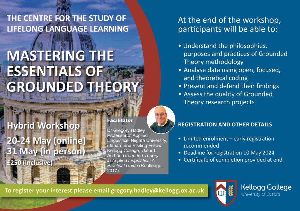
Sadly the timing means that I won’t overlap with my old friend, Gregory Hadley who is over in the UK from his home in Japan. He and I were very early internet collaborators when we got some work done purely by Email. That resulted in a chapter: Hadley, G., & Evans, C. (2001). Constructions across a Culture Gap. In Action Research (pp. 129–143). TESOL Inc. For me the collaboration also definitely expanded my thinking about culture, language and how learning and teaching work. We didn’t actually meet in 3D until much later and Gregory has since become a real expert on Grounded Theory. While he’s over here he’s running a course on GT:
I really recommend it not only because he is a real expert but also because I know how profoundly he has thought about teaching and learning. If you can get to it you will get a first class experience.
Meanwhile, here’s a summary of new things on this site.
In the Rblog I see that one on issues with convergent validity which expands on the glossary entry was actually created just before the last post here but I mention it as I think it’s one the more import posts there. The only changes have been tweaks and improvements to some entries, particularly the one on creating a shiny server.
Which brings me to the shiny server. Progress has been slow and the only new app is one that computes all the scores from CORE-OM item data. That’s working and has had a bit of external testing. It assumes that the data are being submitted in the form of the Excel spreadsheet I created back in cv-19 lockdown for practitioners suddenly using the CORE-OM online and using it via Micro$oft forms. That spreadsheet did compute scores but a researcher reported that it wasn’t working for him and he’s quite correct. I puzzled as it definitely did work and I’d like to blame some failure of backwards compatibility in M$oft Ugcell but that’s probably unfair. Anyway, rather the fix a spreadsheet that I hate and that clearly no-one is using it spurred me to create the scoring app. As well as the correctly pro-rated domain and full scale scores for the CORE-OM it also gives you the CORE-6D health utility scoring and all the scores for the embedded items of the adult short forms: CORE-SF/A, CORE-SF/B, CORE-10 and GP-CORE in case you might be using one of them between CORE-OM completions. In itself this app isn’t a particularly great step forward but the important thing is that it is a prototype, with work I’ve been doing on the shiny code for uploading and pasting in data. Putting those together I can now create a bunch of apps for scoring CORE measure data submitted in various formats. That’s something I’ve wanted for years and should , I hope, be useful for practitioners not affording and using any of the (often excellent) systems for inputting and analysing CORE and other questionnaire data.
That’s it for now. Next update from somewhere ikn Latin America I suspect/hope!
Created 28.iv.24, author CE & header image (clouds on Mont Blanc from Aime, just before I returned to the UK) CE; licence for text and image: Attribution 4.0 International (CC BY 4.0).
It’s been a long time since I last created a new post here in PSYCTC.org but I see I had this title lying around. Time to use it!
I’ve been pretty busy with CORE work but also putting quite a lot of time into building non-CORE resources and I think it really is time to put something about them here.
The first has been around for a long time and is a glossary that started as an online glossary for the OMbook. I’m up to 266 entries as of today, 26.iii.24, there’s a focus on quantitative methodology and I have tried to explain terms that I think often get thrown around to impress or without people really knowing what they mean (Multilevel Models/Modelling (MLM) perhaps) or are a bit esoteric (Anderson-Darling test anyone?) Give the list with its search box a look. Tell me if you want other things in there or existing definitions improved.
Then there are two things that complement the glossary but also stand on their own:
My Rblog. This is a set of static pages that allow much more space to explain some things in the glossary but also has pages for other, mostly statistical, occasionally geeky things. As the name suggests, quite a few of them explain things about using the R statistics system but many of them simply stand alone. Try Explore distributions with plots or Jacobson #1 gives an introduction to Jacobson (RCSC) plots.
My shiny apps. These are interactive: you can put your own values or data in. The early ones were fairly simple: e.g. saving you computing the RCI for your SD and reliability yourself, similarly for the method c CSC (but that has a nice graph as well as the CSC). There are a number that give you confidence intervals (CIs) around observed statistics if you input the statistic, the dataset n and width of the interval you want (usually 95%). So far I’ve created apps of that type for observed means, proportions, differences between two proportions, SDs or variances, Pearson correlations, Spearman correlations and for Cronbach alpha values. One I particularly like gives you CIs for quantiles if you paste in your data and the quantiles you want. I like the graph that goes with that one! Then are some that are demonstrations of issues such as screening and the Bonferroni correction. Finally, and just this last week, I have cracked interactive uploading of data in CSV, R, spreadsheet and SPSS formats. That starts with a fairly simple app that gives you the histogram of your data and its summary statistics (allowing you to download the plot in various formats).
I’ve got my CEPCfuns: a package of R functions for therapy, MH & WB data analyses but that’s pretty geeky though should be useful to anyone who already uses R. More on that another time.
Back in 2002, with two colleagues, I published a paper:
Evans, C., Hughes, J., & Houston, J. (2002). Significance testing the validity of ideographic methods: A little derangement goes a long way. British Journal of Mathematical and Statistical Psychology, 55(2), 385–390. https://doi.org/10.1348/000711002760554525.
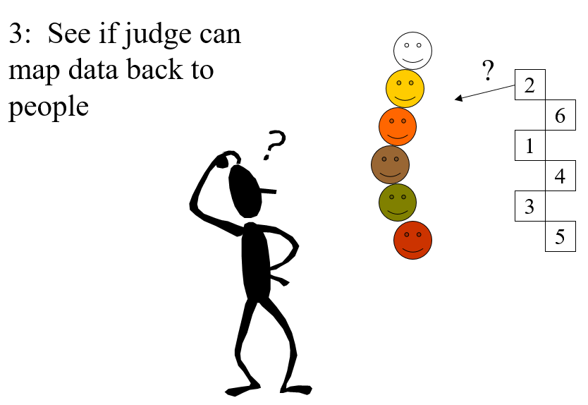
In the paper we used a bit of old maths to show a simple way of validating idiographic/ideographic data. The data in question were principal component plots of person repertory grids created by six patients in a prison psychotherapy group (who gave permission for this). These plots are completely personal to each individual. They depend on the elements the patients chose for the roles in the grid (e.g. victim, brother, boss, ideal self) and the constructs on which they chose to rate them, (e.g. aggressive, caring, selfish) and the ratings they gave each element.
Those principal component plots represent the best two dimensional plot of all the ratings for each grid. Julia (Houston) had asked the two therapists if they could map the six plots back to the patients. As we said in the paper: Both therapists matched four of the six pre-therapy grids successfully; one therapist matched all six post-therapy grids and the other matched three of the six. We sought to assess the probabilities that these matchings might have been achieved by chance alone. This paper reports the logic which shows that this probability was lower than a conventional criterion of significance ( p < 0.05) where four or six grids were matched correctly.
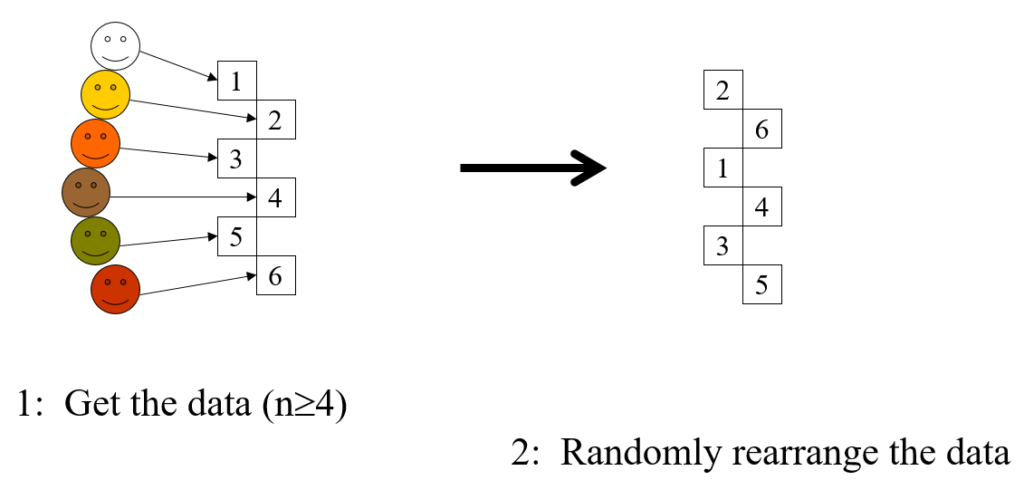
This is a completely general method, the steps are:
Take the data, the idiographic information you have from n individuals (n >= 4)
Shuffle the data
Present them to someone who knows the people who created the data
Ask judge to match data to people
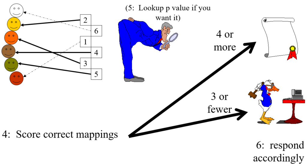
The score is the number of correct matches
If the score is 4 or more, regardless of n, the chances of this being achieved by chance matching alone is p < .05, i.e. statistically significant at the usual criterion for that.
Here’s the same in slightly tongue in cheek cartoon format.
Steps 1 and 2
Step 3
Steps 4 and 5
In the cartoon example the only thing that distinguishes the six sets of idiographic data is actually their colour (yes, this is not a very serious example). The judge successfully mapped four of the six which has probability (that they would score four or even better by chance alone) of p = .022 (see lookup table at https://www.psyctc.org/psyctc/root/stats/derangements-lookup-table/).
That is clearly less than .05 so it meets the conventional criterion of “statistical significance”, i.e. by that convention we reject the null hypothesis that no information is contained in the data and accept the alternative that, though the data were idiographic, and the way the judge did the mapping may have been unique to that one judge and their particular knowledge of the six people (i.e. an idiographic judgement on idiographic data), it has some validity.
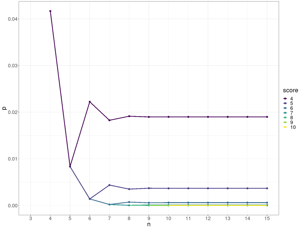
To most of us who are neither mathematicians nor statisticians it may seem utterly counter-intuitive that regardless of the number of objects a score of four or more is always good enough for p < .05. Perhaps it’s so counter-intuitive perhaps that we switch off our own judgement and either decide that the method was published in a good peer-reviewed journal and so must be correct (it is!), or simply believe it cannot be correct.
However, it’s not as counter-intuitive as it may first seem: as the n goes up the number of ways of mapping just four of them correctly does go up rapidly as this table shows.
Number of ways of getting four correct from n objects
wdt_ID
n
Number of ways of getting four correct from n
1
4
1
2
5
0
3
6
15
4
7
70
5
8
630
6
9
5,544
7
10
55,650
8
11
611,820
9
12
7,342,335
10
13
95,449,640
However, the total number of ways of permuting the n is also rocketing up and faster:
Total number of ways of permuting n objects
wdt_ID
n
PossibleWays
1
1
1
2
2
2
3
3
6
4
4
24
5
5
120
6
6
720
7
7
5040
8
8
40320
9
9
362880
10
10
3628800
11
11
39916800
12
12
479001600
13
13
2147483647
14
14
2147483647
The two accelerations pretty much cancel out and so keep the probability of getting four or more correct by chance alone below .05 for any n as shown below.
Significance of scoring four or more
wdt_ID
n
Total possible permutations
score
Number of ways of getting four correct
p (for four or more correct)
1
4
24
4
1
0.04
2
5
120
4
0
0.01
3
6
720
4
15
0.02
4
7
5,040
4
70
0.02
5
8
40,320
4
630
0.02
6
9
362,880
4
5,544
0.02
7
10
3,628,800
4
55,650
0.02
8
11
39,916,800
4
611,820
0.02
9
12
479,001,600
4
7,342,335
0.02
10
13
2,147,483,647
4
95,449,640
0.02
11
14
2,147,483,647
4
1,336,295,961
0.02
This shows how the p value for various scores (on the y axis) stabilises as the number of objects, n, goes up (x axis).
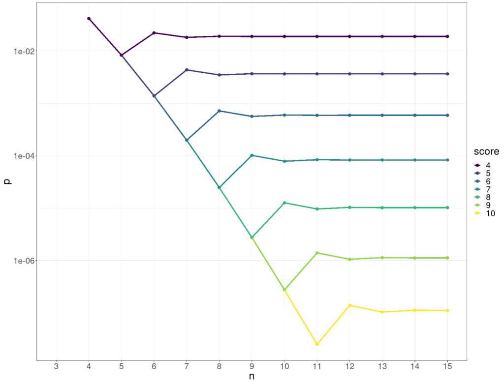
Here’s the same data but with the p values on a log10 scale on the y axis.
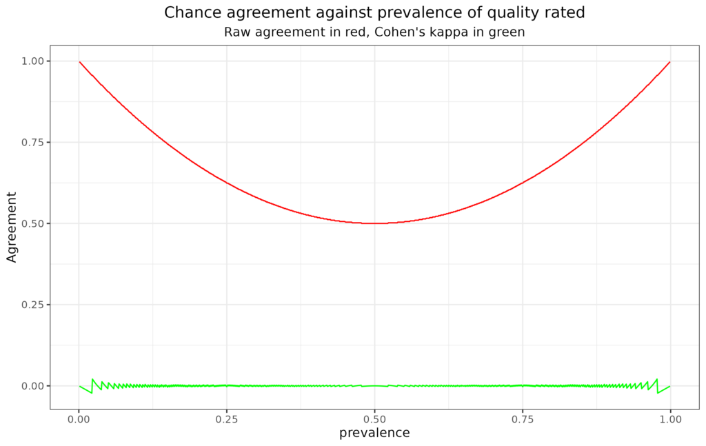
I did a peer review of a paper recently and met an old chestnut: that the inter-rater agreement reported was good because the simple agreement rates were “good”. This is nonsense and that has been written about for probably a century and alternative ways summarising agreement rates have been around for a long time. Jacob Cohen invented his “chance corrected” “coefficient of agreement for nominal scales”, kappa in 1960 (Cohen, 1960). That made me think it might be useful to have a blog post here, perhaps actually several, linking with demonstrations of the issues in my “R SAFAQ” (Self-Answered Frequently (self) Asked Questions” (a.k.a. Rblog).
Background
The issue is very simple: if the thing that is rated is not around 50:50 in the ratings, then agreement even by chance is going to be high. Let’s say two raters are asked to rate a series of photos of facial expressions for the presence of “quizzically raised eyebrows” and the rate of photos that look even remotely quizzical they are given is only 10% and let’s suppose they are told that the rate is about 10% and use that information.
Now if they have absolutely no agreement, i.e. only chance agreement about what constitutes a “quizzically raised eyebrow” they may well still each rate about 90%. In that case by chance alone rater B will rate as quizzical 10% of the photos that rater A rated as quizzical: rate of agreement 10% * 10% = one in a hundred, 1% agreement. However, rater B will rate as not quizzical 90% of the 90% of photos that rater A rated as not quizzical: rate of agreement 90% * 90% = 81%. So their raw agreement rate is 82% which sounds pretty good until we realise that it arose by pure chance. Here’s an aesthetically horrible table of that for n = 100 and the perfect chance level of agreement. (In real life, sampling vagaries mean it wouldn’t be quite as neat as this but it wouldn’t be far off this.)
n
Rated quizzical by rater B
Rated NOT quizzical by rater B
Row totals
Rated quizzical by rater A
1
9
10
Rated NOT quizzical by rater A
9
81
90
Column totals:
10
90
100
That’s why Cohen invented his kappa as a “chance corrected” coefficient of agreement. It actually covers ratings with any number of categories, not just binary “quizzical/not-quizzical” and there are arguments that it’s an imperfect way to handle things but it is easy to compute (look it up, the wikipedia entry, as so often for stats, takes some beating). Pretty much any statistics package or system will compute it for you and there are online calculators that will do it too (https://idostatistics.com/cohen-kappa-free-calculator/#calcolobox, https://www.statology.org/cohens-kappa-calculator/ and https://labplantvirol.com/kappa/online/calculator.html were the first three that gurgle found for me, the last has some advantages over the first two.)
The arguments against it are sound by fairly fine print and it’s orders of magnitude better than raw agreement. Kappa for the chance agreement in that table is zero, as it should be.
See it for different rates of the rated quality from R
This plot illustrates the issue pretty clearly. The x axis has the prevalence of the quality rated (assuming both raters agree that). The red line shows that raw agreement does drop to .5, i.e. random, 50/50 agreement, where the prevalence is 50% but that it rises to near 1, i.e. to near perfect agreement, as prevalence tends to zero or 100%. By contrast, and as a sensible agreement index should, kappa remains on or near zero across all prevalence rates.
See my “Rblog” or “R SAFAQ entry about this for more detail and plots.
References
Cohen, J. (1960). A coefficient of agreement for nominal scales. Educational and Psychological Measurement, 20, 37–46.
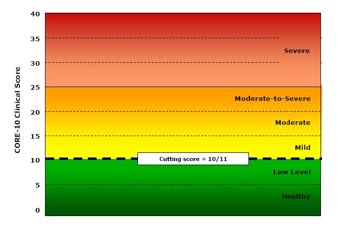
This comes out of receiving intermittent requests at my CORE site for “the graph with the colours” or “the graph with the levels” and for “the scoring levels”, most recently for the GP-CORE and the LD-CORE. I always explain that I don’t provide these. I’m posting about the issue here not on the CORE site as the issues are general.
People are looking for things like this:
YP-CORE blank graph
Or this:
CORE-10 blank graph
The first was a second page of early YP-CORE forms, the other is from Connell, J., & Barkham, M. (2007). CORE-10 User Manual, Version 1.1. CORE System Trust & CORE Information Management Systems Ltd. I think I’m within my rights to post both here as a CST trustee, however I wasn’t involved in creating either of them (as will become clear!)
They’re obviously appealing so why am I against them? It’s partly because I understand ways that we can dichotomise scores by defining cutting scores that separate “clinical” from “non-clinical” scores. There are a number of ways of doing this but the CORE approach has always been the Jacobson et al. “Clinically Significant Change (CSC)” method c. There are arguments for other methods but that is fairly easy to understand.
Part of my problem is that I have no idea how we can establish four other cutting points to get a six level (“sexotomy”?) of the possible scores. In the manual Connell and Barkham say:
“A score of 10 or below denotes a score within the non-clinical range and of 11 or above within the clinical range. Within the non-clinical range we have identified two bands called ‘healthy’ and ‘low’ level distress. People may score on a number of items at any particular time but still remain ‘healthy’. Similarly, people may score in the ‘low’ range which might be a result of raised pressures or particular circumstances but which is still within a non-clinical range. Within the clinical range we have identified the score of 11 as the lower boundary of the ‘mild’ level, 15 for the ‘moderate’ level, and 20 for the ‘moderate-to-severe’ level. A score of 25 or over marks the ‘severe’ level.”
Connell & Barkham, 2007, p.10.
I like the honesty of “we have identified” but I can find nothing in the manual to say how those cutting points were identified.
So what’s going on here? I am becoming uneasy just to explain to people that I don’t provide such levels or those graphs as I suspect the cutting points are essentially aribtrary. I think it’s time to wonder why they appeal, why do authors and publishers of measures provide them (it’s not just CORE, many other measures do this too).
I think one useful answer is that, like “clinical/non-clinical” cutting points they paper over a general unease about what we’re doing with these numbers. They appear to answer the question: what do these scores mean? What do they mean?
Well of they’re just the numbers we create from whatever scoring system the measure uses to convert the response choices the person completing the measure chose. However that doesn’t answer what they “mean”.
We could start by asking what the person completing the measure meant them to mean: did that person know the number they were creating? For some measures (most but not quite all CORE measures) the person may be able to see the numbers allocated to the answer options. For fewer measures (most but not quite all CORE measures on paper) the person may be able to see the actual scoring system at the end of the measure so it’s possible that some people consciously create their score. The person may mean us to see a score of 1.3. However, I suspect that’s very rare. I suspect it’s commoner that someone might calculate their own score and increasingly app or online presentations of measures may do this automatically so the person completing the measure may see a score, say 1.4. Depending on the system they might or might not then be able to go back and change their score. The CORE-bots are one example of a systme that shares the scores with the person completing the measure, however providing scores is probably becoming the norm. (No, not these CoreBots, theseCORE-bots!)
Even if the person creating the score knew their score, even in the very exceptional situation (usually forensic?) in which they knowingly created the score they wanted, is this a communication of a number in one mind to a number in another mind? Are we nearer to what the score “means” to someone seeing it other than the person who created it.
I am going to side step the increasingly common situation in which there is no receiving mind: where the number just goes into a database with no wetware processing, no other mind giving it attention within the someone receiving it. I am also going to sidestep my own situation in which I receive scores. 99.999% of the scores I receive I do as a data processor. Most often, and for good data protection/ confidentiality reasons, I have no idea who chose the answers they did, who created the item numbers they did and hence the score.
The requests I get for those empty graphs, for “the levels” are I think all coming from settings in which there is a receiving mind who has some relationship with the person who created the scores. Why am I opposed to giving them levels or nice empty graphs like the ones above?
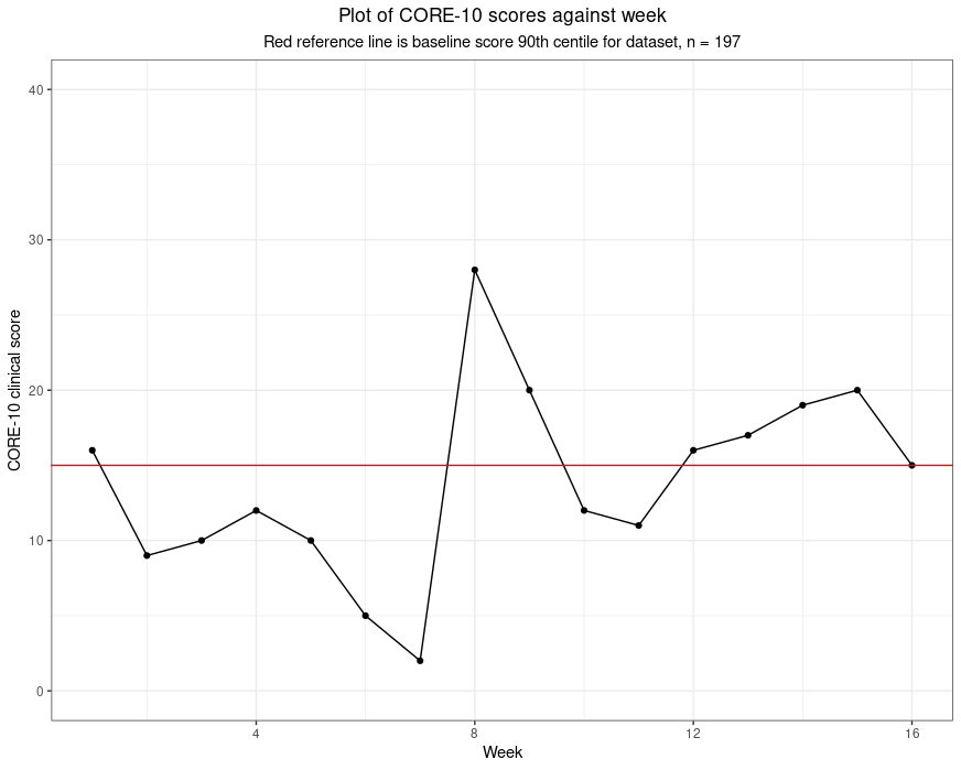
I entirely approve of graphing someone’s scores against time: that is one way of putting meaning on the scores and would love to provide ways people could do that easily and approve of the many systems that do provide that. To me such graphing retains the simple numbers but for most of us converting the numbers to points on a graph makes it easier for to process change. If I am shown 1.6, 0.9, 1, 1.2, 1, 0.5, 0.2, 2.8, 2, 1.2, 1.1, 1.6, 1.7, 1.9, 2, 1.5 I don’t find it has much “meaning” even if I know these are “clinical” scores on the CORE-10, i.e. the total of the item scores, each 0 to 4 across the ten items. However, that little run of numbers can create this.
All that’s happened there is that numbers have been converted into distances with two additions: there is a red reference line and the subtitle tells me that the line marks the score of 15 which was the 90th centile of scores from a set of 197 people, i.e. the score that as nearly as possible given the 197 baseline scores, has 90% of the 197 scoring below it and 10% scoring above it. Now these numbers take on meaning for me and it seems to me that this person’s scores start fairly high for the group (volunteers in a support service during the early stages of the covid pandemic). Her/his scores vary to week 7 but have dropped markedy then they rocket up … you read on.
For me this is reading meaning into the numbers: I can explain it, to me it’s plausible and if you don’t think it’s plausible you are completely at liberty to disagree with the mapping and read your own meaning into the data.
I entirely agree with the wish to do something with questionnaire score numbers that we hope will help us interpret, understand, the numbers. That’s what I try to do all the time with statistics or graphs or both. I just don’t agree with converting the scores to words like “mild”, “moderate” or “severe” as for me there must always be a logic to the conversion and one that I think I understand and that I can try to explain.
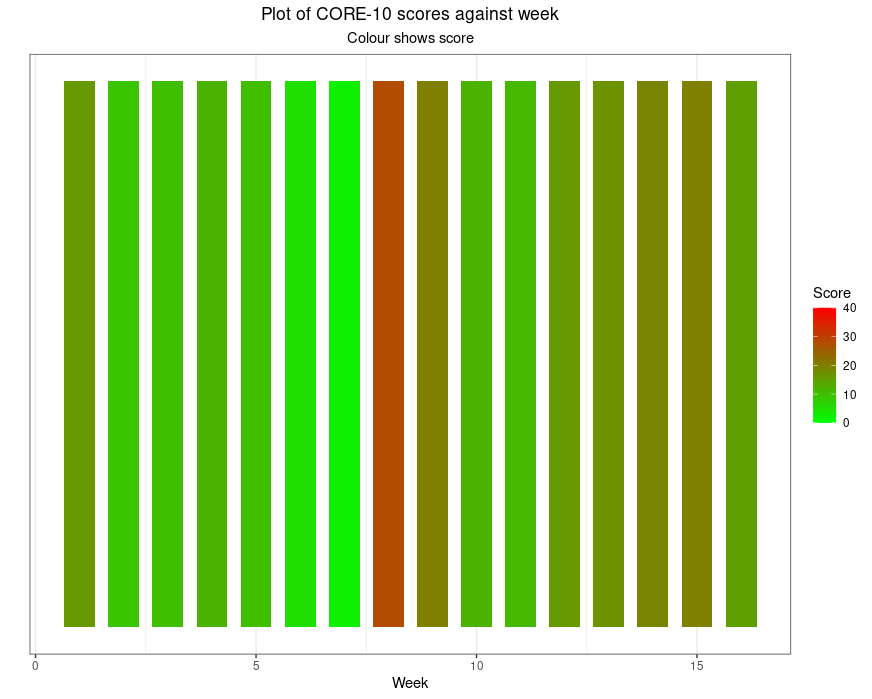
I use “painting by numbers” provocatively. You could argue that converting a number to a colour is as logical as converting it to a distance. However, our visual system means it really isn’t the same. Here are those numbers as colours.
Even without the problem that about 10% of the male population who have red/green colour blindness won’t see what those of us with normal colour vision see there, it’s simply not interpretable as the earlier plot was. Had I given a colour gradient fill behind the first plot I would have simply added an implication, perhaps “safe” versus “dangerous”, actually, I would have added words even without using them.
That’s my real objection to these levels: converting numbers to words, “mild” and “severe” for example, or just giving numbers colours from green to red is covertly forcing a set of meanings onto the numbers. I understand the urge, I just think it’s trying to reassure us that the numbers are as simple as that suggests. I believe they’re not.
Hm, I can see that this post actually follows on from my last about “blended and layered” research. I can see now that it leads into some others, here and on my CORE site, which are brewing, and these are issues that Jo-anne (Carlyle) and I develop in our book which is coming out through SAGE any day now we are told.
The glorious daily Wikipedia feed introduced me to Daniel J. Boorstin, well, he died in 2004 so sadly we didn’t get to have a drink together; however, it did learn of his glorious comment “I write to discover what I think. After all, the bars aren’t open that early.” Genius! (If you’re not a genius, quote the people who are or were!!)
Warm acknowledgements
The data behind the graphs come from an excellent piece of work in Ecuador in which late trainee and qualified psychologists volunteered to provide telephone support to families struggling with deaths and other direct effects of coronavirus and/or with the lockdown. Dr. Clara Paz’s university UDLA, hm, my university now as ever seemed to get things right and go beyond the minimum and encouraged the volunteers to fill in the CORE-10 weekly and scores were shared with their supervisors to put meaning on changes like those in the graph above. There is more about the study in this post in the Spanish CORE subsite (and hence in Spanish!) and the article about the work.
Oh, and the headline image is of sun rising here this morning: that’s just glorious colour!