[Go to the entry about box plots before this if you are not familiar with them.]
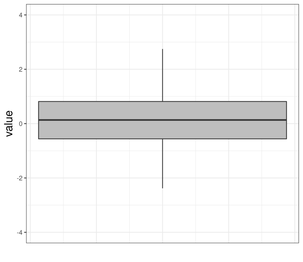
Here is a simple boxplot of some Gaussian data.
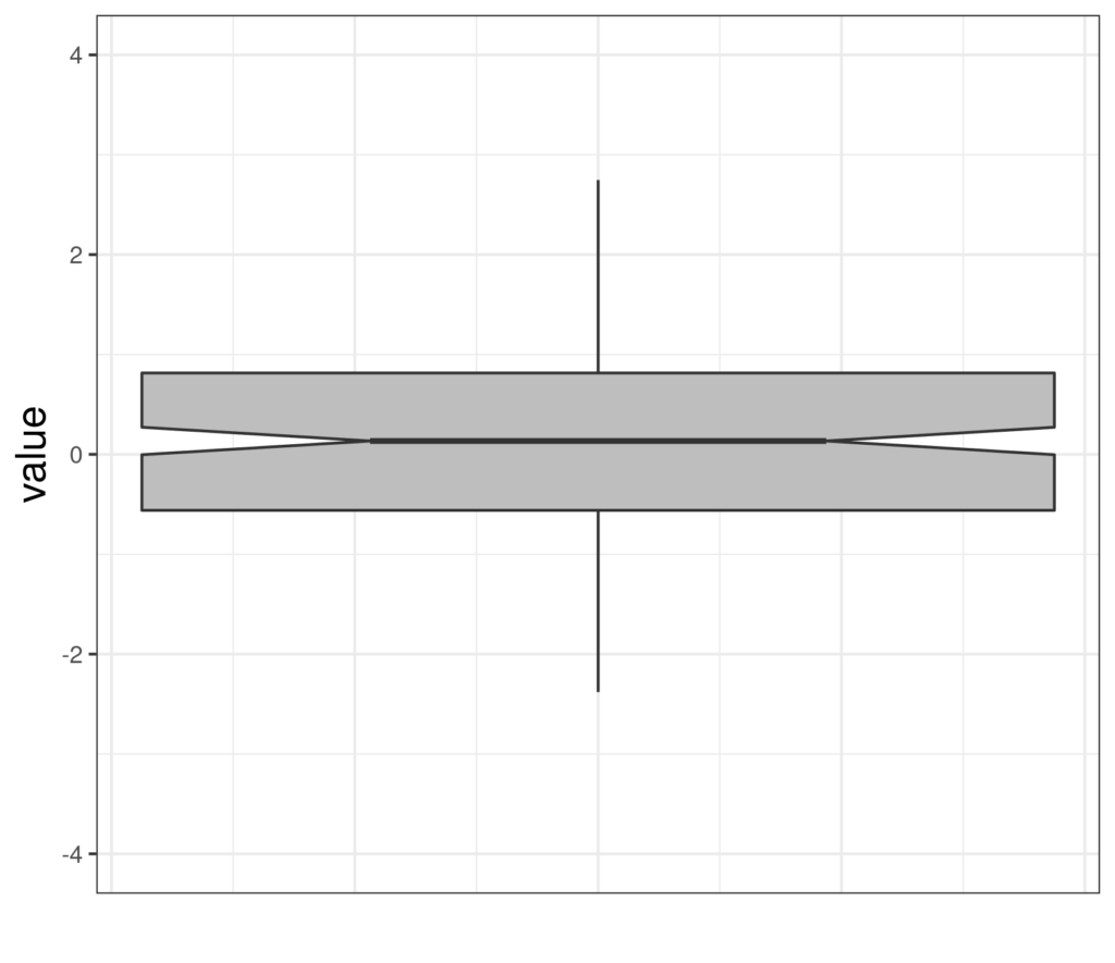
And here’s the same data in a notched boxplot.
Details #
I think we can agree that the box has gained a notch! The notch is like a belted-in waist with the belt the median of the distribution, as usual in a boxplot. So what is the notch? It’s an approximate 95% confidence interval for that median. It tells us how precisely the median of the population has been estimated by the median of this sample. (If this is sounding a bit mad, browse off to the definitions of sample, population and estimation and come back here.) So here are some more notched boxplots of Gaussian distributions.
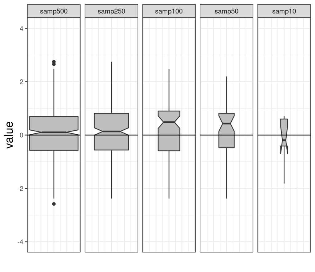
From left to right those are samples of size 500, 250, 100, 50 and 10 (the facet labels at the top fit!) You can see that these are variable width boxplots: the area of the box (without subtracting the notch area) reflects the sample size so they get smaller from left to right. Similarly, the height of the notch gets bigger as the sample size gets smaller ending up in that last simulation run with n = 10 with the lower limit of the notch below the lower quartile of the observed data, hence the rather odd legs on that box.
I drew a horizontal reference line on zero which we know is the population median (and mean) of the standard Gaussian distribution. You can see that for the first two samples, of n = 500 and 250, the notch just embraces that but that for the next two it doesn’t. The nature of the 95% confidence interval is that in the long run, if we are sampling at random, the interval will include the true population value for 95% of the samples. Here are four more simulation runs of the same sized samples.
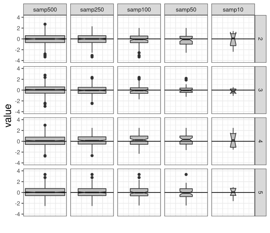
It’s easy to see here how the smaller samples jump around much more than the large samples.
Here is an example from real data
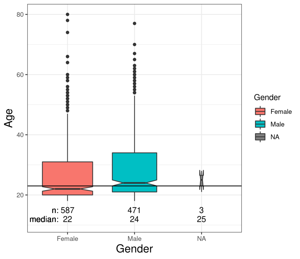
That has the horizontal reference line going through the median age of the total sample and notched boxplots by gender with the overall median just above the notch on the female box suggesting that there is a systematic tendency for the women who participated in the survey to be slightly younger, strictly, to have a slightly younger median age, than the men. However, we can see that the difference is small and that the medians for both women and men are pretty precisely estimated if we regard the sample as representative of a wider population. Unsurprisingly with only three participants who omitted the binary gender question, that median is not precisely estimated! By contrast with that gender effect, the relationship of age with social status is more marked.
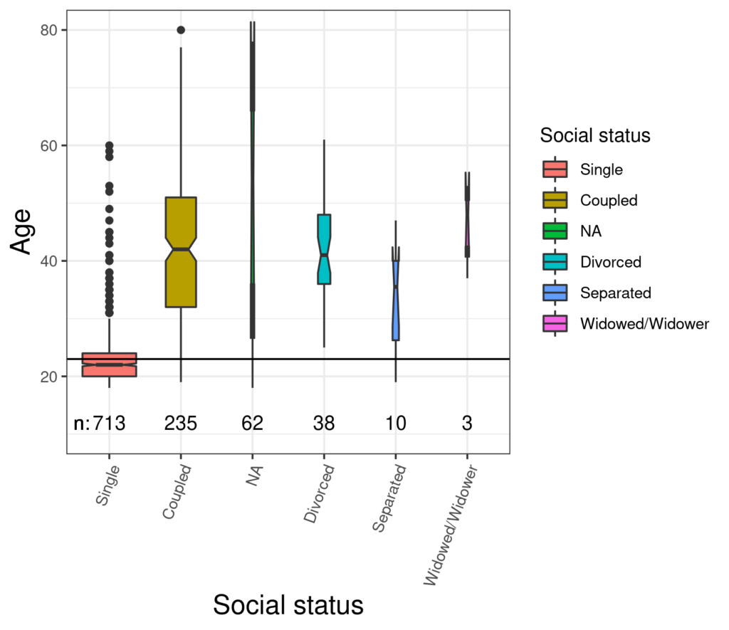
The participants who were single had markedly lower median age than any of the other groups: not terribly surprising. This next plot gets a bit more interesting.
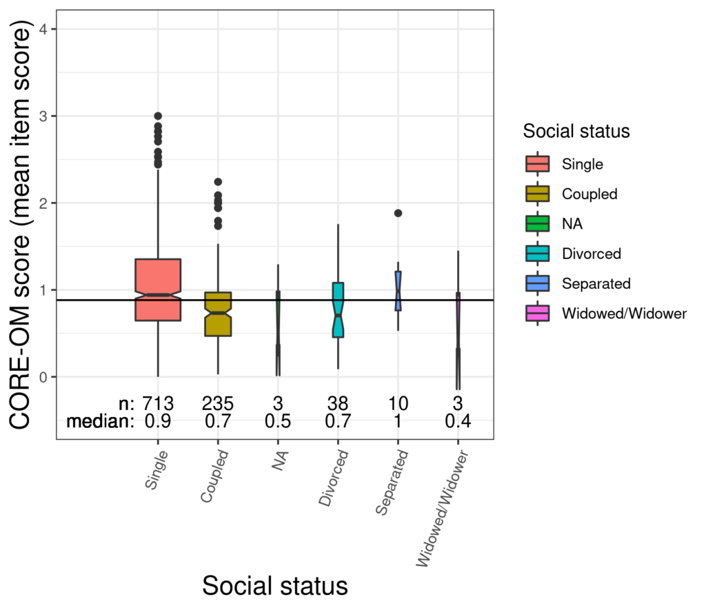
That shows a fairly marked and well defined difference between the median CORE-OM score between the (simply) single participants and those in a relationship with a less precisely estimated median for the divorced group that looks lower than that for the simply single group with an even less precisely estimated median for the separated group that is higher: the notched boxes suggest that being single is not homogenous for CORE score and that there is a clear difference between simply single and coupled groups.
Fundamentally, as Tukey who invented them wanted, notched boxplots are an excellent way to explore group differences on a continuous variable.
Try also #
Boxplots
Confidence intervals
Median
Violin plots
Chapters #
Chapters 5, 7 and 8.
Dates #
Created 9/11/21.

