
Created 19.x.21
This comes out of receiving intermittent requests at my CORE site for “the graph with the colours” or “the graph with the levels” and for “the scoring levels”, most recently for the GP-CORE and the LD-CORE. I always explain that I don’t provide these. I’m posting about the issue here not on the CORE site as the issues are general.
People are looking for things like this:

Or this:
The first was a second page of early YP-CORE forms, the other is from Connell, J., & Barkham, M. (2007). CORE-10 User Manual, Version 1.1. CORE System Trust & CORE Information Management Systems Ltd. I think I’m within my rights to post both here as a CST trustee, however I wasn’t involved in creating either of them (as will become clear!)
They’re obviously appealing so why am I against them? It’s partly because I understand ways that we can dichotomise scores by defining cutting scores that separate “clinical” from “non-clinical” scores. There are a number of ways of doing this but the CORE approach has always been the Jacobson et al. “Clinically Significant Change (CSC)” method c. There are arguments for other methods but that is fairly easy to understand.
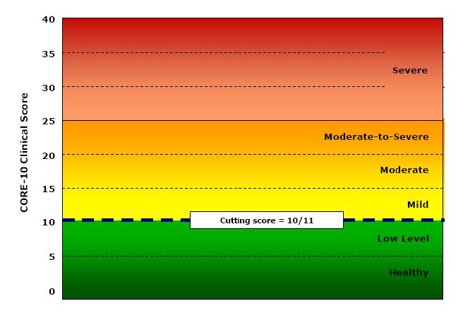
Part of my problem is that I have no idea how we can establish four other cutting points to get a six level (“sexotomy”?) of the possible scores. In the manual Connell and Barkham say:
“A score of 10 or below denotes a score within the non-clinical range and of 11 or above within the clinical range. Within the non-clinical range we have identified two bands called ‘healthy’ and ‘low’ level distress. People may score on a number of items at any particular time but still remain ‘healthy’. Similarly, people may score in the ‘low’ range which might be a result of raised pressures or particular circumstances but which is still within a non-clinical range. Within the clinical range we have identified the score of 11 as the lower boundary of the ‘mild’ level, 15 for the ‘moderate’ level, and 20 for the ‘moderate-to-severe’ level. A score of 25 or over marks the ‘severe’ level.”
Connell & Barkham, 2007, p.10.
I like the honesty of “we have identified” but I can find nothing in the manual to say how those cutting points were identified.
So what’s going on here? I am becoming uneasy just to explain to people that I don’t provide such levels or those graphs as I suspect the cutting points are essentially aribtrary. I think it’s time to wonder why they appeal, why do authors and publishers of measures provide them (it’s not just CORE, many other measures do this too).
I think one useful answer is that, like “clinical/non-clinical” cutting points they paper over a general unease about what we’re doing with these numbers. They appear to answer the question: what do these scores mean? What do they mean?
Well of they’re just the numbers we create from whatever scoring system the measure uses to convert the response choices the person completing the measure chose. However that doesn’t answer what they “mean”.
We could start by asking what the person completing the measure meant them to mean: did that person know the number they were creating? For some measures (most but not quite all CORE measures) the person may be able to see the numbers allocated to the answer options. For fewer measures (most but not quite all CORE measures on paper) the person may be able to see the actual scoring system at the end of the measure so it’s possible that some people consciously create their score. The person may mean us to see a score of 1.3. However, I suspect that’s very rare. I suspect it’s commoner that someone might calculate their own score and increasingly app or online presentations of measures may do this automatically so the person completing the measure may see a score, say 1.4. Depending on the system they might or might not then be able to go back and change their score. The CORE-bots are one example of a systme that shares the scores with the person completing the measure, however providing scores is probably becoming the norm. (No, not these CoreBots, these CORE-bots!)
Even if the person creating the score knew their score, even in the very exceptional situation (usually forensic?) in which they knowingly created the score they wanted, is this a communication of a number in one mind to a number in another mind? Are we nearer to what the score “means” to someone seeing it other than the person who created it.
I am going to side step the increasingly common situation in which there is no receiving mind: where the number just goes into a database with no wetware processing, no other mind giving it attention within the someone receiving it. I am also going to sidestep my own situation in which I receive scores. 99.999% of the scores I receive I do as a data processor. Most often, and for good data protection/ confidentiality reasons, I have no idea who chose the answers they did, who created the item numbers they did and hence the score.
The requests I get for those empty graphs, for “the levels” are I think all coming from settings in which there is a receiving mind who has some relationship with the person who created the scores. Why am I opposed to giving them levels or nice empty graphs like the ones above?
I entirely approve of graphing someone’s scores against time: that is one way of putting meaning on the scores and would love to provide ways people could do that easily and approve of the many systems that do provide that. To me such graphing retains the simple numbers but for most of us converting the numbers to points on a graph makes it easier for to process change. If I am shown 1.6, 0.9, 1, 1.2, 1, 0.5, 0.2, 2.8, 2, 1.2, 1.1, 1.6, 1.7, 1.9, 2, 1.5 I don’t find it has much “meaning” even if I know these are “clinical” scores on the CORE-10, i.e. the total of the item scores, each 0 to 4 across the ten items. However, that little run of numbers can create this.
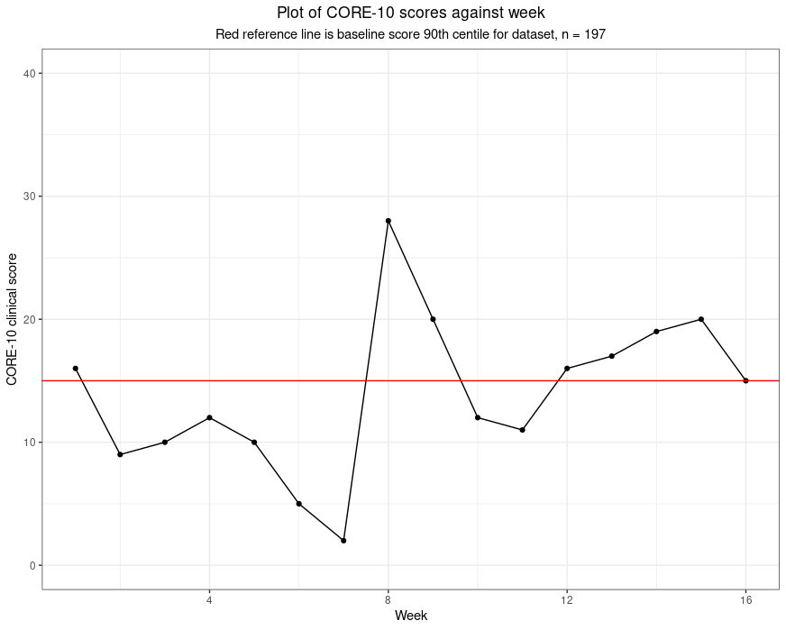
All that’s happened there is that numbers have been converted into distances with two additions: there is a red reference line and the subtitle tells me that the line marks the score of 15 which was the 90th centile of scores from a set of 197 people, i.e. the score that as nearly as possible given the 197 baseline scores, has 90% of the 197 scoring below it and 10% scoring above it. Now these numbers take on meaning for me and it seems to me that this person’s scores start fairly high for the group (volunteers in a support service during the early stages of the covid pandemic). Her/his scores vary to week 7 but have dropped markedy then they rocket up … you read on.
For me this is reading meaning into the numbers: I can explain it, to me it’s plausible and if you don’t think it’s plausible you are completely at liberty to disagree with the mapping and read your own meaning into the data.
I entirely agree with the wish to do something with questionnaire score numbers that we hope will help us interpret, understand, the numbers. That’s what I try to do all the time with statistics or graphs or both. I just don’t agree with converting the scores to words like “mild”, “moderate” or “severe” as for me there must always be a logic to the conversion and one that I think I understand and that I can try to explain.
I use “painting by numbers” provocatively. You could argue that converting a number to a colour is as logical as converting it to a distance. However, our visual system means it really isn’t the same. Here are those numbers as colours.
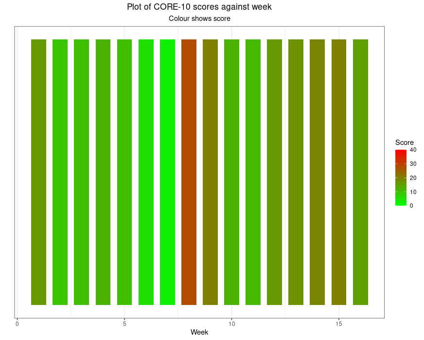
Even without the problem that about 10% of the male population who have red/green colour blindness won’t see what those of us with normal colour vision see there, it’s simply not interpretable as the earlier plot was. Had I given a colour gradient fill behind the first plot I would have simply added an implication, perhaps “safe” versus “dangerous”, actually, I would have added words even without using them.
That’s my real objection to these levels: converting numbers to words, “mild” and “severe” for example, or just giving numbers colours from green to red is covertly forcing a set of meanings onto the numbers. I understand the urge, I just think it’s trying to reassure us that the numbers are as simple as that suggests. I believe they’re not.
Hm, I can see that this post actually follows on from my last about “blended and layered” research. I can see now that it leads into some others, here and on my CORE site, which are brewing, and these are issues that Jo-anne (Carlyle) and I develop in our book which is coming out through SAGE any day now we are told.
The glorious daily Wikipedia feed introduced me to Daniel J. Boorstin, well, he died in 2004 so sadly we didn’t get to have a drink together; however, it did learn of his glorious comment “I write to discover what I think. After all, the bars aren’t open that early.” Genius! (If you’re not a genius, quote the people who are or were!!)
Warm acknowledgements

The data behind the graphs come from an excellent piece of work in Ecuador in which late trainee and qualified psychologists volunteered to provide telephone support to families struggling with deaths and other direct effects of coronavirus and/or with the lockdown. Dr. Clara Paz’s university UDLA, hm, my university now as ever seemed to get things right and go beyond the minimum and encouraged the volunteers to fill in the CORE-10 weekly and scores were shared with their supervisors to put meaning on changes like those in the graph above. There is more about the study in this post in the Spanish CORE subsite (and hence in Spanish!) and the article about the work.
Oh, and the headline image is of sun rising here this morning: that’s just glorious colour!