We put the scatterplot as one of the five vital plotting procedures for therapy outcome/change data. (With the Jacobson plot as a specialised scatterplot and cat’s cradle plots, histograms, boxplots and forest plots as the other four.)
Details #
For our purposes a scatterplot shows the relationship between two variables where they have been measured at the same time in the same person. Here’s an example.
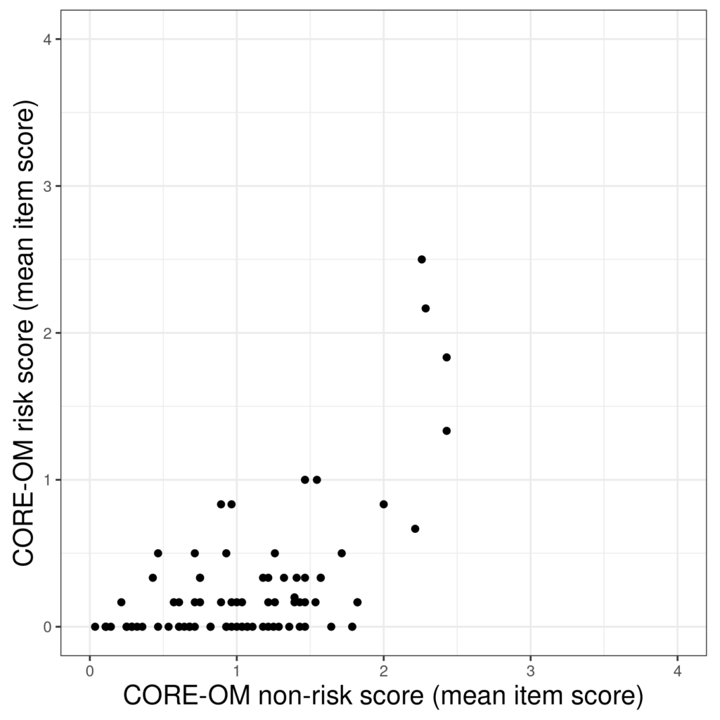
Those are 88 scores on the CORE-OM risk scale on the y axis and the non-risk score, i.e. the mean of the other 28 on-risk items, on the x axis. (The data are real from a non-help-seeking sample of young adults in Quito, Ecuador.) The line of points on the x axis, i.e. with y = 0, show us that a lot of the sample have answered “Not at all” to all six risk items but we can also see that there is a tendency for the risk scores to rise as the non-risk score rises (that takes us to correlation, regression and linear regression, I’ll use the same data to illustrate those entries). One nice thing about scatterplots is that you can use colour to separate points by a third variable.

With a fairly small number of observations/values the scatterplot is pretty self-explanatory, things get a bit more complicated with larger datasets because of “overprinting”.
Try also #
Overprinting
Jittering
Jacobson plot
Cat’s cradle plots
Histograms
Boxplots
Forest plots
Chapters #
Introduced in Chapter 5 and used in Chapters 6 and 7.
Dates #
Created 16/11/21.

