A plot that plots the counts of observed values for a variable against the values. Excellent for giving a picture of the “shape” of the distribution.
Details #
Traditionally a distinction is made between a histogram and a barchart with the former applying for continuous and the latte to discrete variables. Here are two plots observing that distinction.

In the left hand plot the breakdown is a “barplot” by gender (with “NA” standing for “Not Answered and a binary gender classification only offered). That the categories are distinct is signalled conventionally by the gaps between the columns and the heights of the columns showing the numbers choosing each gender category. The right hand plot is a histogram from the same sample and shows age treated as continuous so without gaps between the vertical bars. I am not convinced that the distinction is very helpful.
For example, sometimes age is categorised with only a set of age ranges offered, perhaps:
<20
20 to 29
30 to 39
40 to 49
>= 50
Now the data break down like this:
-----------------------------
Age n percent
------------- ----- ---------
<20 148 14.9%
20 to 29 545 55.1%
30 to 39 131 13.2%
40 to 49 80 8.1%
50 and over 86 8.7%
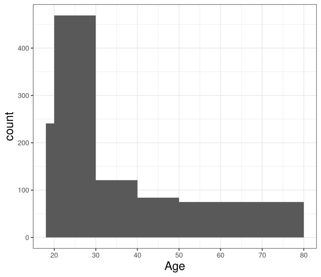
-----------------------------and the histogram looks like this:
While the barplot looks like this:

That’s fair enough as it represents the categories, however, the histogram clearly represents the realities of age as a continuous variable better.
Histograms by multiple categories #
Histograms and barplots are wonderful to convey visually the distributions of variables one variable at a time. They can be used to look at how distributions of one variable differs (or not) by another categorical variable. For example, here is age but taking gender into account as well.
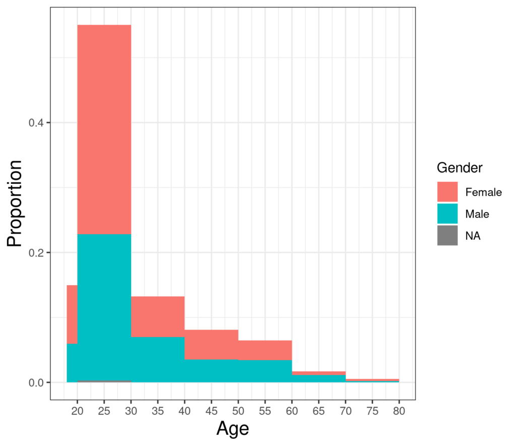
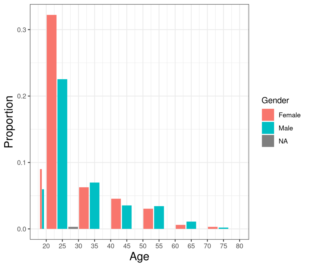
There the counts, actually the proportion of the total, are “stacked” so the gender category with the fewest overlies the category with the next most in that age range and the category with the most in that age range sticks out at the top. Alternatively, the genders can be put side by side as here (in R gglot jargon “dodged”).
Though these approaches can work, comparing distributions across a continuous variable broken down by another variable is often better done with a boxplot or violin plot.
Try also #
Distribution
Gaussian (“Normal”) Distribution
Skew
Box plot (and boxplot!)
Violin plot (and violinpl* App creating samples from Gaussian distribution showing histogram, ecdf and qqplotot!)
Uniform distribution
Chapters #
Chapters 5, 7 and 8.
External resources #
Good if detailed Wikipedia page which itself links to a range of further resources. It also has a link, not very well flagged up, to John Graunt (1620 – 1674) a founder of demography and tabulation and a useful reminder that while statistical methods and rich computer generated graphics are explosions of the 20th and 21st Centuries, the roots go back a long way.
* My shiny app creating samples from Gaussian distribution showing histogram, ecdf and qqplot
Dates #
Created 7/11/21, tweaks 5.iii.24.

