Sometimes also called a “box and whisker plot”. This is a excellent way to describe distributions of observations on a continuous variable and particularly strong for comparisons of distributions in relation across categories of other variables.
Details #
This should really be read with the entries on histograms and barplots and on violin plots not least because the examples use the same data. Here is the illustration of a boxplot from the book (figure 5.9).

Depending on how you are reading this glossary you may get a better view of that by clicking here to go to the image. The essence of a boxplot is that it marks the range of the observed values from the minimum (conventionally and not unreasonably at the bottom of the plot) to the maximum but more importantly the box is the middle fifty percent of the observations, i.e. from the lower quartile to the upper quartile. A line through the middle of the box usually marks the median (but unfortunately in the example in that figure it is the same as the lower quartile). Here is a boxplot of 10,000 values from the “standard” Gaussian distribution. (See Gaussian entry here.)

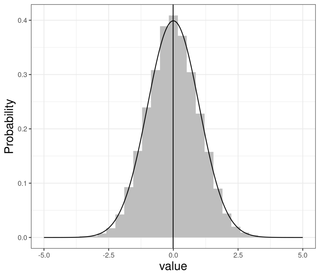
That shows a pretty symmetrical looking distribution ranging from about -3.7 to about +3.9 with lower quartile (the bottom of the box) at about -.66 and upper quartile (the top of the box) at about +.66 and the median (the line through the middle of the box) pretty much on zero. Here are the same data as a histogram with the perfect standard Gaussian density distribution superimposed and the median fo the observed (simulated) 10,000 points marked by the vertical line.
This side by side graphic shows how the boxplot relates to the histogram of the same data.
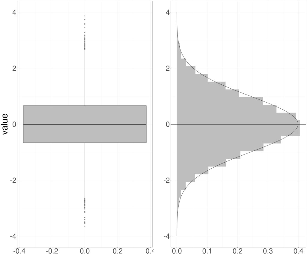
It’s a bit unusual to see a histogram that way around but it helps understand how the boxplot arises from this particular Gaussian dataset.
Whiskers and outliers #
What about the straight “whiskers” and the separated points above and below the ends of the whiskers? This is a statistical convention about “outliers” and really pretty small print. The convention is that points beyond 1.5x the interquartile range (see entry about the IQR) from the nearest quartile are “outliers” and shown as points with whiskers extending to the last point less than that distance from the nearest quartile. Here the IQR is from -.66 to +.66 so it’s 1.32 so the upper whisker will extend 1.5×1.32 = 1.98 above the upper quartile, i.e. 2.64 from the median. Similarly, the lower whisker will extend 1.98 below the lower quartile. It’s a old convention in descriptive statistics it means that if the data are Gaussian there will only be .8% of data showing as outliers (as we can see, on 10,000 points, that’s quite a few points). This means that the the presence of outliers shows when distributions are skew or “heavy tailed” which can be important if one is using inferential parametric statistics pedantically but that’s a way of analysing data that is rarely useful for therapy data because our data are so rarely Gaussian. I think it’s safe to say that I’ve not yet found a therapy dataset in which we would get very interested in this distinction between whiskers and outliers.
Comparing distributions #
The huge strength of boxplots is not really to help understand the distribution of data, histograms are much better for that; the boxplot comes into its own when comparing distributions. Here’s a trivial example showing age by social status.
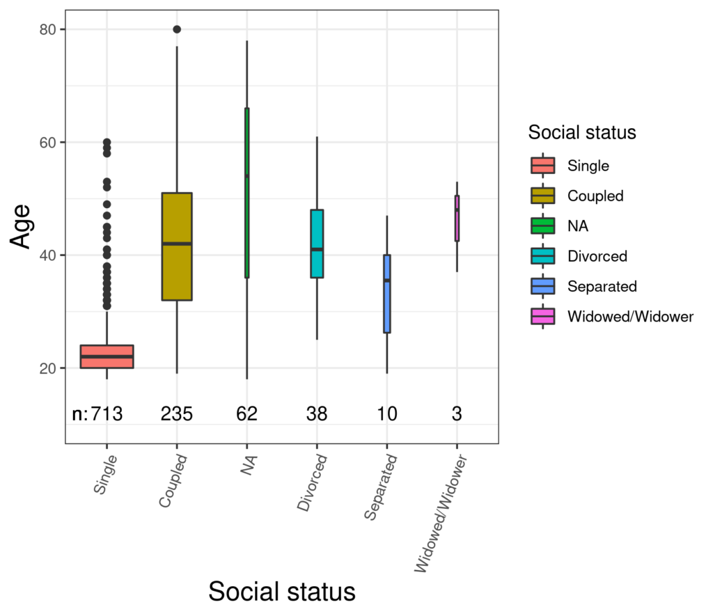
This shows the rather unsurprising finding that the participants who were single hard a markedly lower median age than the other groups. This boxplot follows an increasingly widely used convention that the area of the box reflects the number of observations in that group (“varwidth” in R and, I think, in SPSS too). Our visual system isn’t that good at estimating area so it may come as a surprise looking at that plot that the number of participants who didn’t answer the question about social status (“NA” = Not Available) is larger than the number who put “Divorced” so I have put the numbers in across the bottom of the plot (and put them in order by group/cell size). I can do that but sadly I can’t override that R/ggplot2 gives box and whisker for a group with only three observations (here “Widower/Widowed” which strikes me as misleading. That relationship between social status and age seems fairly unsurprising. What about any relationship with CORE-OM score?
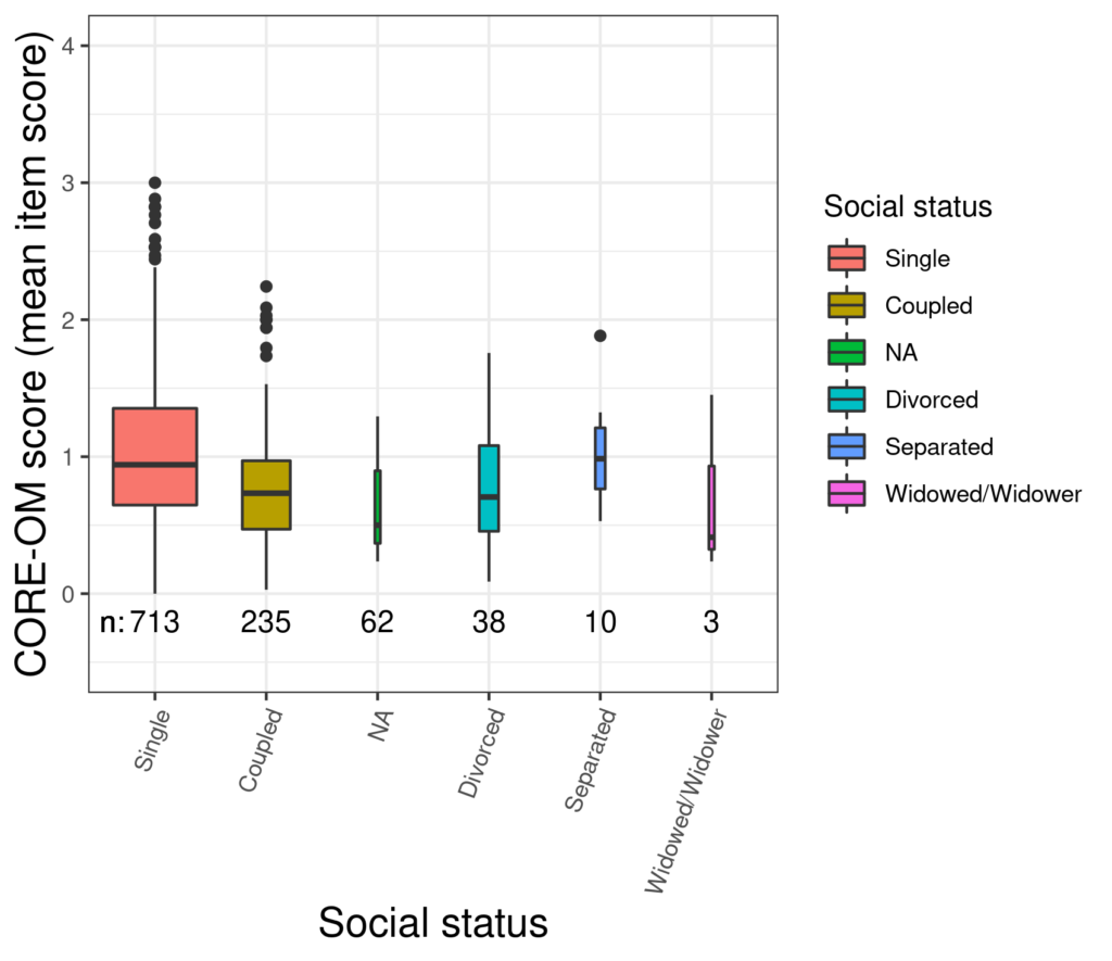
That does seem a bit more interesting with a clear difference in median scores between single participants and those in a relationship. It would be nice to have some way of seeing if the differences are unlikely to have arisen by chance. That takes us to “notched boxplots”…
Try also #
Notched boxplots
Distributions
Minimum
Maximum
Quartiles
Median
Inter-quartile range
Violin plot (and violinplot!)
Histograms and barplots
Uniform distribution
Gaussian (“Normal”) Distribution
Skew
Outliers
Chapters #
Chapters 5, 7 and 8.
Dates #
Created 8/11/21.

