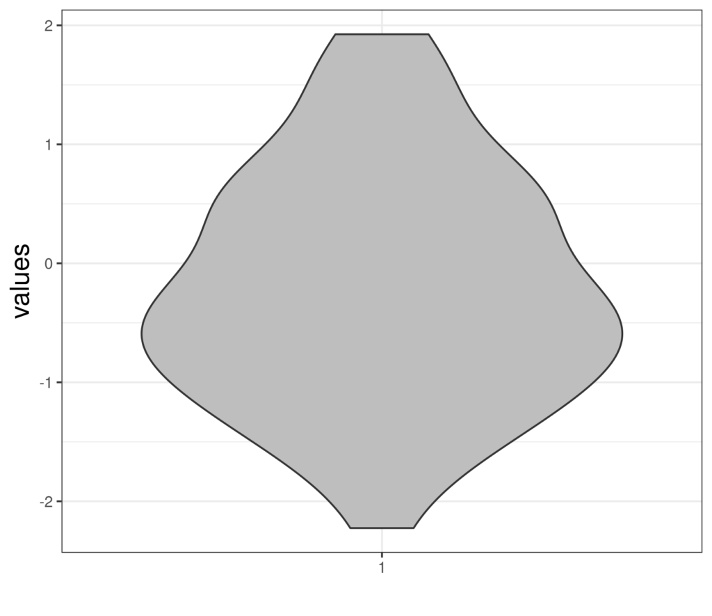
The violin plot complements the histogram and the boxplot as a graphical way of describing the distribution of values of a variable. Here is a violin plot.
Details #
That looks very little like a violin and doesn’t look very informative … and that is correct, such a violin plot is almost useless. It’s actually a violin plot for a sample of 50 values from the standard Gaussian distribution. This shows the points.
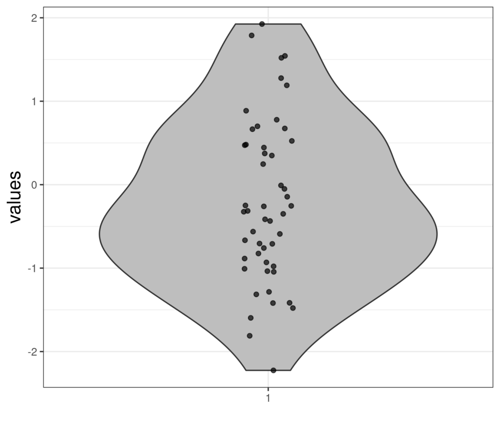
Here the points have been “jittered”: moved a bit randomly on the x axis so they don’t overprint if two points had been essentially the same (essentially meaning so similar that they aren’t separable on the scale of this plot: so called “overprinting”). Here is another way of handling overprinting: printing the points without jittering but with transparency so the overprinting shows quite literally as over printing: darkening or areas of overlap between close points.

The shape of the violin is created by attempting to create a smoothing representing the density of the points (and there are various ways to do that but they go way beyond our needs). Some statisticians prefer violin plots to histograms even for a single variable (as here) however, we prefer to look at histograms when looking at single variables. The violin plot, like the boxplot, really comes into its own when looking at a variable broken down across groups, or when comparing distributions of different variables. Here’s a rather abstract example with five simulations each of size 50, again from the standard Gaussian distribution. I have added a horizontal reference line at zero, the population mean of the standard Gaussian distribution.
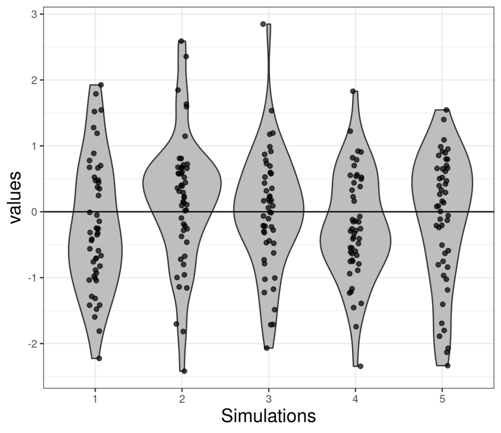
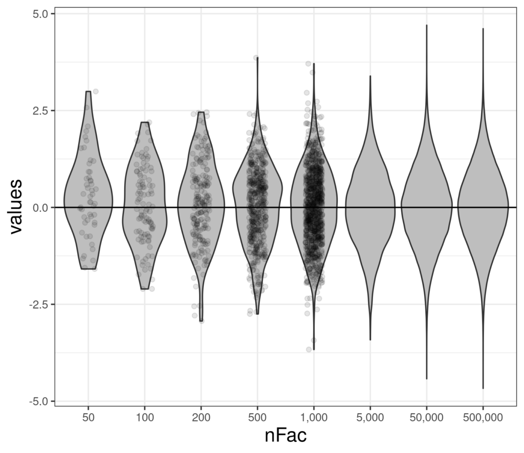
That shows how much samples vary even with a sample size of 50 and, as I think is already becoming clear, violin plots for smaller numbers really gain from having the actual data added and become really useful for larger samples. Here are some larger samples from the standard Gaussian distribution.
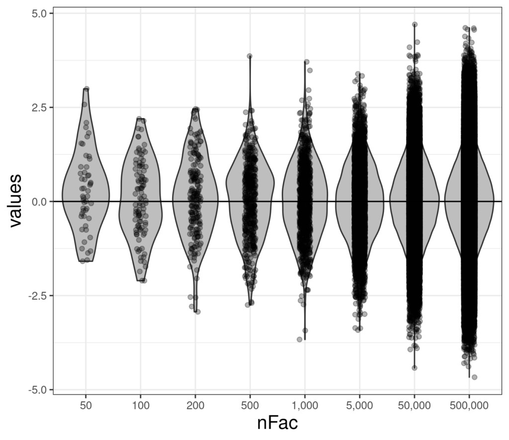
That really shows that as the sample size gets large, even jittering and using transparency can’t solve the challenge of overprinting and showing the actual data swamps the violin and we lose the wood for all the trees. Here’s a compromise.
What about real data? #
Here is a violin plot of some real CORE-OM data from a non-help-seeking sample.
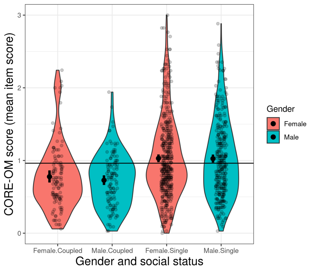
Here the numbers in each subgroup/cell are sufficiently large for a violin plot to give a sensible depiction of the shape of the distribution but not so large that, with some jittering and transparency, adding the raw points overloads things. The horizontal reference line is the mean CORE-OM score across all the data and the stumpy vertical error bars for each subgroup, offset a little from the vertical centres of the violins show the mean scores and 95% confidence intervals for those means. It’s easy to see that the mean scores in the single group are clearly systematically different from those for the coupled participants as shown by the marked differences in locations of the means, the differences markedly larger than the 95% confidence intervals around those observed means. It can also be seen that the means within the single participants don’t differ much at all by gender and the shapes of the distributions within gender look very similar. Within the coupled participants the female mean is a little higher than the male and there is a suggestion that the distributions differ a bit in shape by gender. With somewhat more higher scores among the females. The fairly markedly greater number of higher scores in the single group than the coupled is also clear and this is where a violin plot can tell us more than the boxplot as the latter reduces the distribution mostly to the quartiles and extreme scores and can’t convey the distribution.
Summary #
Violin plots really only make sense for continuous variables or variables that may only take discrete values but can take many of them; they need quite large numbers to become useful but then they help us understand where there may be differences not just in the cental locations of scores, but also in the distributions. As high scores are sometimes particularly important clinically, this ability to compare the “tails” of distributions can be particularly useful to us.
Try also #
Histogram
Boxplot
Notched boxplot
Distribution
Central location
Variance
Gaussian distribution
Jittering
Overprinting
Chapters #
We didn’t actually include a violin plot anywhere in the book but chapter 8 on service level data would have been the most obvious place to have used them.
Dates #
Created 10.xi.21, updated links 16.viii.24.

