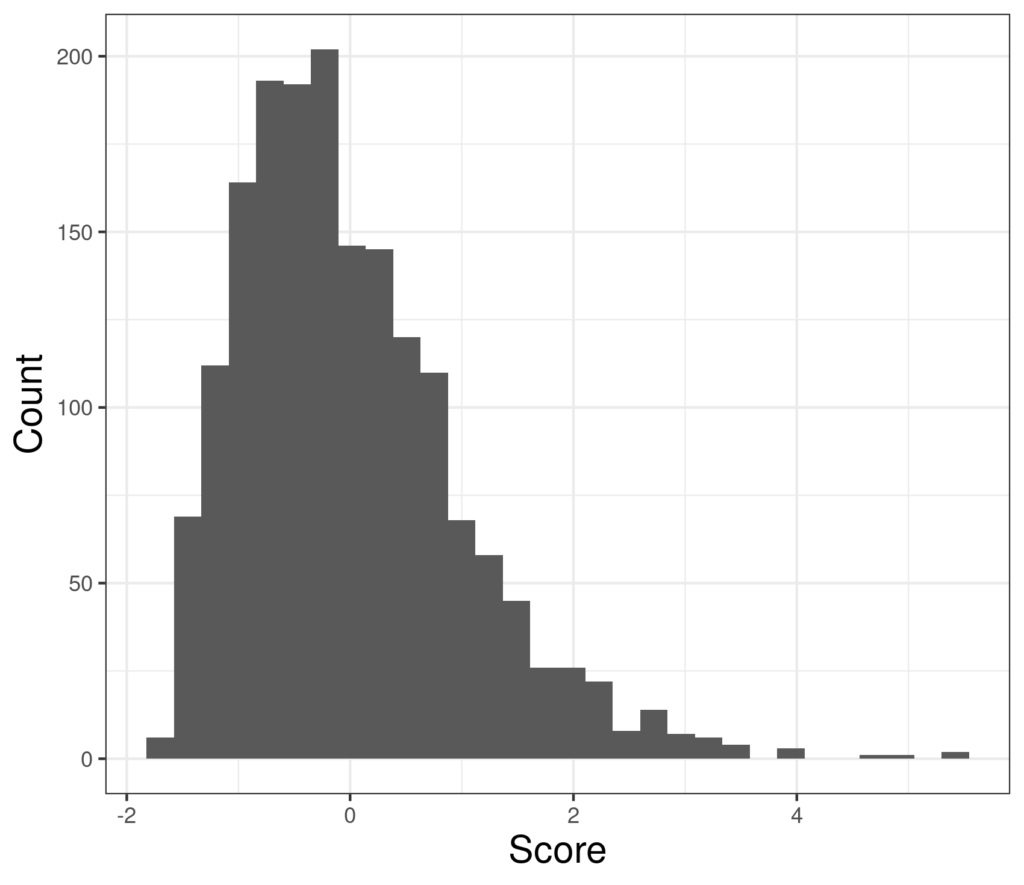
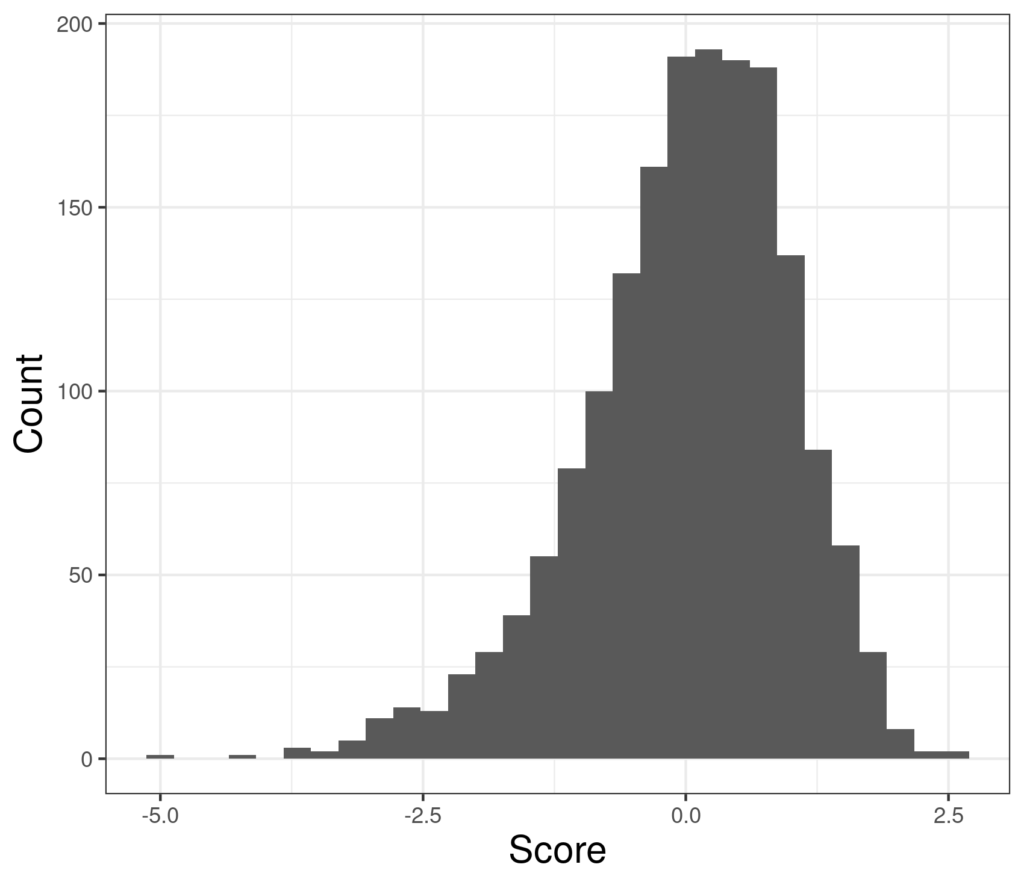
It’s useful to think of distributions of continuous variables in terms of their “central location”, typically the mean or median; their spread, typically their standard deviation (SD) or inter-quartile range (IQR) and the Gaussian (“Normal”) distribution is completely defined by just those two parameters (mean and SD). However, real world distributions are more complex and it’s useful to think of their shape. After central location and spread the next shape issues are skew (roughly assymmetry) and “kurtosis”: how “heavy” the tails are. In addition distributions may have multiple lumps: if you ask people to give you numbers between 0 and 100 “at random” they won’t be random and often they have lumps at round numbers and sometimes the 5s: 25, 35, … 95.
Implications #
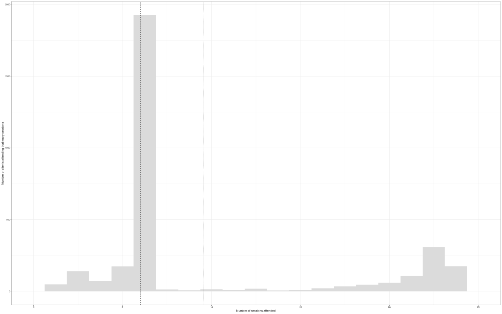
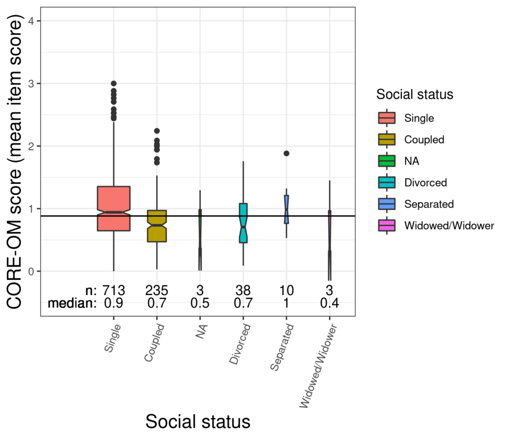
Thinking about shapes of distributions particularly of therapy change measure scores but also of age does matter and add important information to simply knowing the mean and SD. If a distribution of first session scores for one clinic extends lower than for another because the second service is not accepting into therapy clients scoring below some cut off score but if the first also has a lot of social deprivation it may have markedly more clients starting therapy with high scores and yet the means may be very similar for the two services (but the SD will be larger for the first) and the two services may actually be dealing with really rather diferent challenges.
Details and examples #
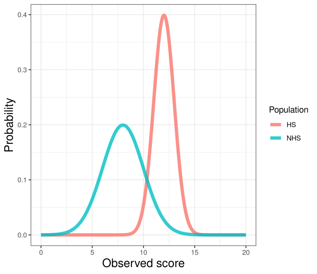
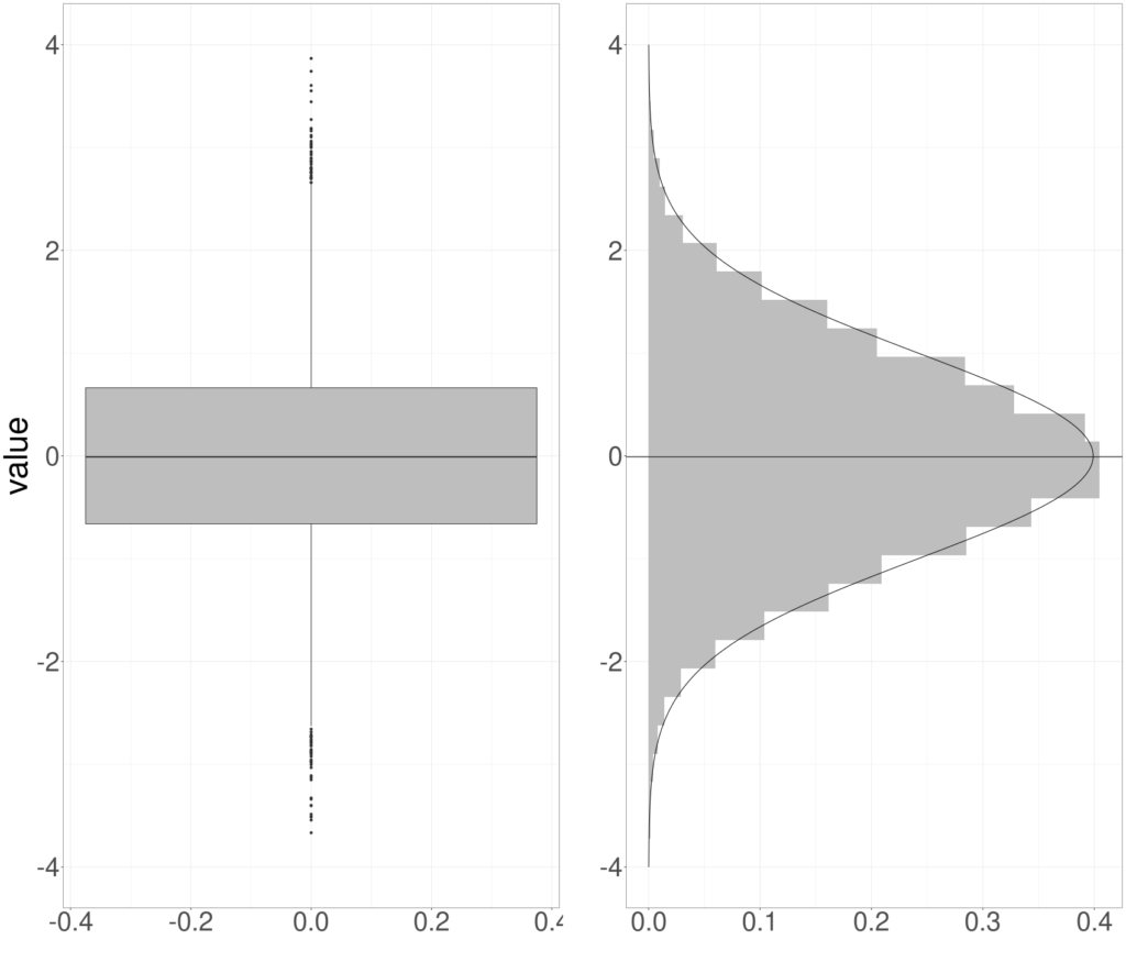
It’s really useful to get familiar with looking at distributions occasionally as density/probability plots (next image) but generally in histograms or bar graphs, boxplots and violin plots (see entries for more on each of those). Here’s a probability/density plot of two theoretical (near) Gaussian distributions differing only in location and spread. (Only “near Gaussian” as the scores can only take values between finite limits, 0 and 20 hear by the look of it; the true Gaussian goes from minus infinity to plus infinity.)

Try also #
Distributions
Gaussian (“Normal”) distribution
Mean
Standard Deviation (SD)
Variance
Median
Inter-Quartile Range (IQR)
Range
Minimum
Maximum
Histogram
Boxplot (and notched boxplot)
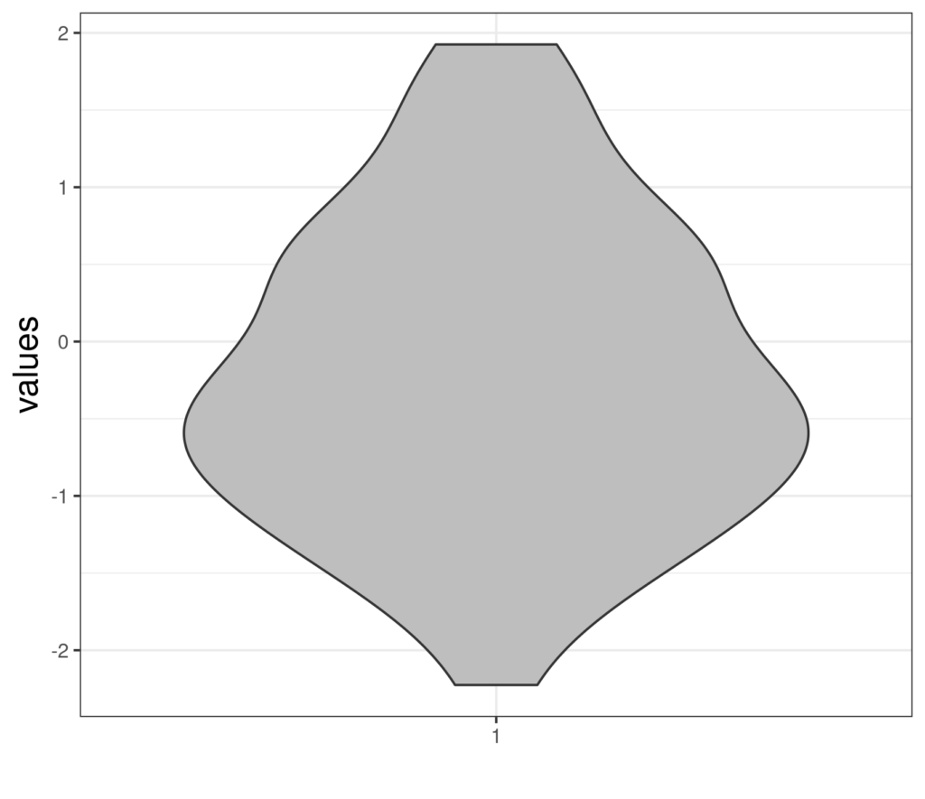
Violin plot
Chapters #
Touched on in chapter 5 but the principle of “looking at your data” runs through the book.
Dates #
Created 13/11/21

